Category: Cover Art
Dive into a gallery of vintage cover art from books, magazines, and albums. Discover how graphic design and illustration reflected the moods of their times.
These covers capture the essence of cultural evolution — from bold propaganda to elegant minimalism.
-

#9 Judge magazine, January 18, 1913
A playful sense of motion runs through the cover of *Judge* magazine’s “Winter Travel Number,” dated January 18, 1913. At the top, the crisp masthead and the printed price of 10 cents frame an airy scene in which a bundled driver stands high on a small motorcar, suggesting a sudden stop or a slippery mishap.…
-
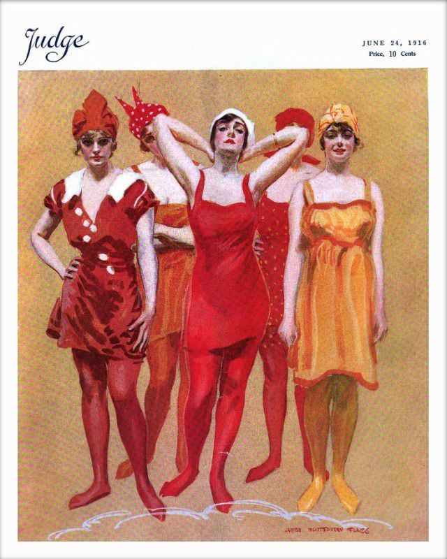
#25 Judge magazine, June 24, 1916
Bold color and breezy attitude define the cover of *Judge* magazine dated June 24, 1916, a moment when illustrated periodicals competed on the newsstand with instantly readable style. The masthead sits cleanly at the top, along with the issue date and “Price, 10 Cents,” framing what is essentially a fashion-forward tableau designed to stop passersby…
-
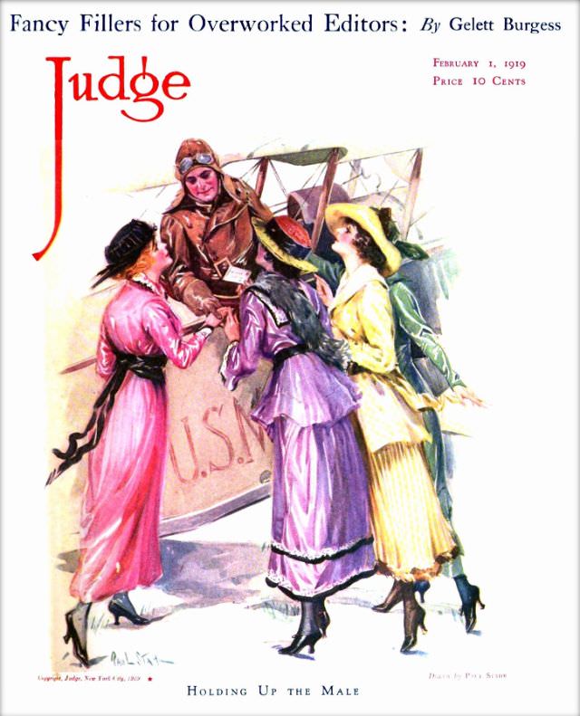
#41 Judge magazine, February 1, 1919
Bold color and lighthearted satire meet on the cover of *Judge* magazine dated February 1, 1919, where a leather-helmeted aviator leans from his aircraft to greet three fashionable women clustered at the fuselage. Their long skirts, fitted waists, gloves, and broad hats evoke the late-1910s wardrobe at a glance, while the pilot’s goggles and heavy…
-

#16 Pianos, Pin-Ups, and Party Tunes: Exploring the Wild World of Honky-Tonk Records #16 Cover Art
Bright as a neon sign and twice as loud, this cover for Joe “Fingers” Carr’s “Rough-House Piano” turns honky-tonk music into a full-blown scene: a grinning pianist at an upright, hands flying over the keys while the room tilts toward mischief. The bold banner lettering and the Capitol Records logo frame the promise right on…
-

#12 Everybody Was Kung Fu Fighting: Exploring the Heyday of Martial Arts Mags in the 1970s and 1980s #12 Co
Bold, oversized lettering announces BLACK BELT across a dramatic illustrated cover, the kind of newsstand beacon that helped fuel martial arts mania in the 1970s and 1980s. The artwork stages two gi-clad fighters in mid-technique, their white uniforms slicing through a warm, cinematic palette while a larger, watchful face looms behind like a poster for…
-

#16 Blood, Masks, and Glory: A Visual Tour Through Lucha Libre Magazine Covers of the 1970s #16 Cover Art
Chrome-bright costumes and hard-edged masks announce the world of 1970s lucha libre magazine cover art, where wrestlers were staged like comic-book heroes. The bold “LUCHA LIBRE” masthead slants across the corner, while three figures pose in a theatrical tableau: one raised high in a triumphant, almost statue-like stance, flanked by two partners crouched and ready.…
-

#32 Blood, Masks, and Glory: A Visual Tour Through Lucha Libre Magazine Covers of the 1970s #32 Cover Art
Bright cyan floods the cover, turning masked wrestling into pop-art spectacle while keeping the stakes unmistakably serious. Two luchadores pose in crisp white masks and gear: one seated with a cape draped over his shoulders, the other standing behind in a short-sleeved shirt, hands set with confident ease. Bold, diagonal “LUCHA LIBRE” lettering and punchy…
-
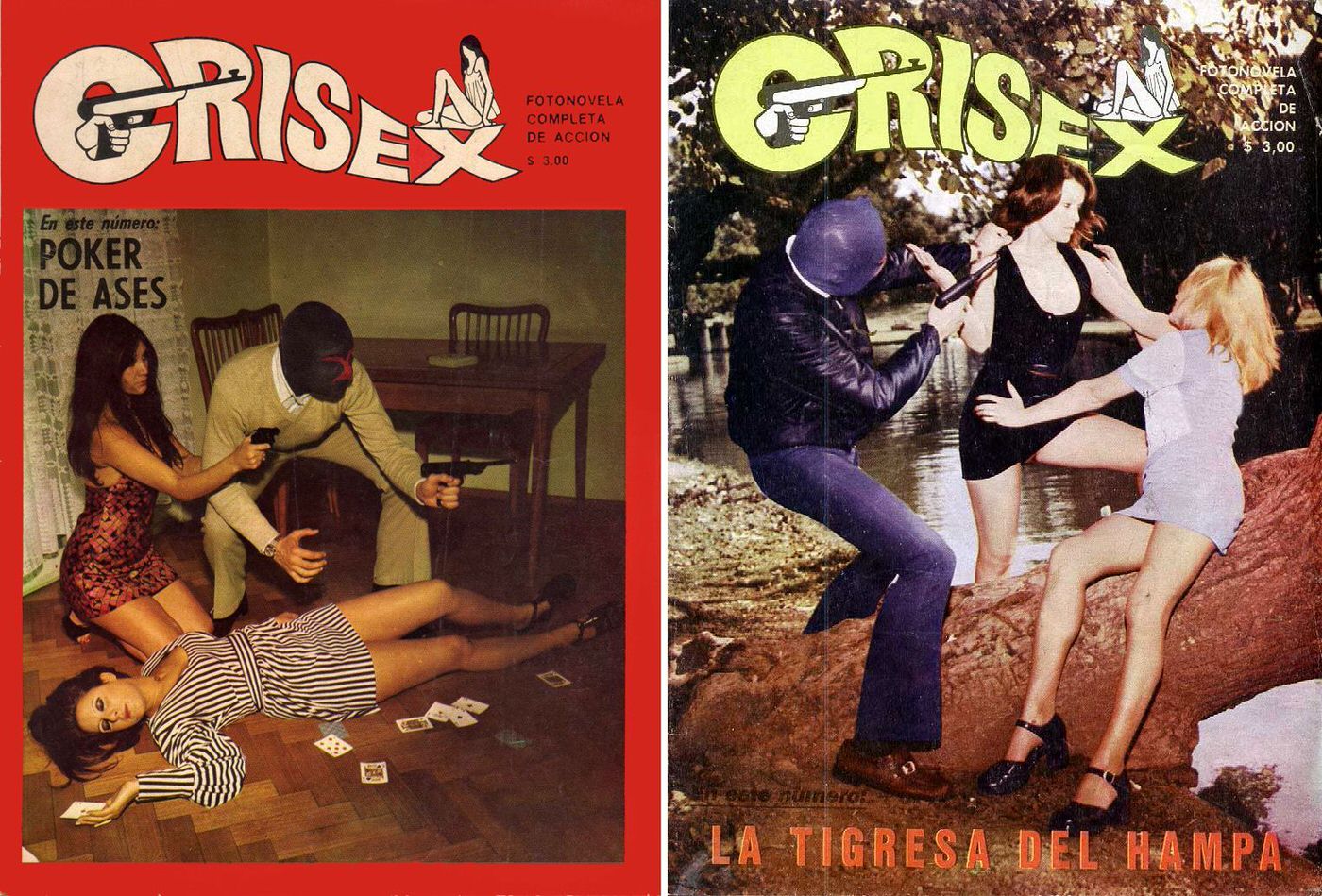
#10 The World of Spanish and Italian Crime Comics (Fotonovelas) from the 1960s-70s: Stories Told with Sensational Photogr
Lurid typography, pistol silhouettes, and staged peril leap off these “CRISEX” covers, a perfect entry point into the Spanish and Italian crime fotonovela boom of the 1960s–70s. Marketed as “fotonovela completa de acción,” the format sold suspense in a tabloid register—bold mastheads, bright blocks of color, and sensational taglines designed to grab a kiosk browser…
-
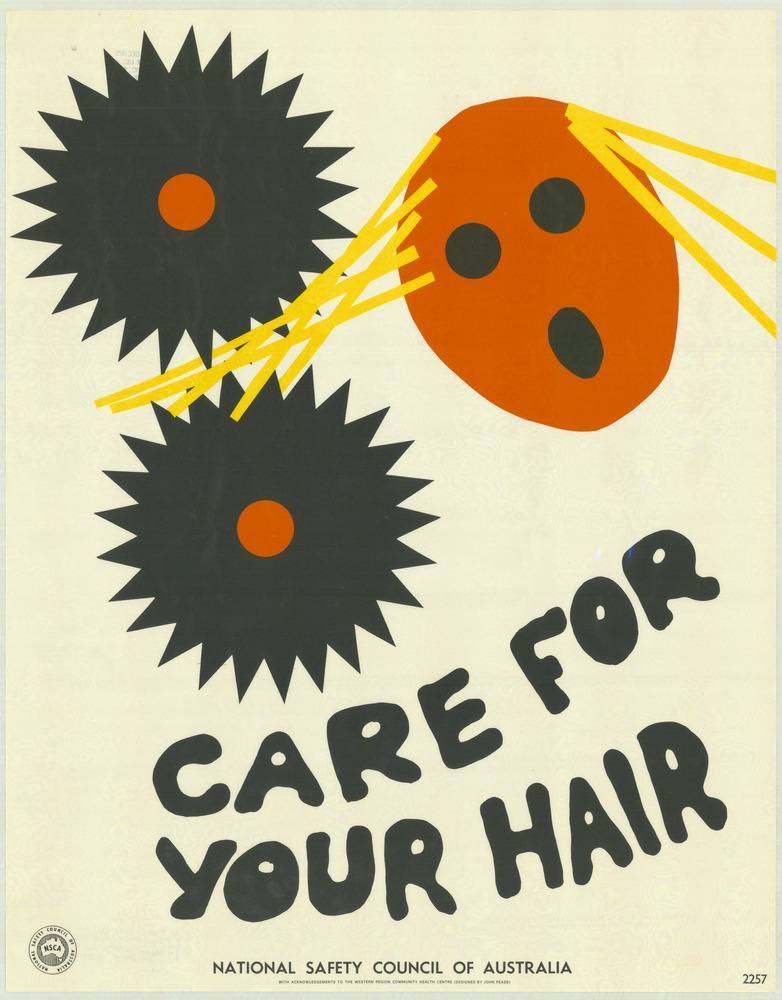
#14 National Safety Council of Australia Posters from the 1970s: Visual Messages for Keeping People Safe and Well
Bold, cut-paper shapes and high-contrast colour announce a no-nonsense safety message, pairing two jagged black “gears” with a bright orange head and strips of yellow hair caught in the danger zone. The hand-drawn lettering—“CARE FOR YOUR HAIR”—leans playfully across the lower half, yet the visual warning is immediate: long hair and moving machinery don’t mix.
-
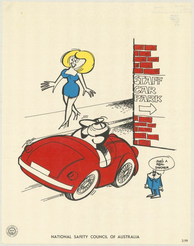
#30 National Safety Council of Australia Posters from the 1970s: Visual Messages for Keeping People Safe and Well
Bright, cheeky illustration rather than stern warning sets the tone for this National Safety Council of Australia poster from the 1970s, where a red sports car pulls into view beside a brick wall marked “STAFF CAR PARK.” A stylised blonde figure in a blue dress strides across the open space, while a small onlooker offers…