Category: Cover Art
Dive into a gallery of vintage cover art from books, magazines, and albums. Discover how graphic design and illustration reflected the moods of their times.
These covers capture the essence of cultural evolution — from bold propaganda to elegant minimalism.
-
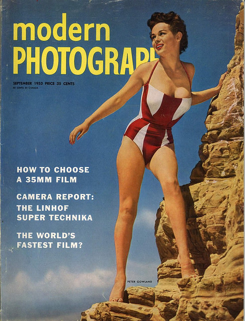
#10 A Look Back at Vintage Modern Photography Magazine Covers from the 1950s and 1960s #10 Cover Art
Bold typography and sunlit color set the tone on this Modern Photography cover, where a swimsuit-clad model poses against rugged rock and a deep blue sky. The design balances glamour with the promise of practical know-how, a hallmark of mid-century magazine cover art that sold readers both aspiration and instruction. Even at a glance, the…
-
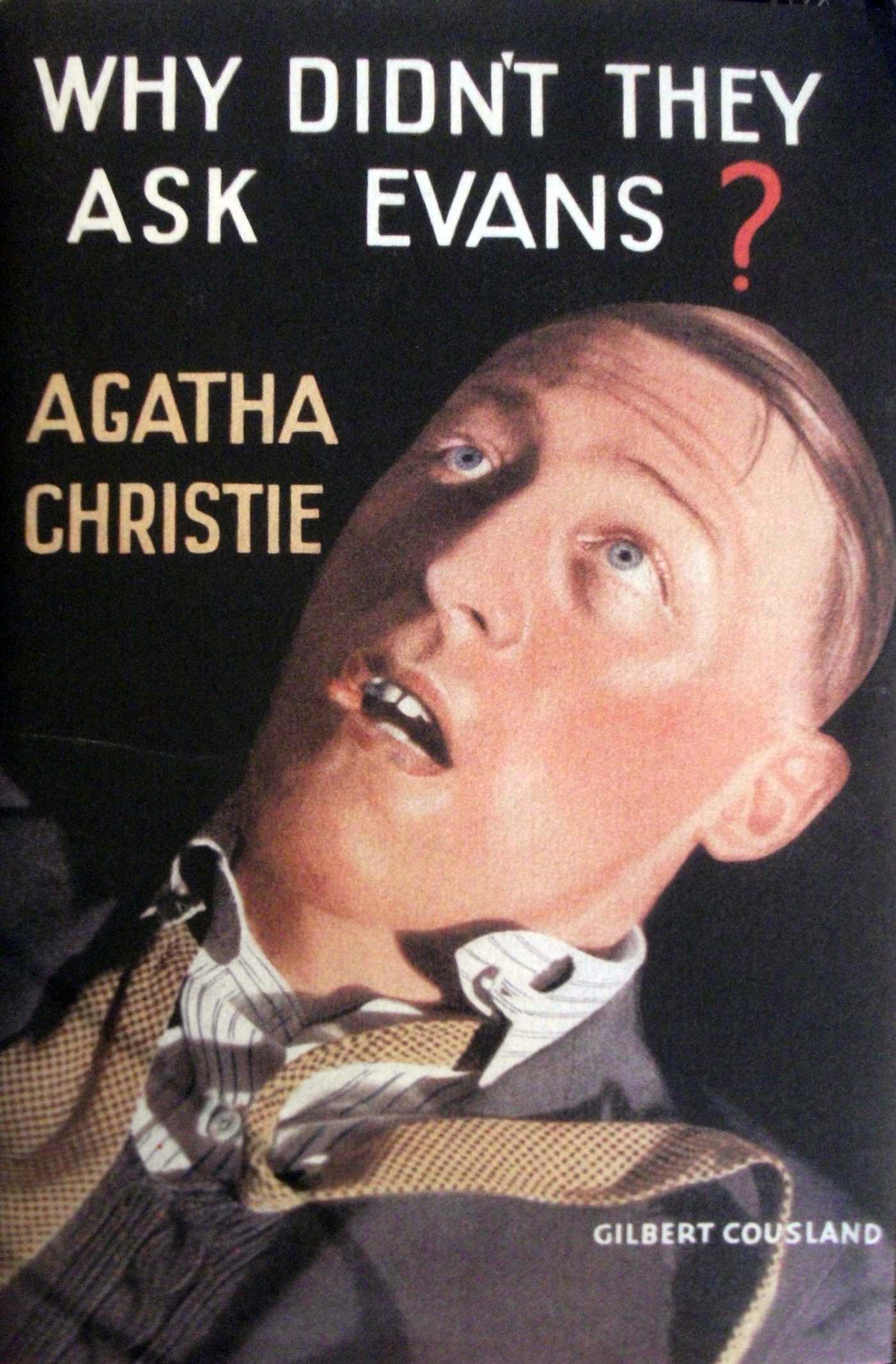
#6 Why Didn’t They Ask Evans? , first published, 1934
Bold lettering and a single, startled face do most of the talking on this 1934 cover for *Why Didn’t They Ask Evans?* The title stretches across a deep dark field, punctuated by a vivid question mark that feels almost accusatory, while the figure below looks upward with wide eyes and parted lips, caught in the…
-
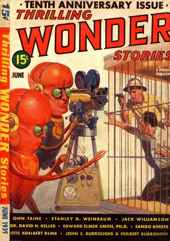
#11 Thrilling Wonder Stories, 1959
Bold lettering trumpets “Thrilling Wonder Stories” across a celebratory “Tenth Anniversary Issue,” and the cover immediately leans into the magazine’s mid-century sense of spectacle. A 15¢ price circle and the month “June” anchor it as a piece of vintage newsstand culture, while the worn edges and slightly faded inks hint at decades of handling. For…
-
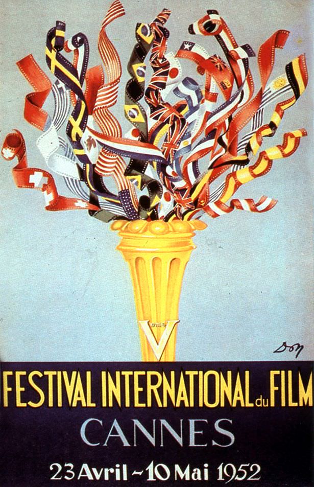
#7 1952: The Festival moved from September to April to make the most of the beginning of the tourist season. The poster though, er, still looks like an advert for the Olympics. In fact it arguably looks better than the adverts for this year’s Olympics.
A golden torch rises from the bottom of the poster, erupting into a jubilant spray of ribbon-like national flags that twist and curl against a pale blue sky. The design leans into the clean, athletic symbolism of an international gathering—part ceremonial flame, part celebratory bouquet—giving it that unmistakable “Olympics advert” energy mentioned in the title.…
-
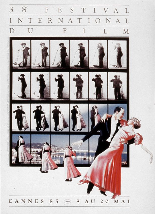
#23 1985
Across the top, the lettering announces the “38e Festival International du Film,” framing a piece of cover art that feels both elegant and kinetic. A grid of small, filmstrip-like panels repeats a dancing couple in silhouette, each frame catching a slightly different step, as if motion has been pinned to paper. Beneath the montage, a…
-
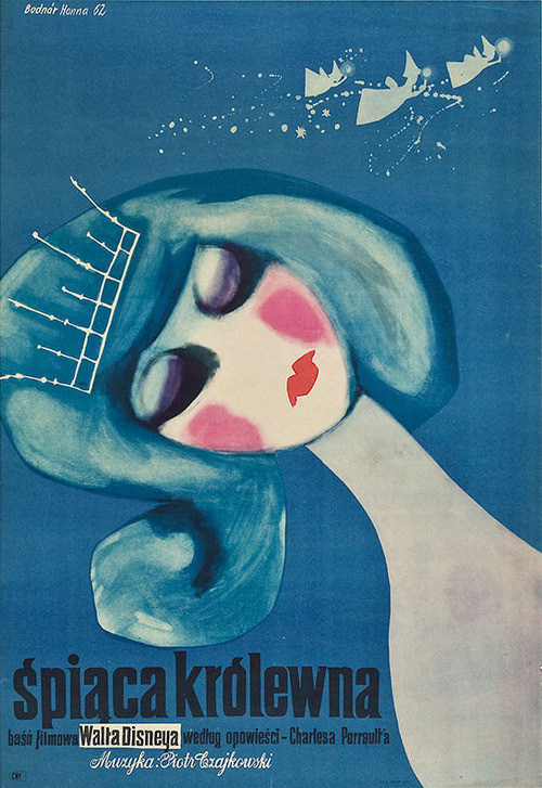
#15 Sleeping Beauty. Artist: Hanna Bodnar. Year: 1962
Drifting across a deep blue field, Hanna Bodnar’s 1962 cover art for “Sleeping Beauty” turns the familiar fairy tale into a modern dreamscape. A serene face fills the composition at an angle, framed by sweeping teal hair and closed, violet-shadowed eyes, while rosy cheeks and bright red lips add a theatrical, storybook hush. The minimal…
-
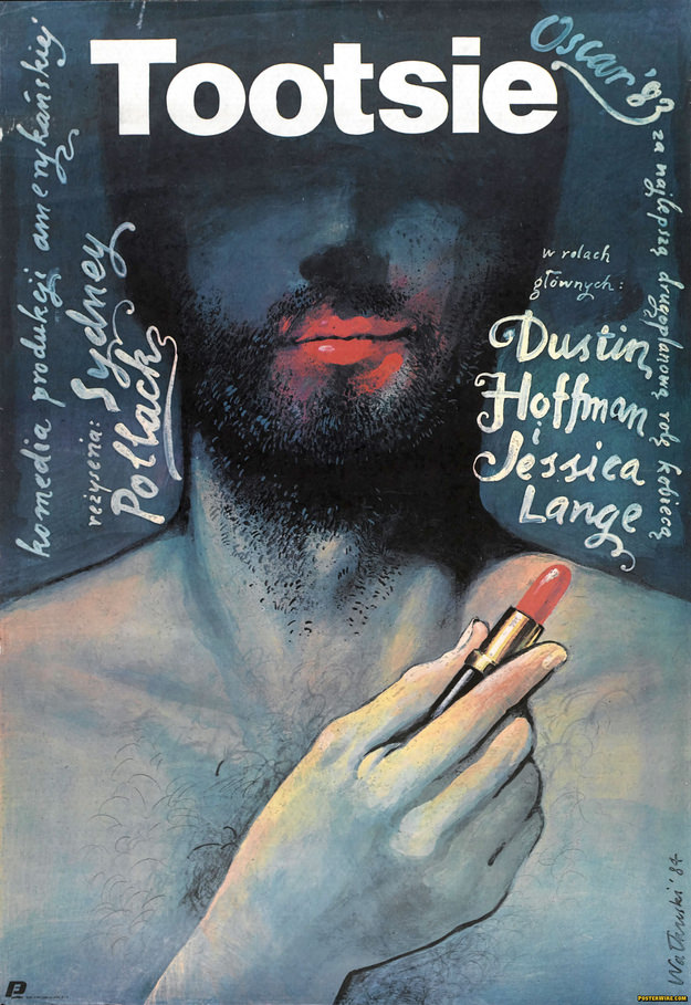
#31 Tootsie. Artist: Wieslaw Walkuski. Year: 1984
Bold lettering shouts “Tootsie” across the top, while Wieslaw Walkuski’s 1984 cover art lingers in the moody space beneath it—an intimate close-up of a bearded face, lips tinted a theatrical red. The palette leans into smoky blues and soft shadow, turning skin and stubble into a stage for transformation. A hand in the foreground lifts…
-
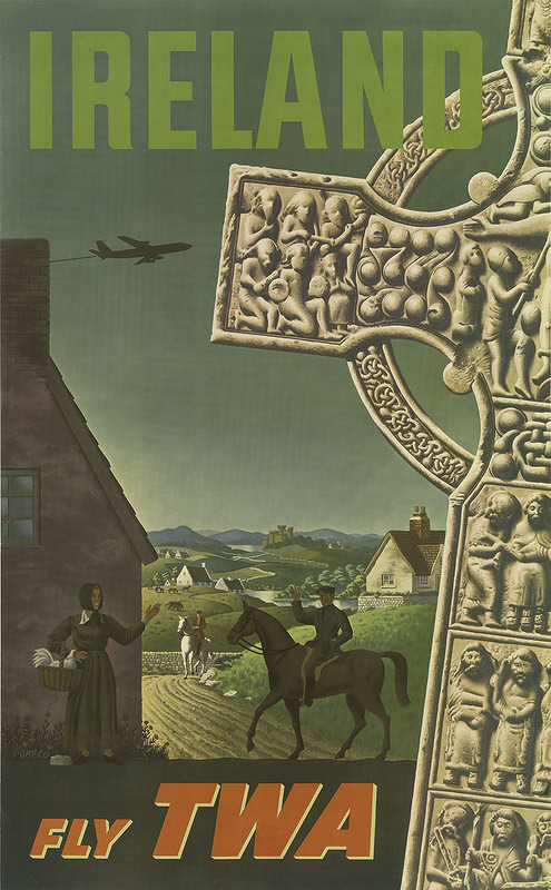
#2 Around the World in Posters: A Look at Vintage Travel Advertising #2 Cover Art
Bold green lettering spells “IRELAND” across a calm, clouded sky, while a sleek airplane silhouette glides overhead—an instant cue that this is travel advertising from the age when flight still felt a little miraculous. At the bottom, the command “FLY TWA” anchors the design with mid-century confidence, pairing a modern airline promise with imagery that…
-
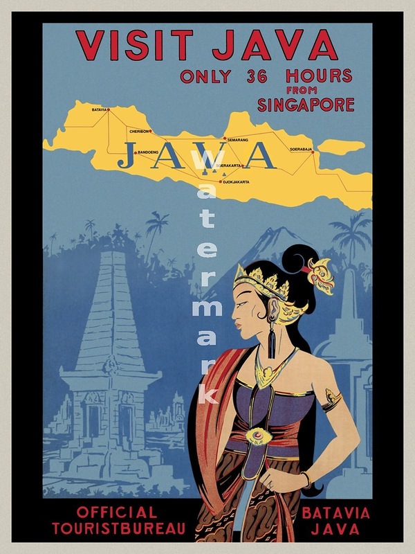
#18 Around the World in Posters: A Look at Vintage Travel Advertising #18 Cover Art
Bold lettering urges travelers to “Visit Java,” promising the island is “only 36 hours from Singapore,” and the design wastes no time setting a mood. A simplified map stretches across the top with place names marked along rail-like lines, turning geography into an itinerary and suggesting that modern transport could make distant destinations feel reassuringly…
-
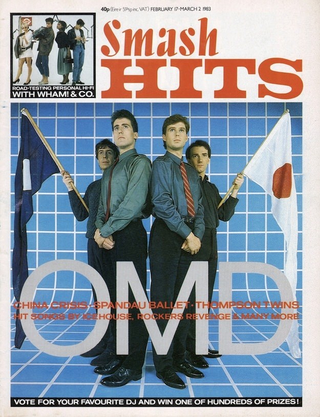
#7 Inside Smash Hits: The Iconic Magazine Covers of the 1980s #7 Cover Art
Bold typography and pop-colour confidence make this Smash Hits cover an instant time capsule of 1980s music magazine culture. The masthead dominates the page in classic tabloid style, while the price (40p) and the issue window—February (17–March 2) 1983—anchor it firmly in its moment. Even before you read a single line, the design signals what…