Category: Cover Art
Dive into a gallery of vintage cover art from books, magazines, and albums. Discover how graphic design and illustration reflected the moods of their times.
These covers capture the essence of cultural evolution — from bold propaganda to elegant minimalism.
-

#23 Halloween Greetings
Bright candy colors and gentle mischief set the tone in this “Halloween Greetings” cover art, where two rosy-cheeked children lean in close to a grinning jack-o’-lantern. The girl’s oversized blue bow and curls, the boy’s neat sailor-style collar, and the pumpkin’s playful carved face create a scene meant to charm more than frighten. Above them,…
-
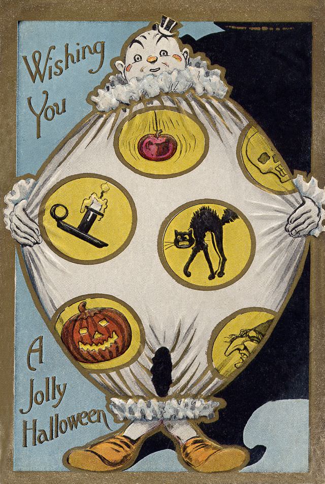
#39 Wishing You a Jolly Halloween
Playful greeting-card art sets the tone in “Wishing You a Jolly Halloween,” where a wide-eyed clown-like figure balloons into a comically round costume, complete with ruffled collar, tiny hat, and oversized shoes. The hand-lettered message runs along the left side, balancing the character’s bright, theatrical presence against a simple blue-and-black background. Even at a glance,…
-
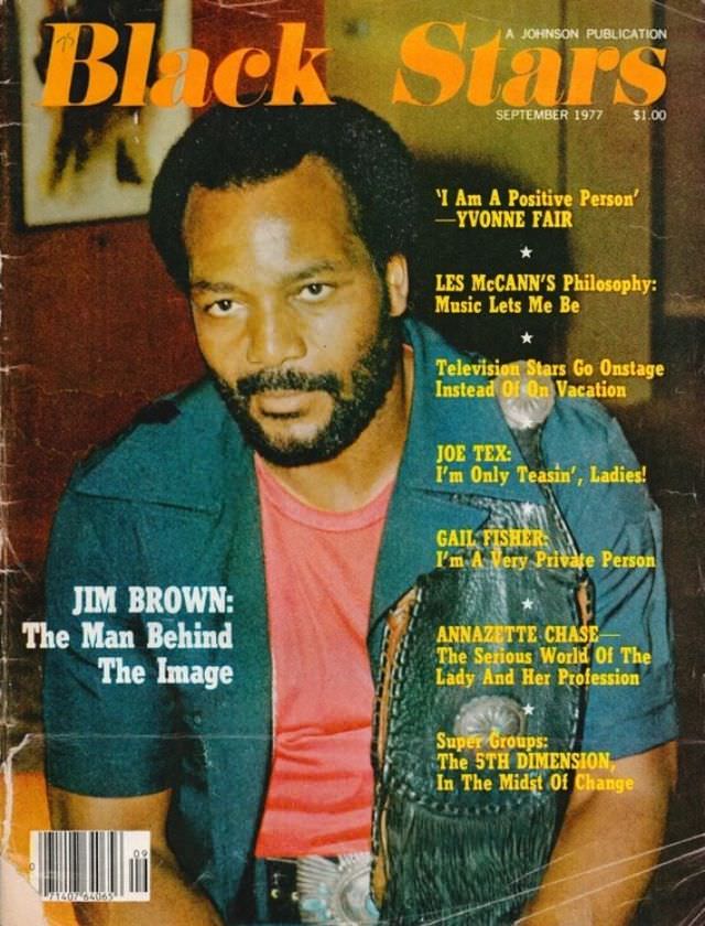
#15 Jim Brown, September 1977
Bold color and confident typography frame this September 1977 cover of *Black Stars*, a Johnson Publication, placing Jim Brown at the center with a direct, steady gaze. The portrait feels intimate rather than staged, with warm tones, casual clothing, and a textured backdrop that gives the layout a lived-in, late-1970s magazine look. As cover art,…
-
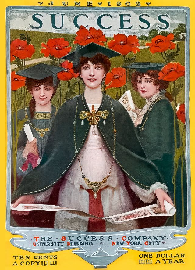
#5 Success magazine, June 1902
June 1902 arrives in bold lettering across the top of *Success*, framing a richly colored cover illustration that feels equal parts aspiration and pageantry. Three women in academic caps and gowns stand before a field of vivid red poppies, their faces rendered with the careful, idealized detail typical of turn-of-the-century magazine art. The central figure,…
-
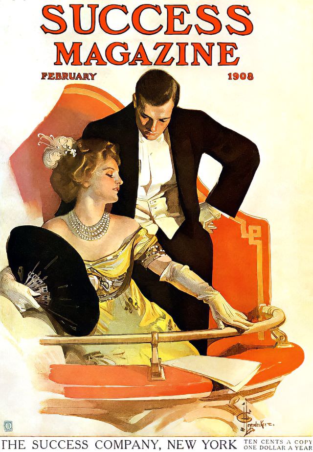
#21 Success magazine, February 1908
Bold serif lettering shouts “SUCCESS MAGAZINE” above a polished illustration dated February 1908, setting the tone for an era when ambition was marketed with theatrical flair. The cover art presents an elegantly dressed woman in a shimmering gown and long gloves, her posture poised as she holds a dark fan, while a sharply tailored man…
-
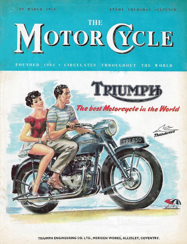
#11 The Motor Cycle magazine, March 29, 1951
Bold, sky-blue lettering announces **The Motor Cycle** at the top of this March 29, 1951 issue, complete with the promise of a weekly Thursday read and the proud note that the magazine “circulates throughout the world.” The cover art leans into mid-century confidence, balancing crisp typography with an airy illustrated scene that feels as much…
-
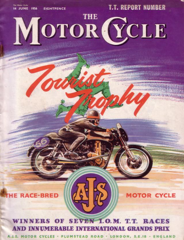
#27 The Motor Cycle magazine, June 14, 1956
Purple sky, bold serif lettering, and a streak of speed set the tone on the cover of *The Motor Cycle* magazine dated June 14, 1956. The design spotlights the “Tourist Trophy” with a stylized outline of the Isle of Man hovering behind a crouched rider, turning the whole page into a poster-like tribute to competition.…
-
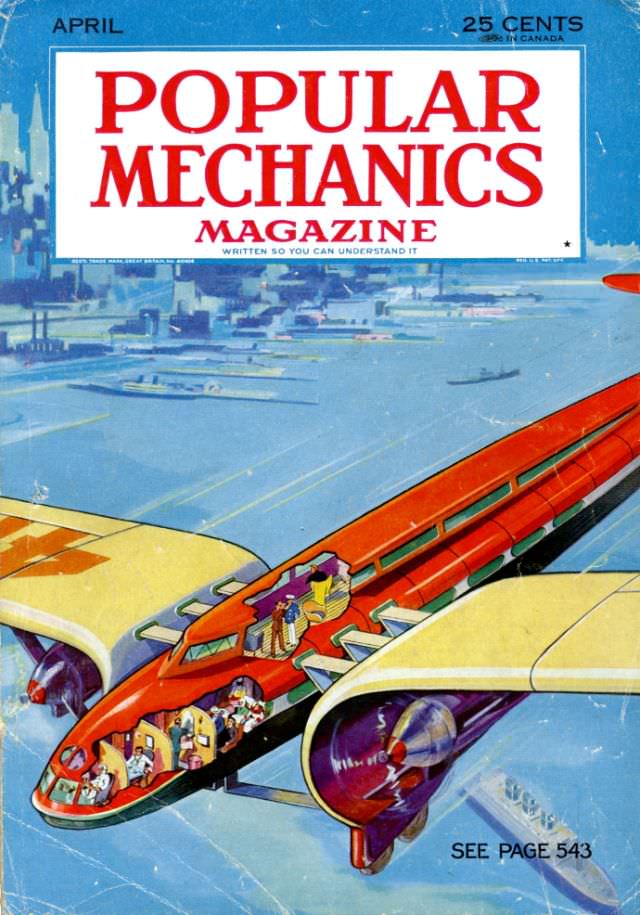
#8 Popular Mechanics magazine cover, April 1933
Bold red lettering announces “Popular Mechanics Magazine” across the April 1933 cover, priced at 25 cents, with the familiar promise that it’s “written so you can understand it.” Beneath the masthead, the artwork plunges into a cool blue scene where distant buildings fade into the background, setting a modern, forward-looking stage for the magazine’s fascination…
-
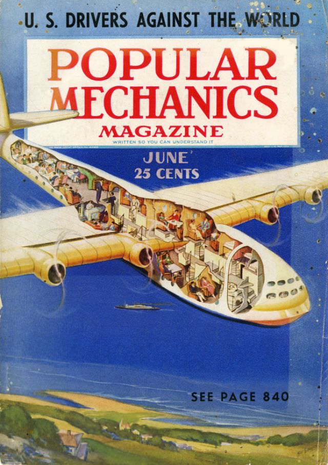
#24 Popular Mechanics magazine cover, June 1938
Bold red lettering crowns the June 1938 cover of Popular Mechanics magazine, set against a sky-blue field that still carries the scuffs and speckles of a well-handled issue. A headline about “U.S. drivers” hints at the era’s fascination with speed and competition, while the familiar promise of practical know-how sits beneath the masthead. Even the…
-

#40 Popular Mechanics magazine cover, March 1947
March 1947 arrives in bold red letters atop a classic Popular Mechanics magazine cover priced at 25 cents, a small detail that instantly places the artwork in its mid-century moment. The familiar tagline “Written so you can understand it” sits beneath the masthead, promising practical explanations for a world newly captivated by modern engineering. Even…