Category: Cover Art
Dive into a gallery of vintage cover art from books, magazines, and albums. Discover how graphic design and illustration reflected the moods of their times.
These covers capture the essence of cultural evolution — from bold propaganda to elegant minimalism.
-
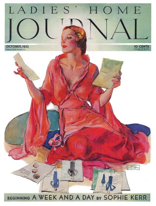
#10 Ladies’ Home Journal, October 1932
October 1932 arrives in a wash of seafoam green and crisp white, with “LADIES’ HOME JOURNAL” stretched boldly across the top like a marquee. At center, a fashionable woman in a flowing red gown sits among scattered papers, her posture poised yet absorbed, as if weighing choices before the week begins. The limited palette—cool background,…
-

#26 Ladies’ Home Journal, January 1934
Across the top of the January 1934 Ladies’ Home Journal cover, bold lettering frames an elegant painted scene: a poised woman reclining against deep red cushions, her gaze turned slightly away as if caught in a private thought. Soft, blended brushwork gives her sheer wrap and pale dress a dreamy, almost misted texture, while the…
-

#42 Ladies’ Home Journal, April 1938
April 1938 arrives in bright, rain-washed color on the cover of *Ladies’ Home Journal*, where a smiling woman tilts beneath a red umbrella spangled with water droplets. The composition leans into close-up intimacy—rosy lipstick, softly waved hair, and a red hat that echoes the umbrella’s ribs—set against a cool blue background that makes the warm…
-

#8 Dark Energy
Emerging from a field of swirling galaxies and cold green starlight, the cover art for “Dark Energy” leans hard into retro sci‑fi horror: a void-black center, a clawed, spectral presence, and a mouth of darkness that feels less like a creature than an omen. The distressed, jagged title lettering anchors the composition like a classic…
-
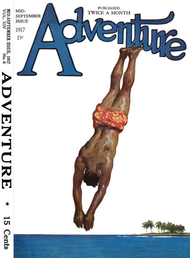
#15 Adventure cover, September 15, 1917
Bold lettering spells “Adventure” across the top of the page, setting the tone for a mid-September 1917 issue priced at 15 cents and billed as published twice a month. The cover art is clean and graphic, with a wide sweep of blue sea and sky leaving plenty of white space to spotlight the central action.…
-
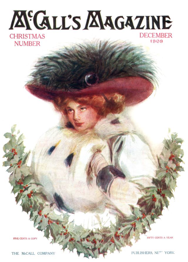
#5 McCall’s magazine cover, December 1909
McCall’s Magazine greets December 1909 with a lavish holiday “Christmas Number,” pairing bold, decorative lettering with a softly painted portrait that feels at once fashionable and intimate. The cover centers on an elegantly dressed woman wrapped in a plush white fur muff and winter coat, her gaze turned slightly aside as if caught mid-thought. Above…
-
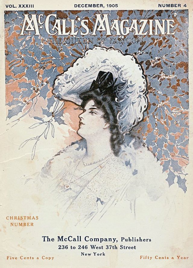
#21 McCall’s magazine cover, December 1905
December, 1905 sits proudly at the top of this McCall’s Magazine cover, framed by painterly foliage in muted winter blues and warm copper tones. The typography—“Vol. XXXIII” and “Number 4”—anchors the design with period authority, while the title declares the publication’s fashion-forward identity. Even before the reader turns a page, the composition sells an idea…
-
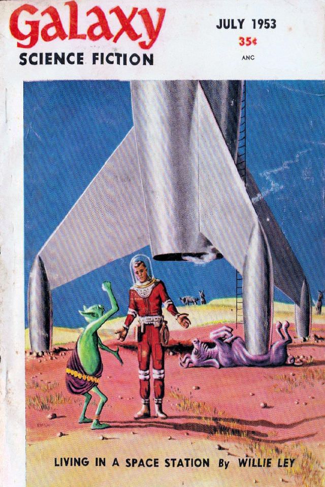
#7 Galaxy Science Fiction cover, July 1953
Bold, playful, and unmistakably mid-century, the July 1953 cover of *Galaxy Science Fiction* sets its masthead against a stark white band before plunging into a bright alien landscape. The price—35¢—and the crisp “JULY 1953” date anchor it firmly in the era of drugstore magazine racks, when science fiction cover art had to shout from a…
-
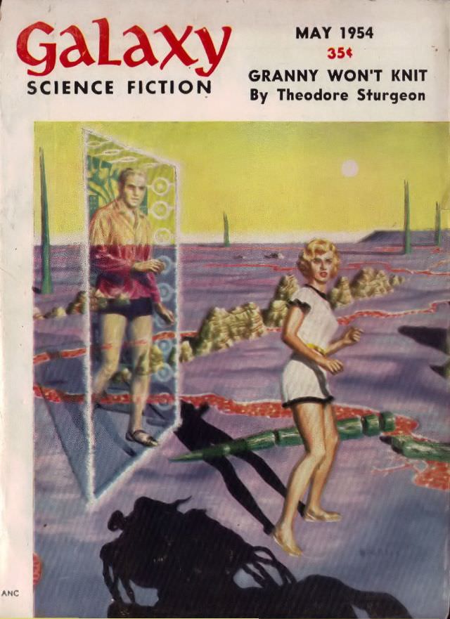
#23 Galaxy Science Fiction cover, May 1954
Galaxy Science Fiction’s May 1954 cover greets the eye with bold, red lettering and a crisp promise of pulp-era wonder, priced at 35¢ and headlined by “Granny Won’t Knit” by Theodore Sturgeon. The typography and clean masthead layout place it firmly in mid-century magazine culture, when science fiction was sold as both sleek entertainment and…
-
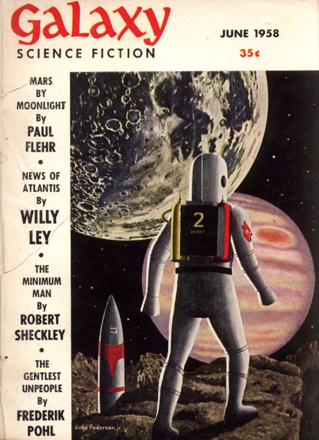
#39 Galaxy Science Fiction cover, June 1958
Bold red lettering crowns the June 1958 issue of *Galaxy Science Fiction*, pulling the eye into a classic mid-century vision of space travel. A lone suited explorer stands on a jagged, cratered foreground while a compact rocket waits nearby, its fins and markings rendered with the clean, confident lines of magazine illustration. Behind him, two…