Category: Cover Art
Dive into a gallery of vintage cover art from books, magazines, and albums. Discover how graphic design and illustration reflected the moods of their times.
These covers capture the essence of cultural evolution — from bold propaganda to elegant minimalism.
-
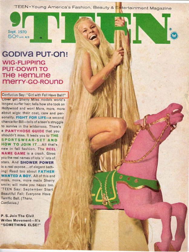
#2 A Blast from the Past: Exploring the World of Vintage Teen Magazine Covers #2 Cover Art
Big, bold lettering crowns this *TEEN* magazine cover, where “Young America’s Fashion, Beauty & Entertainment Magazine” promises a glossy doorway into youth culture. A laughing model with strikingly long blond hair clings to a rope as if caught mid-swing, while a bright pink carousel horse anchors the scene with playful, candy-colored flair. Even before reading…
-
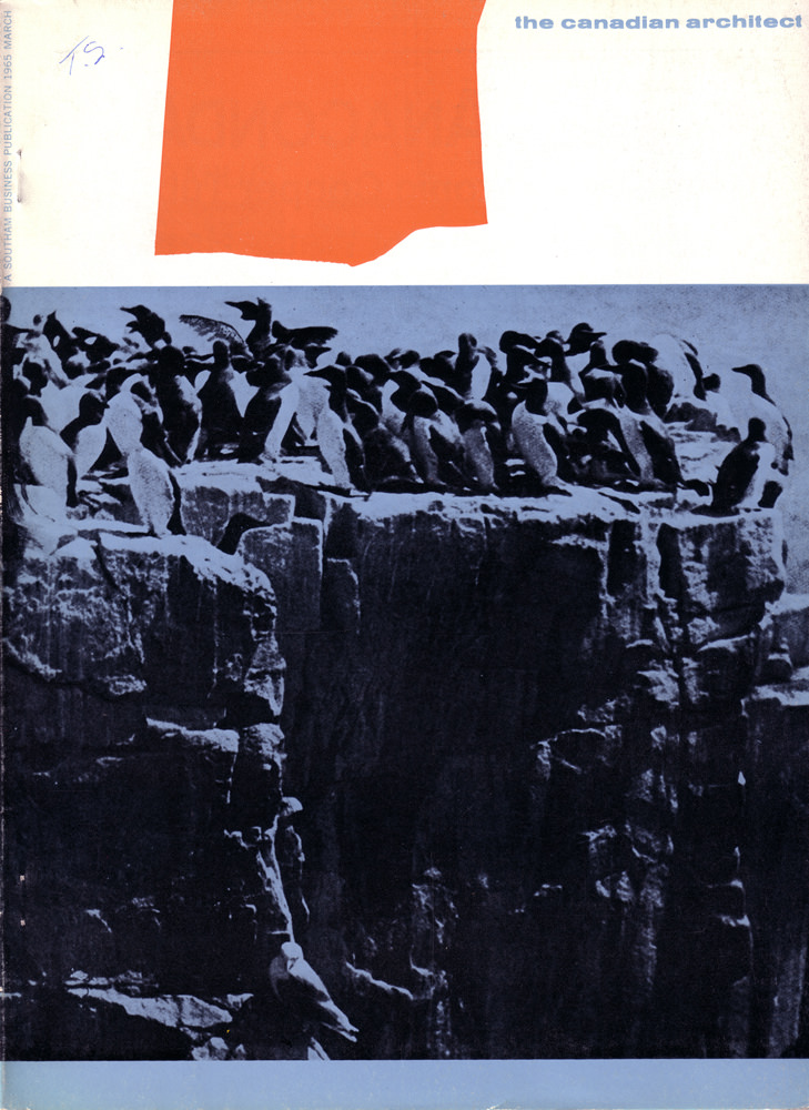
#7 The Canadian architect – March 1965
Bold graphic restraint meets raw nature on the March 1965 cover of *The Canadian Architect*. A flat field of red and a wide band of white hover above a stark, blue-toned photograph, creating a modernist composition that feels as intentional as any elevation drawing. The magazine title sits quietly at the upper right, letting color…
-

#23 The Canadian architect – May 1966
A burst of mustard-yellow sets the mood on this May 1966 cover of *The Canadian Architect*, where graphic contrast turns a quiet landscape into a stage for modern construction. Dark, textured trees fill the foreground like a dense screen, while angular structures and scaffolding rise beyond them, their hard lines cutting across the horizon. The…
-
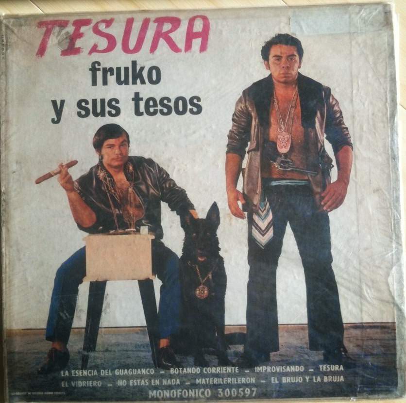
#12 So Bad, They’re Good: Vintage Album Covers That Will Make You Laugh #12 Cover Art
Across a wrinkled, well-loved sleeve, the bold word “TESURA” shouts in red while “fruko y sus tesos” sits beneath it, setting the stage for a piece of cover art that’s equal parts swagger and accidental comedy. Two stern-looking men in shiny jackets pose with nightclub seriousness, as if daring the viewer to laugh. Between them,…
-
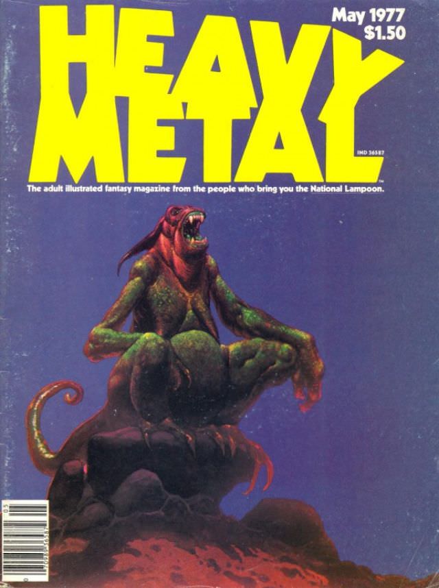
#3 Heavy Metal Magazine Covers: A 1970s Blast of Sci-Fi and Fantasy #3 Cover Art
Oversized yellow lettering shouts “HEAVY METAL” across a deep blue field, instantly selling the era’s appetite for loud ideas and louder design. In the corner, the cover is marked May 1977 with a $1.50 price, grounding the fantasy in a very real moment when newsstands still shaped what readers discovered. Beneath the masthead, the small-print…
-
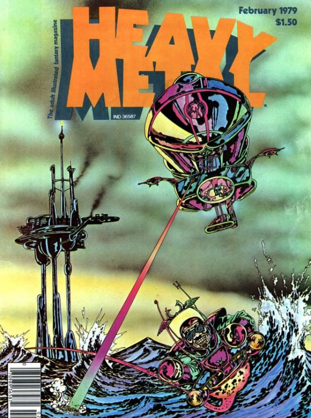
#19 Heavy Metal Magazine Covers: A 1970s Blast of Sci-Fi and Fantasy #19 Cover Art
Bold orange lettering shouts “HEAVY METAL” across a stormy, sea-green sky, instantly setting the loud, rebellious tone that made the magazine’s 1970s era so collectible. The cover shown here is clearly marked February 1979 with a $1.50 price, and it leans hard into sci‑fi spectacle: a bulbous hovering craft fires a razor-bright beam toward churning…
-
#10 The A-Frame’s Influence: How This Iconic Pose Continues to Shape Modern Fashion, Art, and Movie Posters #10
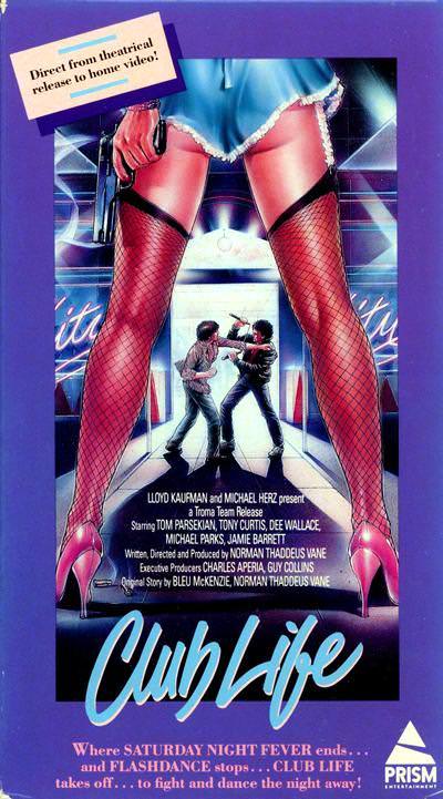
Towering legs in fishnet stockings frame the action like a theatrical proscenium, turning the viewer into an onlooker at the threshold of a neon-lit night. The exaggerated A-frame stance—feet planted wide, hips set as the apex—creates a bold visual gateway that pulls the eye straight down the corridor and into the story. Even before you…
-

#3 Super Man Chu: Master of Kung Fu (1973)
Boldly illustrated cover art like this reflects the early-1970s appetite for kung fu cinema, where a single commanding hero could anchor a whirlwind of action around him. A stern-faced martial artist in a dark uniform stands at center with a raised palm and clenched fist, projecting calm control amid chaos. Behind him, a pagoda silhouette…
-
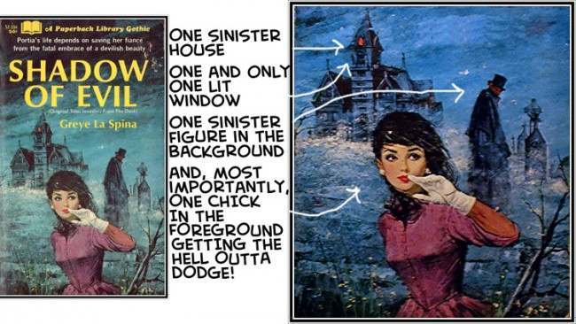
#2 The Psychological Appeal of Women Running from Houses on Gothic Romance Covers #2 Cover Art
Gothic romance cover art thrives on a single, instantly readable scenario: a woman in the foreground, caught mid-flight, glancing back toward a looming house with just one glowing window. In the composition shown here, the mansion-like silhouette rises out of mist and cold color, while a dark, distant figure stands as a vague threat rather…
-
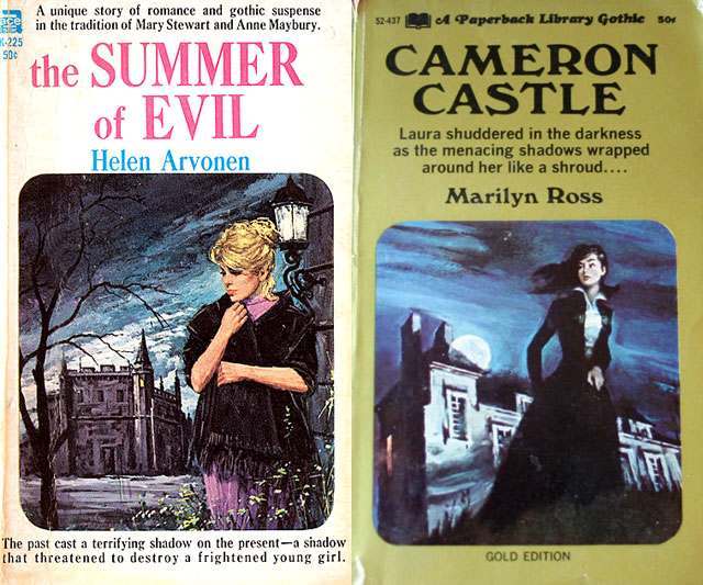
#18 The Psychological Appeal of Women Running from Houses on Gothic Romance Covers #18 Cover Art
Two paperback Gothic romance covers sit side by side, and both lean hard into the genre’s signature tension between desire and dread. On one, a pensive blonde woman stands foregrounded under a cold sky while a looming mansion recedes behind her; on the other, a dark-haired figure appears poised in motion near a stark house,…