Category: Cover Art
Dive into a gallery of vintage cover art from books, magazines, and albums. Discover how graphic design and illustration reflected the moods of their times.
These covers capture the essence of cultural evolution — from bold propaganda to elegant minimalism.
-
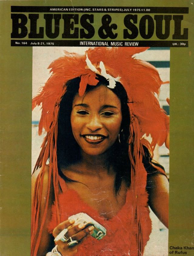
#22 Chaka Khan, July 8-21, 1975
A bold “Blues & Soul” masthead crowns this 1975 cover, immediately placing the image in the world of period music journalism and international record culture. Beneath the title and issue line for July 8–21, 1975, the layout balances clean typography with a warm, slightly faded color palette that feels unmistakably mid-’70s. Even the small print—“International…
-
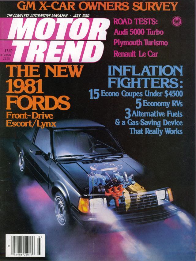
#1 Motor Trend, July 1980
Bold typography and neon-tinged color set the tone on the Motor Trend July 1980 cover, where the magazine leans into a high-energy, late-’70s/early-’80s design language. A compact car dominates the lower half of the artwork, its hood visually “opened” by an illustrated, cutaway-style engine overlay that turns mechanical detail into headline-grabbing drama. Even at a…
-
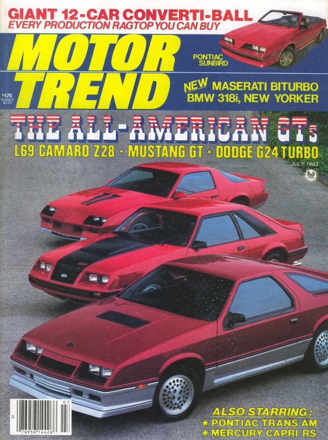
#17 Motor Trend, July 1983
Bold blocks of yellow and blue “MOTOR TREND” lettering set the stage on this July 1983 cover, a snapshot of early-’80s performance culture rendered in bright, high-contrast magazine art. The main headline—“THE ALL-AMERICAN GTs”—signals a moment when sporty coupes and hatchbacks were reclaiming the spotlight, with aggressive front fascias, hood graphics, and sharp wedge profiles…
-
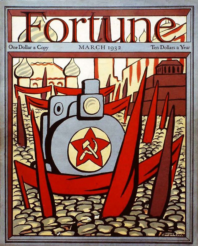
#6 Cover of Fortune Magazine, March 1932
Bold lettering crowns the March 1932 cover of *Fortune*, with period pricing tucked neatly beneath the masthead—“One Dollar a Copy” and “Ten Dollars a Year”—a small reminder of how the magazine positioned itself in an era when money and industry were on everyone’s mind. The design is graphic and forceful, built from a tight palette…
-
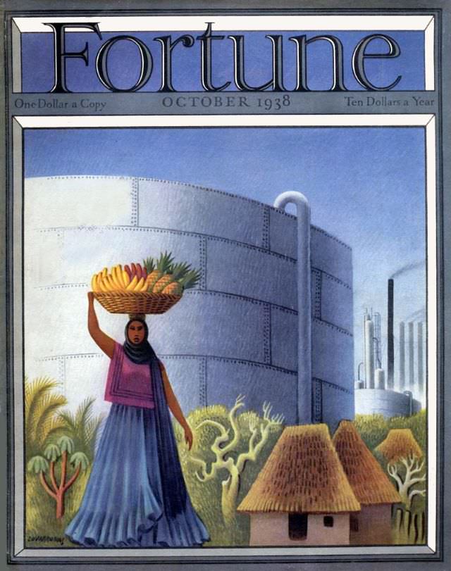
#22 Cover of Fortune magazine, October 1938
Bold lettering crowns the October 1938 cover of *Fortune*, framing a scene where modern industry and everyday labor share the same horizon. A woman in flowing blue and purple carries a basket of fruit—bananas and pineapples—balanced with practiced ease, her figure set against lush greenery. The crisp border and cool sky give the composition a…
-
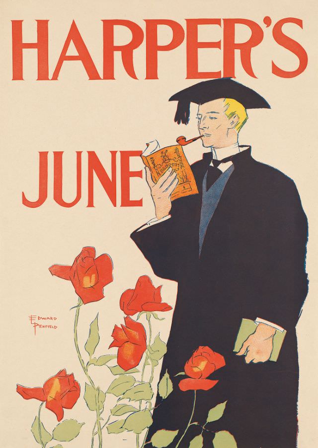
#16 A man wearing cap and gown reads a magazine while smoking a pipe, Harper’s June, 1895
Bold red lettering announces “HARPER’S” and “JUNE” across a clean, pale background, framing an elegant cover illustration from June 1895. At center stands a stylish figure in cap and gown, absorbed in a small magazine while a pipe rests at the corner of his mouth, giving the scene a calm, self-assured air. The limited palette—inky…
-
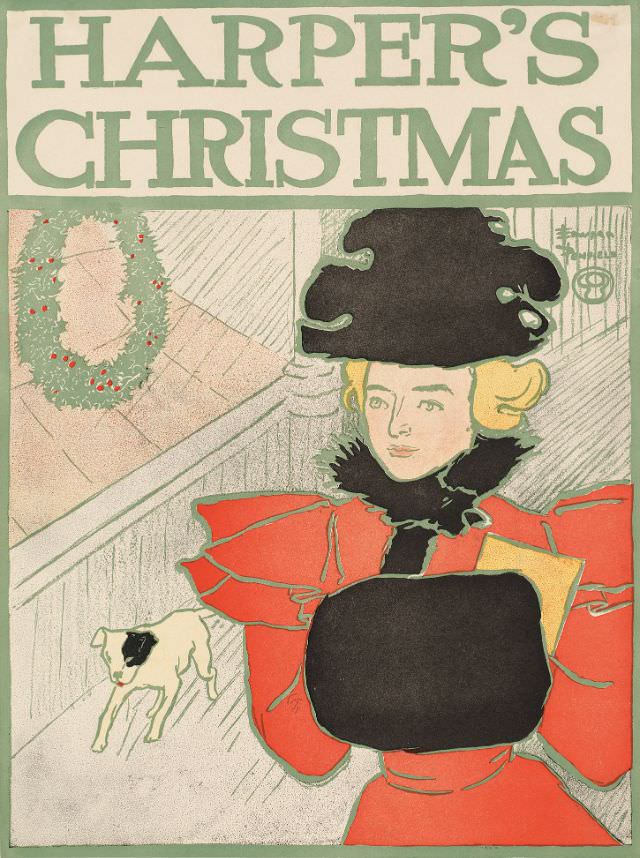
#32 A woman stands with her hands in a muff with a dog behind her, Harper’s Christmas, 1896
Harper’s Christmas fills the page in bold lettering, framing a stylish winter scene rendered in flat, poster-like color. A fashionable woman in a vivid red coat stands with her hands tucked into a large black muff, her face calm beneath a dramatic black hat and a dark, feathery collar. The simplified lines and limited palette…
-
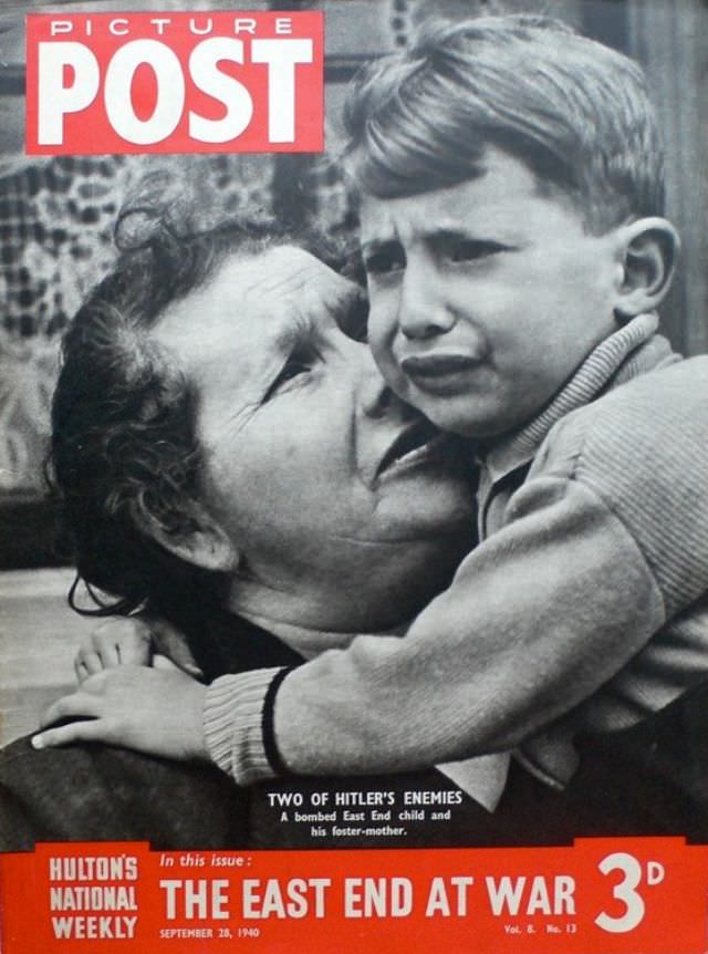
#3 Eastenders at War, Picture Post, September 28th, 1940
A tight embrace fills the cover of Picture Post dated September 28th, 1940, pairing an anxious child with the steadying presence of an older woman. Their faces are close, framed by the magazine’s bold masthead and wartime design, as if the publication wants the reader to meet the conflict not through maps or machinery, but…
-
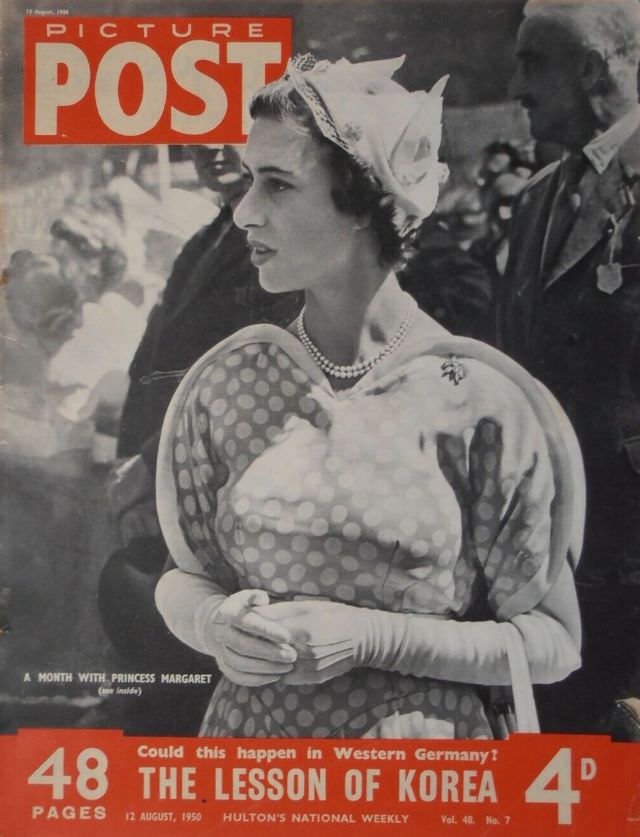
#19 A Month With Princess Margaret, Picture Post, August 12th, 1950
Picture Post leads with Princess Margaret in profile, poised amid a blur of onlookers that suggests a public engagement just out of frame. Her patterned dress, long gloves, and neatly pinned hat create a crisp silhouette, while the magazine’s bold masthead and cover typography frame her as both subject and symbol. The effect is classic…
-
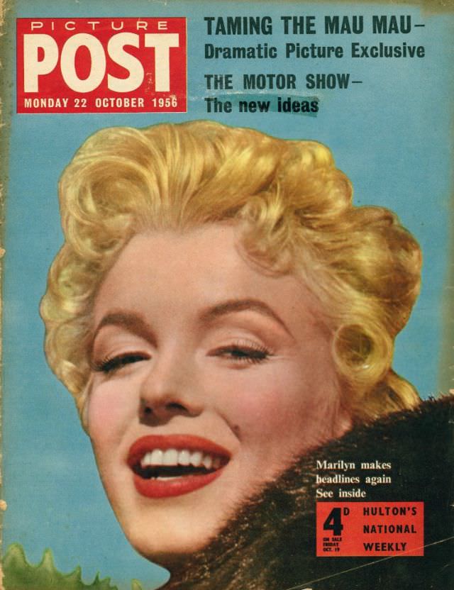
#35 Marilyn Monroe, Picture Post, October 22nd, 1956
Bold color and confident typography announce the Monday 22 October 1956 issue of *Picture Post*, with a glamorous close-up of Marilyn Monroe dominating the cover. Her softly curled blonde hair, arched brows, and bright red lipstick are rendered in a polished, magazine-stand style that immediately evokes mid-century celebrity culture. A dark fur stole frames the…