Category: Cover Art
Dive into a gallery of vintage cover art from books, magazines, and albums. Discover how graphic design and illustration reflected the moods of their times.
These covers capture the essence of cultural evolution — from bold propaganda to elegant minimalism.
-
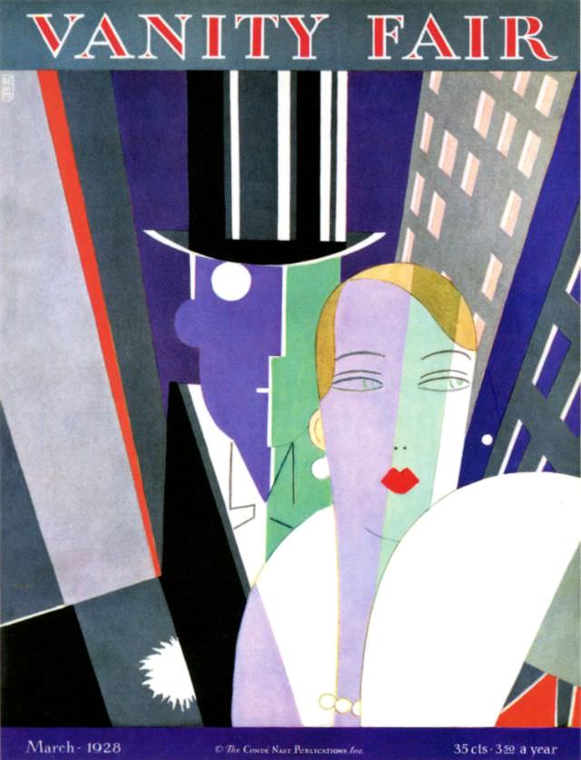
#16 Vanity Fair cover, March 1928
Bold, geometric color blocks and razor-sharp silhouettes set the tone on this Vanity Fair cover from March 1928, where a poised couple emerges from a city of slanted skyscrapers and electric night. A towering top hat, a crisp white shirtfront, and a fan-like sweep of white in the foreground create a theatrical stage for modern…
-
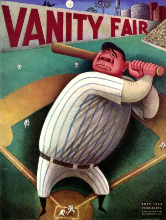
#32 Vanity Fair cover, September 1933
Bold block letters spelling “VANITY FAIR” loom over a stylized ballpark, while a hulking batter in a pinstriped uniform fills the foreground, bat cocked as if the next swing might shake the stadium. The artist exaggerates scale for comic impact: tiny fielders scatter across the green diamond, and the crowd reads as a dense, shimmering…
-
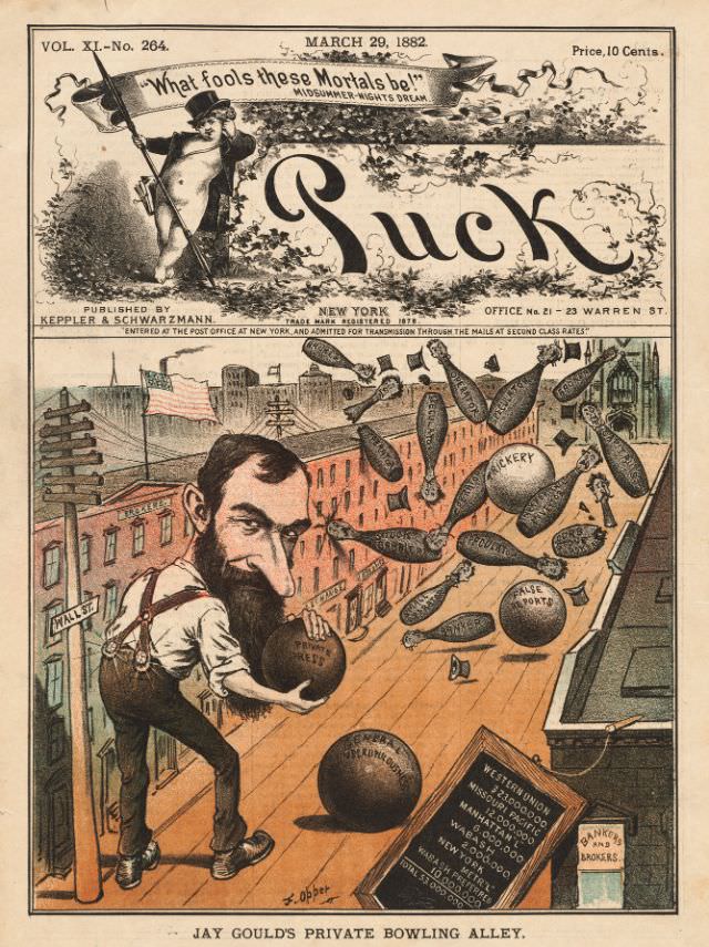
#8 Puck magazine cover, March 29, 1882
Bold lettering and theatrical flair announce Puck’s March 29, 1882 cover, topped with the Shakespearean tease “What fools these mortals be!” and the familiar masthead that made the magazine a powerhouse of American satire. The page is crowded with period details—publisher information, a New York address line, and the ten-cent price—framing the cover art as…
-
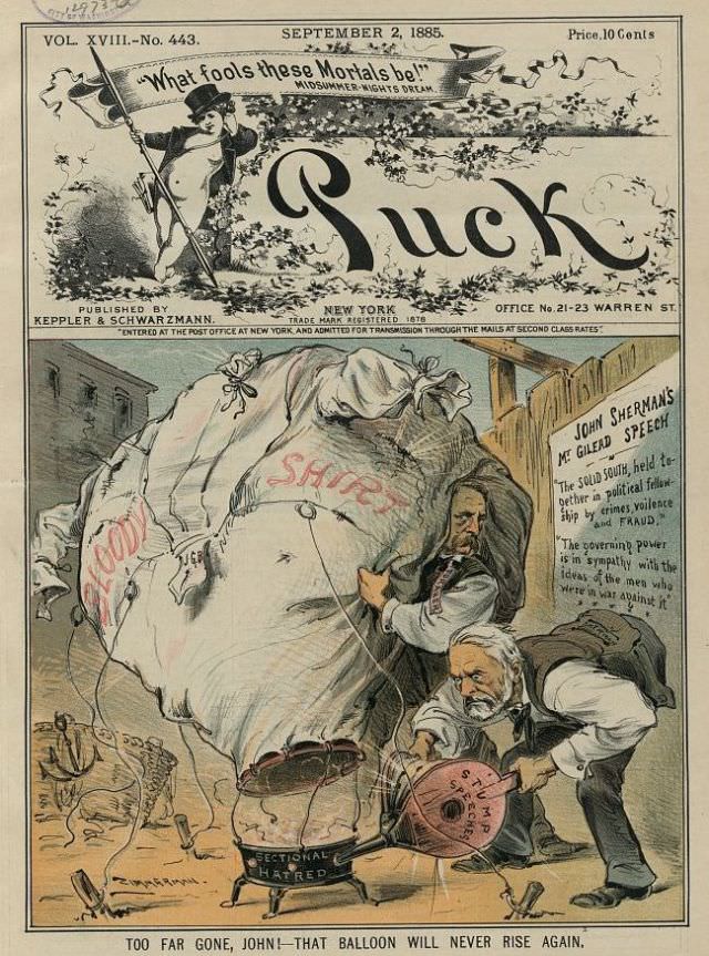
#24 Puck magazine cover, September 2, 1885
Boldly lettered across the top, the Puck magazine cover dated September 2, 1885 announces itself with theatrical flair, even quoting “What fools these mortals be!” in a nod to Shakespeare. The familiar masthead sprawls over a decorative band of foliage, while the issue details—volume number and a 10‑cent price—anchor the design in the everyday world…
-
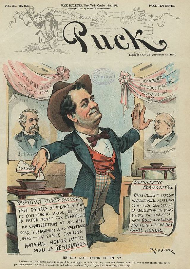
#40 Puck magazine cover, October 14, 1896
Bold lettering and careful color work make this Puck magazine cover from October 14, 1896 instantly recognizable, with the publication’s playful masthead hovering above a sharply staged political scene. At the center stands a confident figure posed like a ringmaster, arm extended as if directing the drama, while banners and framed portraits push the reader’s…
-
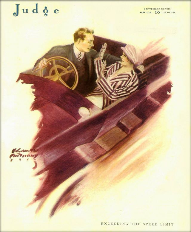
#12 Judge magazine, September 13, 1913
Speed and flirtation collide on the cover of *Judge* magazine dated September 13, 1913, a moment when automobiles still felt daring and slightly lawless. A well-dressed driver leans in at the wheel while his passenger—wrapped in a striped coat and topped with a broad hat—raises a hand in playful protest or teasing caution. The sweeping…
-

#28 Judge magazine, September 16, 1916
Bold blocks of red and yellow fabric billow across the cover of *Judge* magazine, dated September 16, 1916, as two stylish women brace themselves against a sudden gust. Wide-brimmed hats tilt, gloved hands lift, and the sweeping skirts become the real stars—turning a simple moment into a lively study of motion and modern fashion.
-
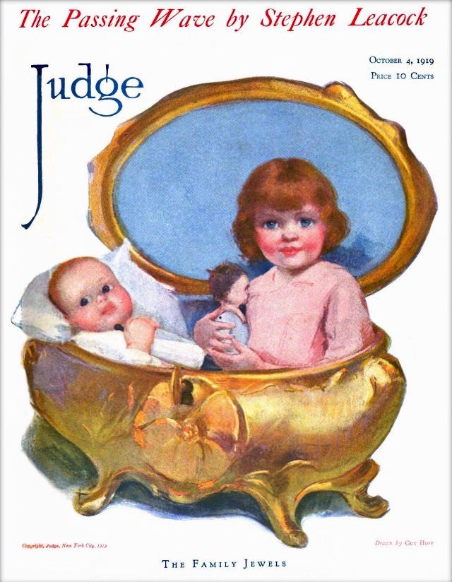
#44 Judge magazine, October 4, 1919
Judge magazine’s October 4, 1919 cover art offers a whimsical domestic tableau rendered in warm, storybook color. Two small children are tucked inside an oversized, gold-toned jewel box with its lid thrown open, turning a luxury object into a playful cradle. The title at the bottom, “The Family Jewels,” leans into the visual pun and…
-
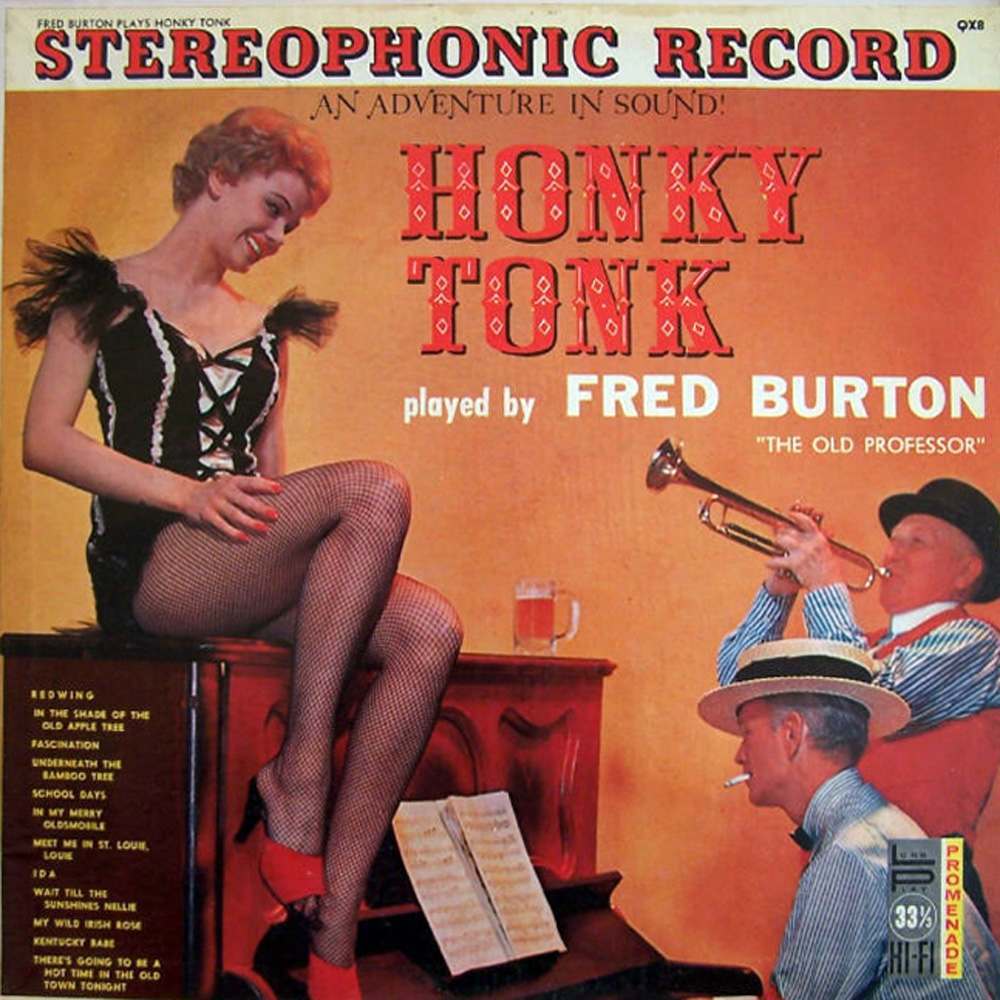
#4 Pianos, Pin-Ups, and Party Tunes: Exploring the Wild World of Honky-Tonk Records #4 Cover Art
Bold lettering shouts “STEREOPHONIC RECORD” and “HONKY TONK,” setting a loud, playful tone before the eye even lands on the scene: a smiling pin-up perched atop an upright piano, fishnet stockings and stage-ready confidence turned into pure advertising. The warm, poster-like color palette and theatrical pose sell not just music, but an after-hours mood—part burlesque…
-
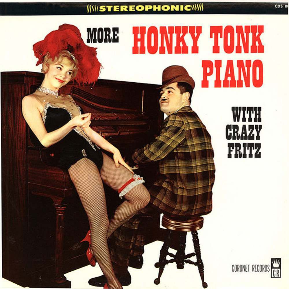
#20 Pianos, Pin-Ups, and Party Tunes: Exploring the Wild World of Honky-Tonk Records #20 Cover Art
Loud lettering, cheeky staging, and a piano pushed right to the foreground—honky-tonk record cover art sold a whole night out before the needle ever touched the groove. Here, the promise is spelled in bold: “More Honky Tonk Piano,” with “Stereophonic” crowning the top like a marquee. The scene leans into cabaret swagger, pairing the upright…