Category: Cover Art
Dive into a gallery of vintage cover art from books, magazines, and albums. Discover how graphic design and illustration reflected the moods of their times.
These covers capture the essence of cultural evolution — from bold propaganda to elegant minimalism.
-

#18 Motor Trend, August 1983
Bold red masthead and blocky type scream early-1980s newsstand energy on this Motor Trend August 1983 cover, a moment when car culture felt equal parts futuristic and showroom-real. The main teaser—“’84 Mark VII LSC”—sets the tone, promising a close look at a luxury coupe positioned as something more than traditional American comfort. Even the smaller…
-
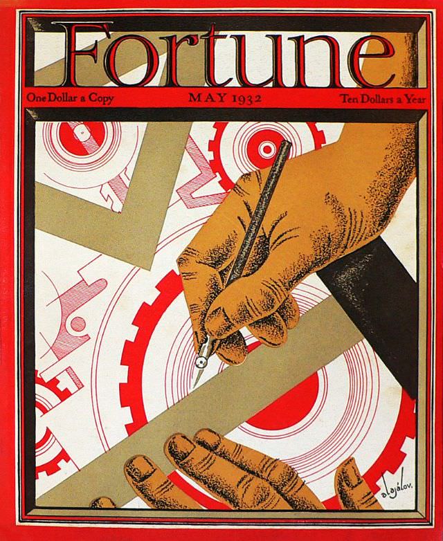
#7 Cover of Fortune magazine, May 1932
Boldly framed in red beneath the unmistakable Fortune masthead, the May 1932 cover turns industry into graphic drama. A large hand grips a drafting pen while another steadies a T-square, cutting a precise line across a field of gears and circular forms. The limited palette—strong reds, warm browns, and crisp whites—makes the composition feel both…
-
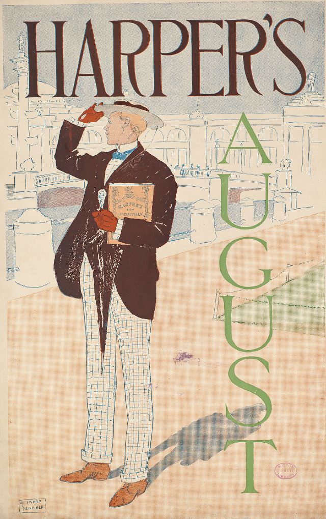
#1 A man holds a magazine and umbrella looks back, Harper’s August, 1893
Harper’s fills the top of the page in bold lettering, framing a stylish figure who pauses mid-stroll with an umbrella hooked in one hand and a magazine tucked under the other arm. He turns his head as if someone has called to him, lifting a gloved hand toward the brim of his hat in a…
-
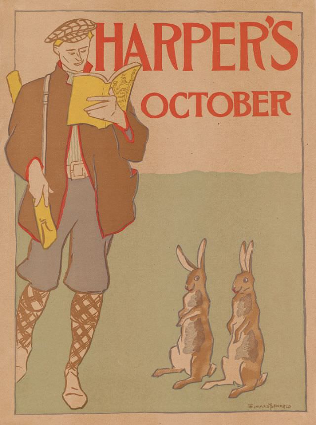
#17 A man wearing sporting gear reads Harper’s New Monthly Magazine, watched by two rabbits, Harper’s October, 1895
Bold red lettering announces “HARPER’S” and “OCTOBER” above a softly colored scene that feels poised between the indoors and the open field. At left, a man in sporting gear—cap, jacket, knickerbockers, and patterned stockings—stands absorbed in a copy of Harper’s New Monthly Magazine, a yellow cover bright against the muted background. Tucked under one arm…
-
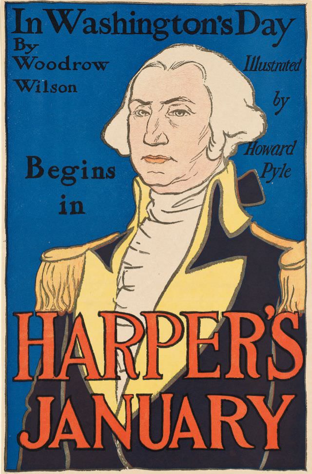
#33 George Washington looks out, Harper’s January, 1896
Bold color and confident linework turn George Washington into a commanding presence on the cover of Harper’s January 1896 issue. Set against a deep blue field, his familiar profile—high collar, military coat, and steady gaze—anchors the composition while oversized lettering announces the magazine’s name and month with theatrical flair. The design balances portraiture and typography,…
-
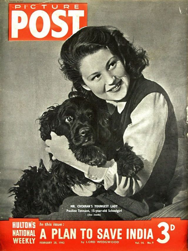
#4 A Plan To Save India, Picture Post, February 28th, 1942
Bold red lettering shouts “PICTURE POST” across the top of this wartime magazine cover, framing a soft studio portrait that feels deliberately calm. A smiling schoolgirl cradles a dark, curly‑coated dog, her pose relaxed and affectionate, the lighting smoothing shadows into a classic, reassuring glamour. The contrast between the intimate scene and the emphatic typography…
-
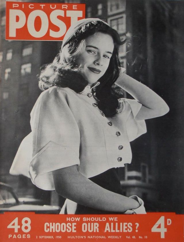
#20 How Should We Choose Our Allies, Picture Post, September 2nd, 1950
Bold red masthead and pricing frame a poised young woman, her dark hair swept into soft waves beneath a small hat as she turns toward the camera with an easy, knowing smile. The buttoned jacket and cuffed sleeves suggest mid-century fashion at its most polished, while the blurred façades behind her hint at a busy…
-
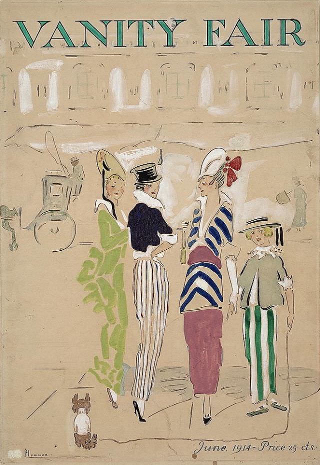
#1 Vanity Fair cover, June 1914
Bold, airy lettering spells “VANITY FAIR” across the top of the June 1914 cover, setting the stage for a lighthearted street scene rendered in soft washes of color. The illustration favors suggestion over detail: pale architecture rises in the background, a carriage silhouette drifts by, and the open space around the figures gives the whole…
-
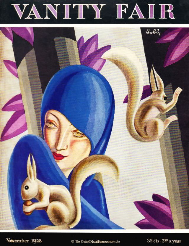
#17 Vanity Fair cover, November 1928
Bold “VANITY FAIR” lettering crowns this November 1928 cover, immediately setting a confident, modern tone. A stylized woman in a saturated cobalt hood dominates the composition, her pale face and red lips rendered with the cool elegance associated with late-1920s fashion illustration. Angular architectural forms and prismatic, purple leaf shapes frame her like a stage…
-

#33 Vanity Fair cover, February 1934
Bold color and playful exaggeration define the February 1934 Vanity Fair cover, where a grinning cowboy in a white shirt and red scarf rides a bucking green horse against a bright yellow field. The oversized black “VANITY FAIR” masthead anchors the design, while the rider’s raised hand, star-tipped cuff, and theatrical profile turn the scene…