Category: Cover Art
Dive into a gallery of vintage cover art from books, magazines, and albums. Discover how graphic design and illustration reflected the moods of their times.
These covers capture the essence of cultural evolution — from bold propaganda to elegant minimalism.
-
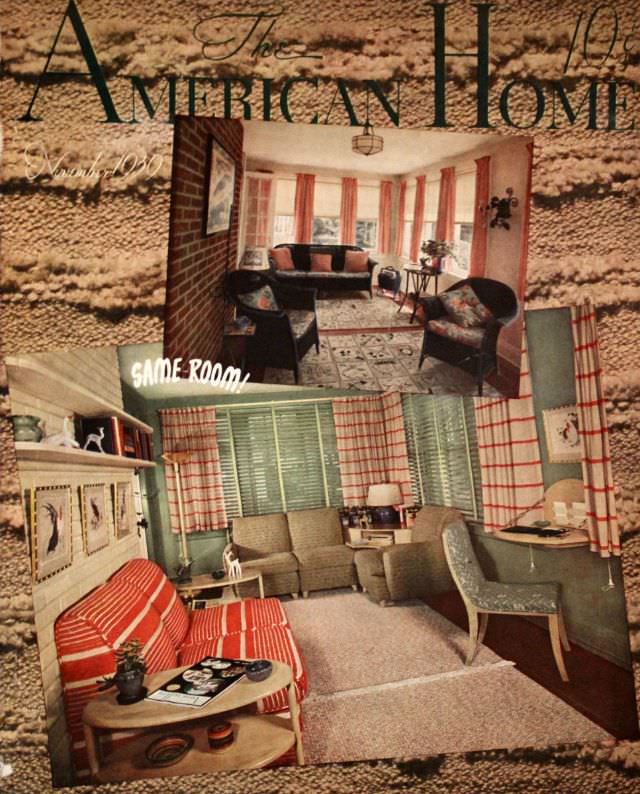
#40 The American Home cover, November 1939
November 1939 arrives here as a promise of comfort, framed by the bold masthead of *The American Home* and a warmly staged “SAME ROOM!” comparison that invites readers to look twice. The cover art leans into color and texture, presenting domestic life as something you can improve with taste, planning, and a few decisive purchases.…
-
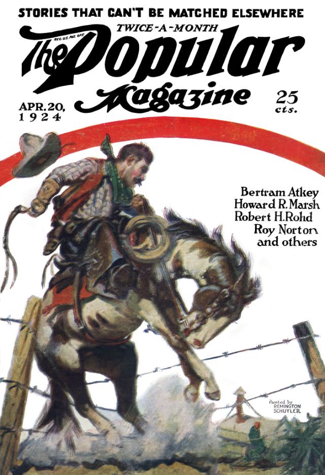
#16 Popular magazine cover, April 20, 1924
Across the top, bold lettering promises “STORIES THAT CAN’T BE MATCHED ELSEWHERE,” framing an energetic cover for The Popular Magazine dated Apr. 20, 1924 and priced at 25 cts. The sweeping red arc and dramatic typography pull the eye downward, where painted action takes over. It’s a perfect snapshot of how early 20th-century magazine design…
-
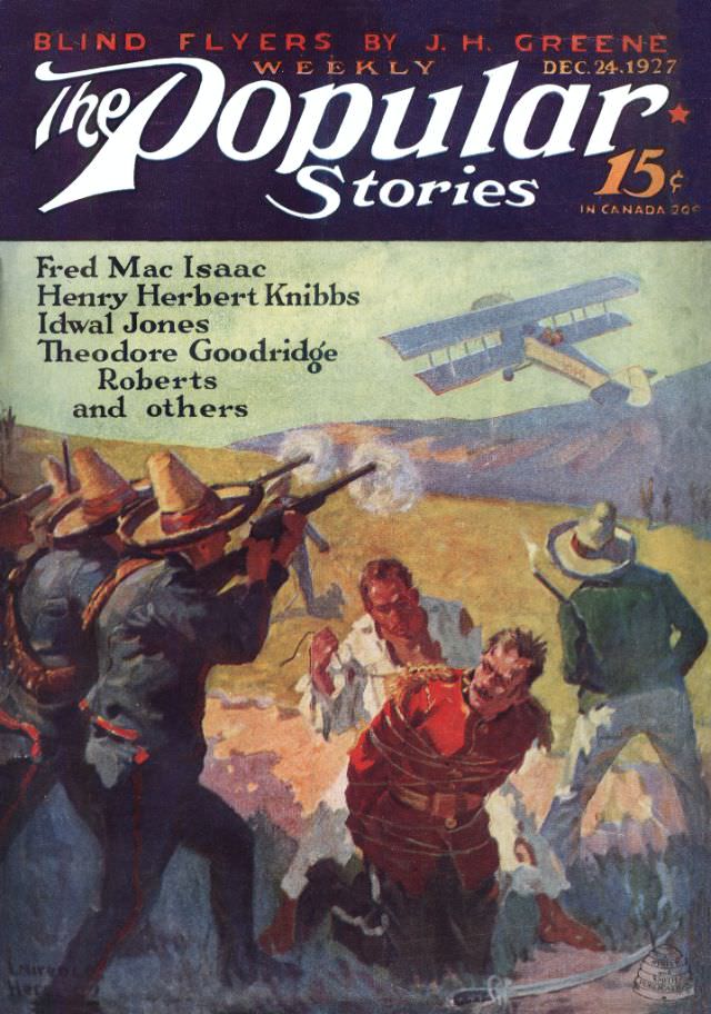
#32 Popular magazine cover, December 24, 1927
Bold typography and urgent illustration collide on the December 24, 1927 cover of *The Popular Stories Weekly*, priced at 15¢ (30¢ in Canada). Across the top, a dramatic teaser—“Blind Flyers” by J. H. Greene—sits beside the issue date, while the magazine’s sweeping logo dominates the design in a way that would have been instantly recognizable…
-

#3 Asimov’s Science Fiction cover, January 1980
Bold yellow lettering shouts “Isaac Asimov’s” across the top of this January 1980 issue of *Asimov’s Science Fiction* magazine, with a small portrait medallion tucked into the typography like a seal of approval. The cover layout is busy in the best late-20th-century way: prominent issue details, a visible price, and a left-hand column of featured…
-
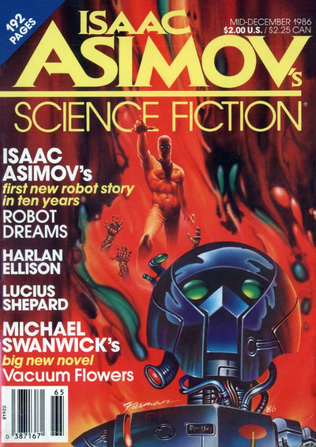
#19 Asimov’s Science Fiction cover, Mid-December 1986
Bold, molten reds and greens surge behind the towering masthead of *Isaac Asimov’s Science Fiction*, instantly placing this mid-December 1986 cover in the high-gloss, high-concept visual language of late–Cold War pop futurism. The typography is loud and confident, with “192 pages” and the cover price called out like a promise of value, while the issue…
-
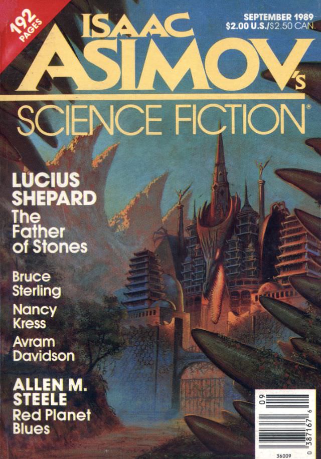
#35 Asimov’s Science Fiction cover, September 1989
Bold lettering and a cool, atmospheric palette announce the September 1989 issue of Isaac Asimov’s Science Fiction, a magazine cover that wears its era with confidence. The masthead dominates the top, flanked by the month and pricing details, while “192 pages” signals a substantial read for late–Cold War genre fans. As cover art, it functions…
-
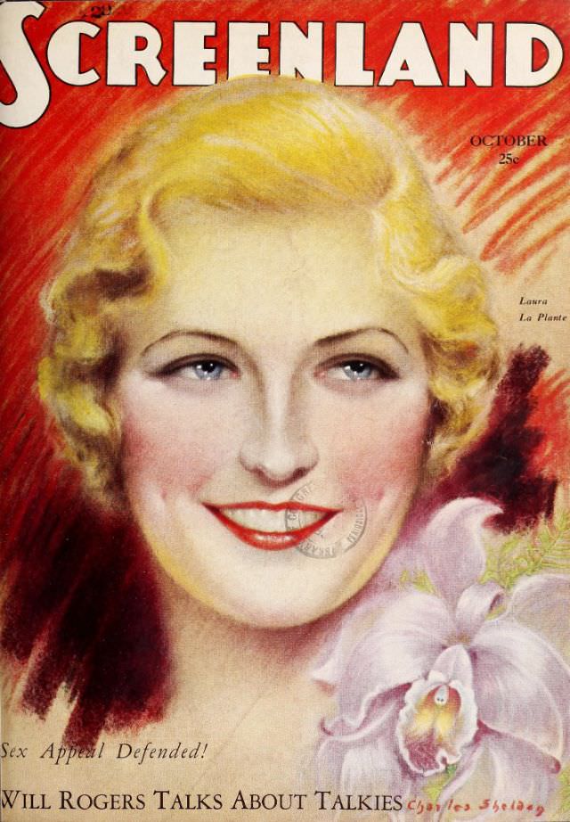
#16 Screenland magazine cover, October 1929
Bold lettering crowns the Screenland magazine cover for October 1929, setting a confident tone before the viewer even meets the glamorous portrait below. The illustrated woman’s softly waved blonde hair, bright lipstick, and rosy cheeks reflect the polished, aspirational style of late-1920s Hollywood fan culture, while the warm red background heightens the sense of spotlight…
-
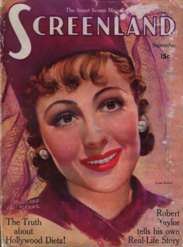
#32 Screenland magazine cover, September 1937
September 1937 arrives in bold color on the cover of Screenland, a classic piece of movie-magazine ephemera that wears its era proudly. The oversized masthead and the small tagline “The Smart Screen Magazine” frame a glamor portrait rendered with soft, painterly shading—rouged cheeks, carefully waved hair, bright lipstick, and pearl-like earrings that signal old-Hollywood polish.…
-

#13 The Ugly Truth About Yugoslavian Album Art in the 1970s and 1980s #13 Cover Art
Glaring typography and a fantasy “harem” tableau collide on this Yugoslav record sleeve, where the name LJUBA ALIČIĆ dominates the top edge and the title NEMA VIŠE HAREMA sprawls along the bottom. The composition leans into soft-focus glamour: a lounging central figure framed by three stylized women, ornate textiles, and props that gesture toward an…
-
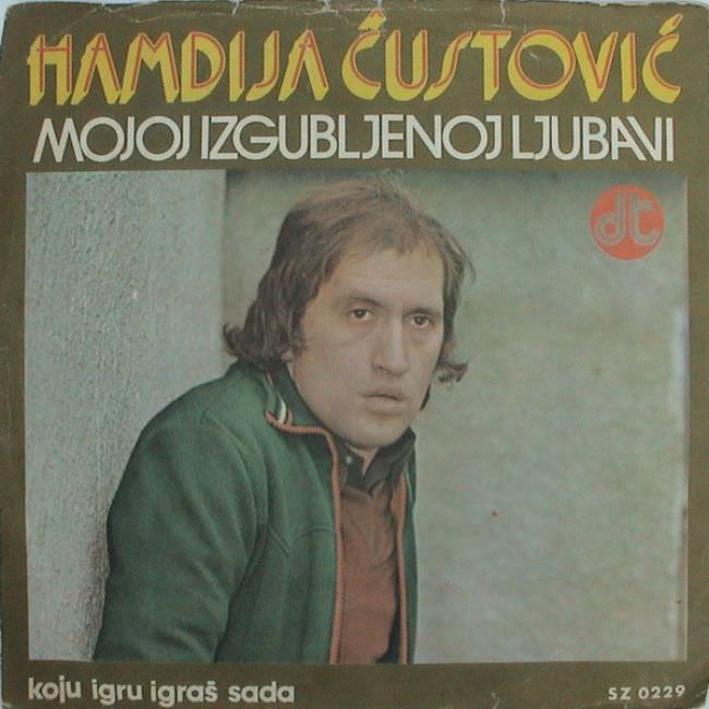
#29 The Ugly Truth About Yugoslavian Album Art in the 1970s and 1980s #29 Cover Art
Bold lettering crowds the top of the sleeve—“Hamidja Čustović” over “Mojoj izgubljenoj ljubavni”—while the portrait below feels caught between sincerity and awkward staging. The singer leans against a rough wall, wearing a green jacket and a steady, almost weary expression, framed in muted tones that look slightly faded with age. Even before you hear a…