Category: Cover Art
Dive into a gallery of vintage cover art from books, magazines, and albums. Discover how graphic design and illustration reflected the moods of their times.
These covers capture the essence of cultural evolution — from bold propaganda to elegant minimalism.
-
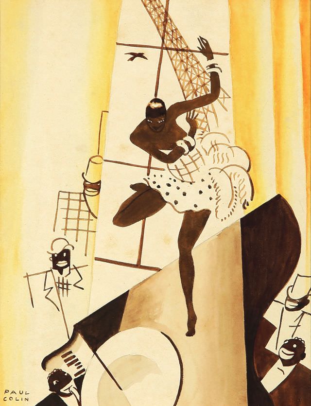
#19 Josephine & Jazz – Maquette, circa 1930
A whirl of motion dominates this circa-1930 maquette for “Josephine & Jazz,” where a spotlighted dancer kicks forward in mid-step, her ruffled skirt dotted like confetti against a warm wash of cream and honey tones. The composition leans into theatrical exaggeration—long limbs, sharp angles, and a dramatic diagonal that makes the whole scene feel like…
-
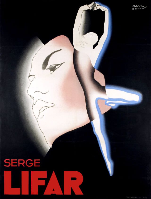
#35 Serge Lifar, 1935
Against a deep, theatrical black, a stylized dancer rises in a clean, vertical line—arms arched overhead, one leg extended in a poised balance—while a softly shaded profile floats behind like a stage mask or dream. The bold red lettering “SERGE LIFAR” anchors the composition, giving the piece the unmistakable feel of 1930s cover art designed…
-

#11 Hallowe’en
A playful sense of spook-season whimsy runs through this “Hallowe’en” cover art, where a costumed child peers out from a jack-o’-lantern mask framed by an oversized keyhole. Warm oranges and golds glow against a deep midnight-blue backdrop, turning the pumpkin face into a lantern-like focal point while the child’s simple white outfit keeps the scene…
-
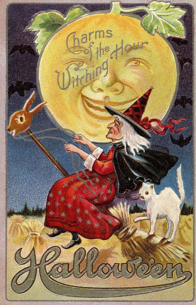
#27 Halloween, Charm of the Witching Hour
Moonlight turns playful on the cover art for “Halloween, Charm of the Witching Hour,” where a grinning jack-o’-lantern face looms like a harvest moon in the background. The lettering curls across that glowing pumpkin-moon, merging typography and illustration in a way that feels both theatrical and inviting. Against a deep night sky, bats and shadowy…
-
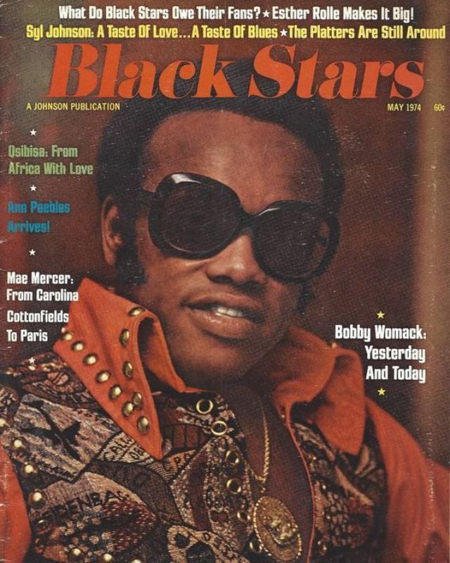
#3 Bobby Womack, May 1974
Front and center on the May 1974 cover of *Black Stars*, Bobby Womack wears oversized dark sunglasses and a richly patterned jacket with a bold collar, the kind of styling that instantly anchors the piece in the texture of 1970s soul culture. The warm, saturated tones and tight framing turn the portrait into both fashion…
-
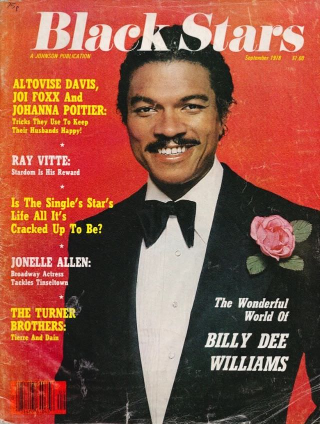
#19 Billy Dee Williams, September 1978
Against a bold red backdrop, the September 1978 cover of *Black Stars* places Billy Dee Williams front and center in formal black tie, finished with a pink rose boutonniere that softens the sharp lapels. The typography is loud and confident, with the magazine’s masthead stretched wide above his smiling portrait and a cover line promising…
-
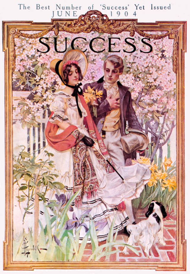
#9 Success magazine, June 1904
June 1904 arrives in full bloom on the cover of *Success*, framed by ornate Art Nouveau flourishes and the proud, oversized masthead. A finely dressed couple pauses in a garden thick with spring color—lilies and other blossoms spilling across the foreground—while a small dog keeps close at their feet. Above them, the magazine teases itself…
-
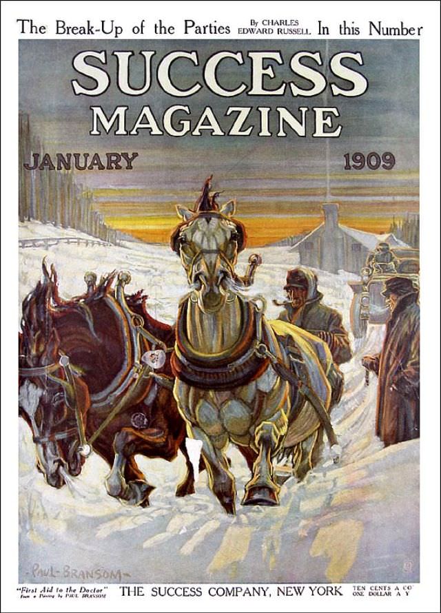
#25 Success magazine, January 1909
Bold block lettering crowns the page—“SUCCESS MAGAZINE”—with “January 1909” set against a cold sky that fades from gray into a band of warm sunrise color. The cover art plunges you into winter labor: two harnessed horses push forward through churned snow while bundled figures in heavy coats and caps guide them along a rutted street.…
-
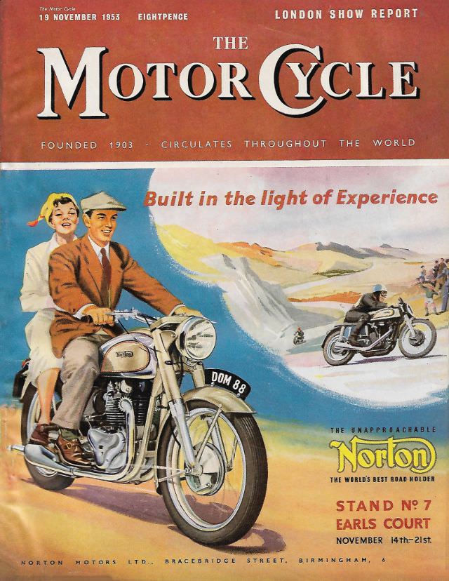
#15 The Motor Cycle magazine, November 19, 1953
Bold lettering and warm mid-century color announce **The Motor Cycle** magazine dated **19 November 1953**, a cover that doubles as a spirited advertisement for **Norton**. A sharply dressed rider in a suit and cap pilots a classic machine while a smiling passenger rides sidesaddle behind him, selling the idea that motorcycling could be stylish, sociable,…
-
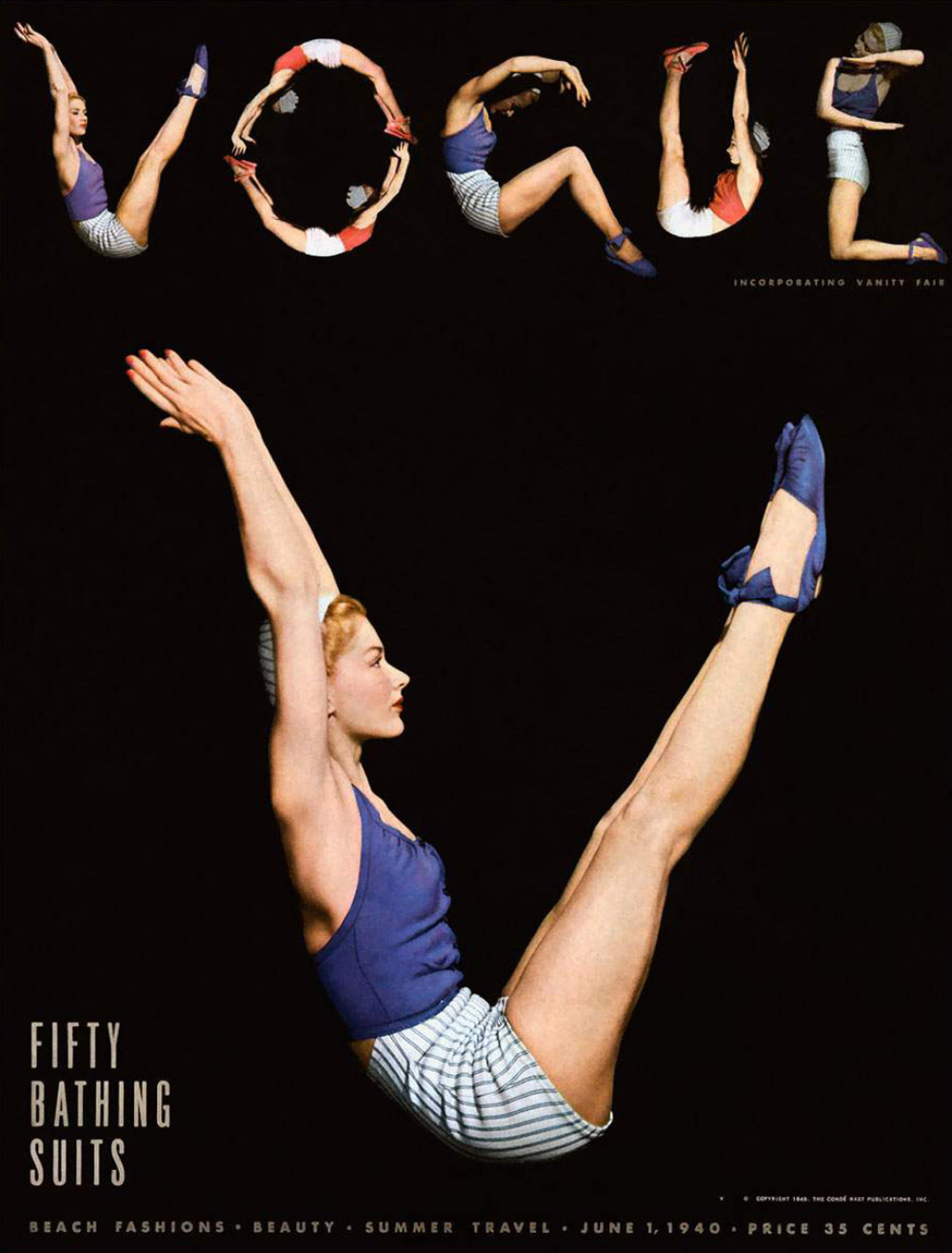
#1 Photographer Horst P Horst, model Lisa Fonssagrives, and editor Audrey Withers for the cover of Vogue US, June 1, 1940.
Across a deep black field, the word “VOGUE” is spelled not with type but with motion—five small acrobatic poses forming each letter like a playful rebus, while a larger figure below lifts into a crisp V-sit. The model’s cobalt swimsuit, striped shorts, and matching shoes pop against the void, turning the body into both subject…