Category: Cover Art
Dive into a gallery of vintage cover art from books, magazines, and albums. Discover how graphic design and illustration reflected the moods of their times.
These covers capture the essence of cultural evolution — from bold propaganda to elegant minimalism.
-
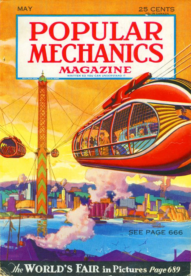
#12 Popular Mechanics magazine cover, May 1933
Bold red lettering announces **Popular Mechanics Magazine** across the top of this May 1933 cover, priced at 25 cents (with a note for Canada), and the tagline promises it is “written so you can understand it.” The artwork below erupts in saturated oranges, blues, and metallic tones, immediately selling a future where engineering isn’t hidden…
-
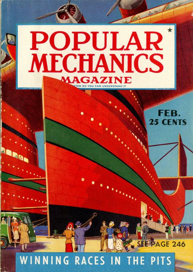
#28 Popular Mechanics magazine cover, February 1940
Bold, blocky lettering announces POPULAR MECHANICS across the top of this February 1940 cover, priced at 25 cents, setting an upbeat tone for a magazine that sold modern know-how to everyday readers. Behind the masthead, the artwork leans into streamlined spectacle: a huge, glossy red hull dominates the scene, its curves emphasized by a sweeping…
-
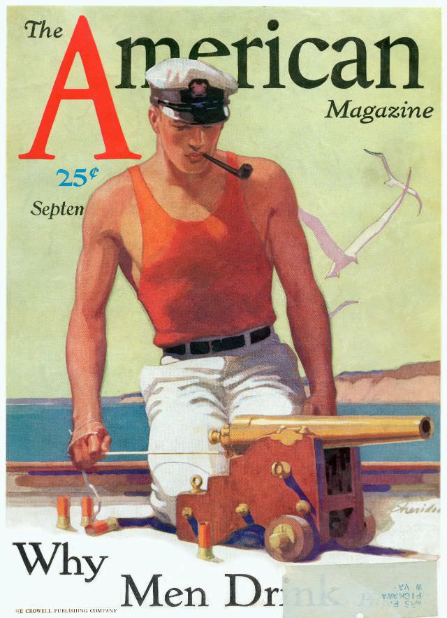
#4 The American Magazine cover, September 1931
Bold lettering and a confident nautical scene announce *The American Magazine* in this September 1931 cover, priced at 25 cents. The illustrated sailor—pipe set at an angle, cap pulled low—leans over deck equipment with the purposeful calm of someone at home on the water. A pale sky, distant shoreline, and a few wheeling seabirds keep…
-
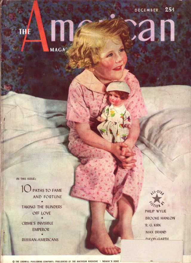
#20 The American Magazine cover, December 1937
Warm color and quiet domesticity set the tone on *The American Magazine* cover for December 1937, where a curly‑haired child in pink pajamas sits on a rumpled white bed, cradling a small doll. The oversized red “A” of the masthead frames the scene, while “December” and the price “25¢” hover at the top like a…
-
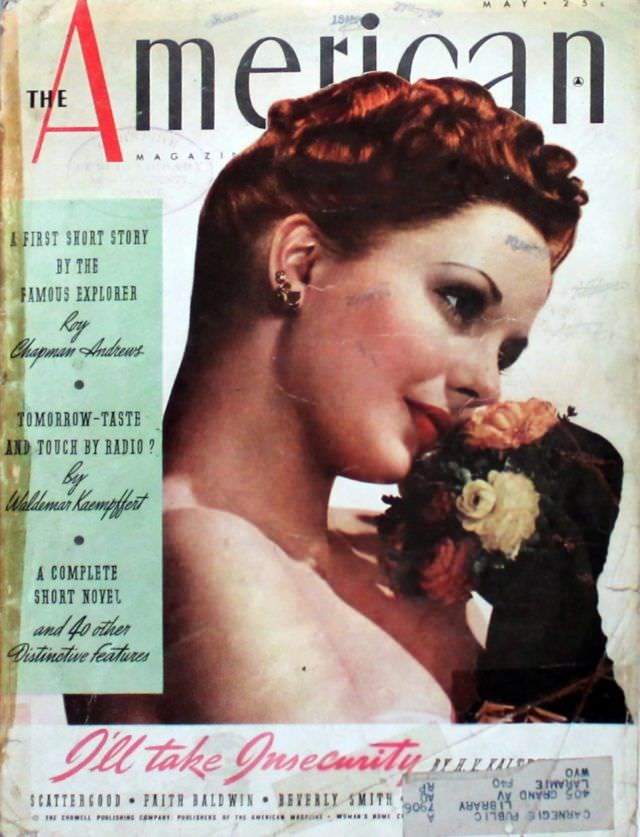
#36 The American Magazine cover, May 1939
May 1939 arrives in a sweep of glamorous color on the cover of *The American Magazine*, where a poised woman in profile leans toward a clustered bouquet. Her carefully waved auburn hair, bright lipstick, and sparkling earrings speak to late‑1930s fashion ideals, while the soft shading and close-up composition turn a simple pose into a…
-
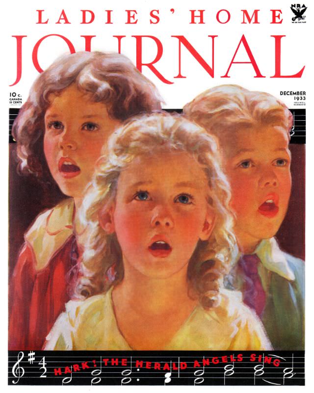
#14 Ladies’ Home Journal, December 1933
December 1933 arrives in a wash of warm reds and wintery light on the cover of *Ladies’ Home Journal*, where three children lift their faces as if caught mid-carol. Their rosy cheeks and open mouths suggest song and breath in cold air, while the painterly brushwork gives the scene a soft, storybook immediacy. Above them,…
-
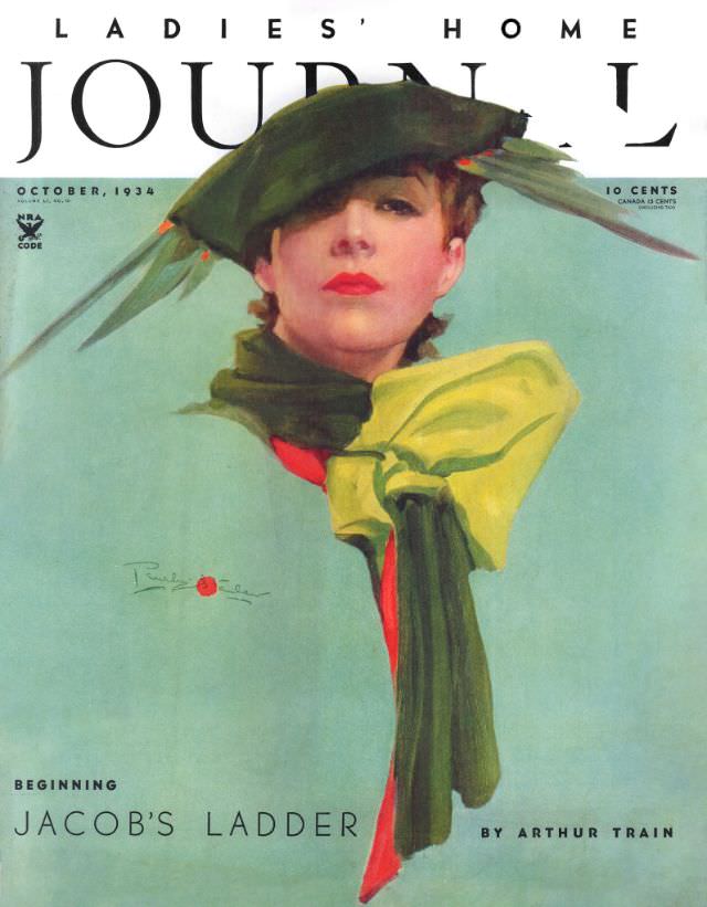
#30 Ladies’ Home Journal, October 1934
Bold typography crowns the October, 1934 cover of *Ladies’ Home Journal*, framing a poised, stylized portrait that feels both glamorous and self-possessed. The illustrated woman gazes outward beneath a dark, fashion-forward hat, her red lips and softly modeled features standing out against the cool, airy background. A large chartreuse bow and a deep green scarf…
-
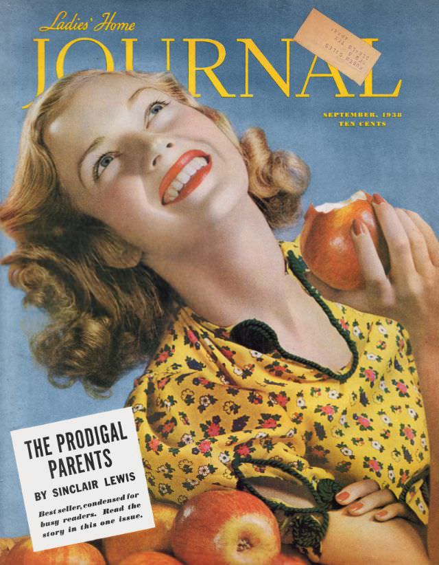
#46 Ladies’ Home Journal, September 1938
Golden lettering stretches across a calm blue background as the Ladies’ Home Journal announces its September 1938 issue, priced at ten cents. The cover illustration leans into cheerful abundance: a smiling woman tilts her face toward the light, red lipstick bright against her complexion, while she lifts an apple as if savoring the first bite…
-
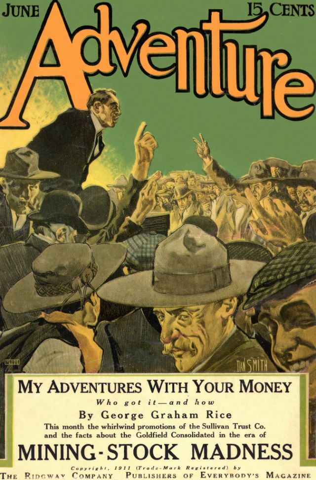
#3 Adventure cover, June 1911
June 1911’s *Adventure* cover hits with the punchy confidence of early twentieth-century magazine art: a sea of brimmed hats and intent faces packed tightly together while a sharply dressed speaker rises above the crowd, finger lifted as if delivering the decisive point. The palette leans green-gold and sepia, giving the scene a dusty, urgent atmosphere—part…
-
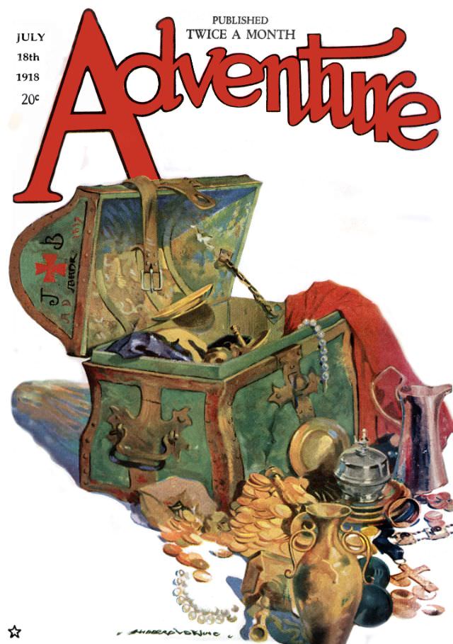
#19 Adventure cover, July 18, 1918
Bold red lettering announces *Adventure* while the rest of the cover leans into irresistible mystery: an ornate green treasure chest has been forced open, spilling a glittering jumble of gold coins, pearls, and bright metalware across a pale ground. The careful shading and saturated color palette give the objects weight and shine, inviting the eye…