Category: Cover Art
Dive into a gallery of vintage cover art from books, magazines, and albums. Discover how graphic design and illustration reflected the moods of their times.
These covers capture the essence of cultural evolution — from bold propaganda to elegant minimalism.
-
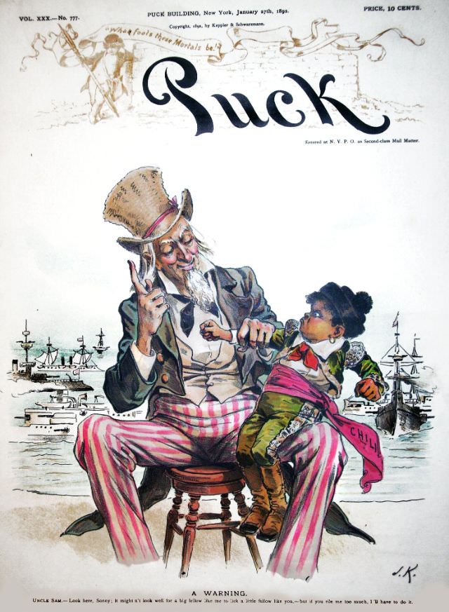
#27 Puck magazine cover, January 27, 1892
Bold lettering spells out “Puck” across the top, framed by the magazine’s New York masthead details and a ten-cent price—an immediate reminder that satire was a mass-market product in the 1890s. Published for January 27, 1892, this cover art showcases the bright, theatrical color and confident draftsmanship that made Puck magazine a dominant voice in…
-
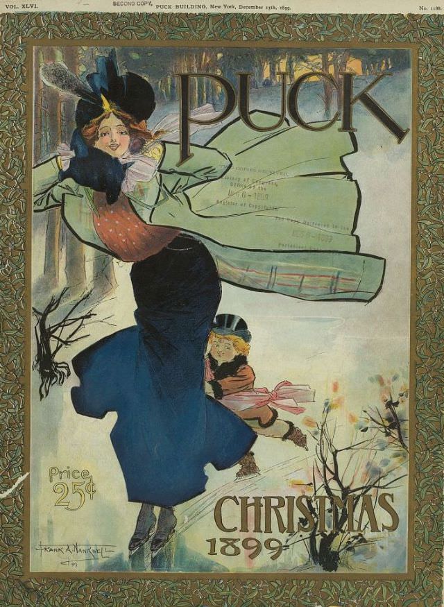
#43 Puck magazine cover, December 13, 1899
Bold lettering spells out “PUCK” across a wintry scene, while a stylish woman braces against the gusts—her coat flaring, hat ribbons flying, and gloved hands tightened around her wrap. Behind her, a bundled child slips along the icy ground, adding a playful note that balances the elegance of the main figure. The overall effect feels…
-
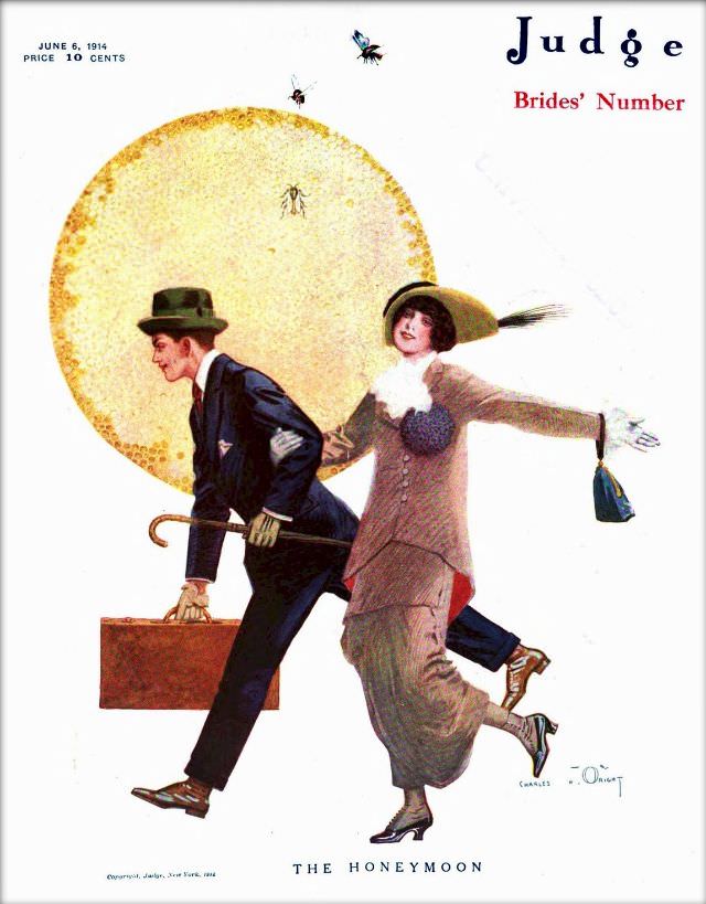
#15 Judge magazine, June 6, 1914
A bright, honeyed disk dominates the background of this Judge magazine cover dated June 6, 1914, setting a playful stage for a fast-moving couple in early-20th-century dress. The man hustles forward with a suitcase and cane, while the woman—hat brim tilted, purse swinging—keeps pace with an open-armed, almost theatrical stride. Overhead, small insects hover in…
-
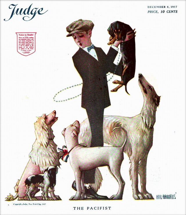
#31 Judge magazine, December 8, 1917
Across a clean white field, the Judge magazine cover dated December 8, 1917 arranges its drama like a stage scene: a sharply dressed man in cap and bow tie stands at center, surrounded by attentive dogs of different sizes and breeds. One small dark dog is lifted in his arms while the others look up,…
-

#6 Pianos, Pin-Ups, and Party Tunes: Exploring the Wild World of Honky-Tonk Records #6 Cover Art
Bold lettering sprawls across the top—“HONKY-TONK PIANO”—setting the stage for a nightlife fantasy where the music is loud, the colors are punchy, and the mood is unabashedly rowdy. An ornate upright piano dominates the scene, its carved trim rendered like a saloon trophy, while a pianist in rolled-up sleeves and suspenders leans in with workingman…
-
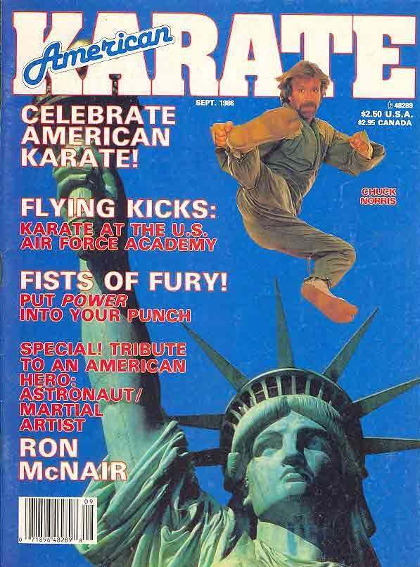
#2 Everybody Was Kung Fu Fighting: Exploring the Heyday of Martial Arts Mags in the 1970s and 1980s #2 Cov
Bold, electric cover design announces the boom years of U.S. martial arts culture with a masthead that practically shouts from the page: “American Karate.” Against a saturated blue sky, a midair kick freezes in time above the Statue of Liberty’s crown, turning a familiar national icon into a backdrop for high-flying technique and pop bravado.…
-
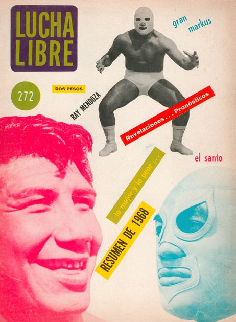
#6 Blood, Masks, and Glory: A Visual Tour Through Lucha Libre Magazine Covers of the 1970s #6 Cover Art
Lucha Libre bursts across the cover in bold lettering, setting the tone for a decade when Mexican wrestling magazines sold spectacle as much as sport. A masked grappler poses mid-stretch near the top, while the design splashes color over a pale background with cutout-like shapes and angled text. The price tag “dos pesos” and issue…
-

#22 Blood, Masks, and Glory: A Visual Tour Through Lucha Libre Magazine Covers of the 1970s #22 Cover Art
Bold block letters spelling “LUCHA LIBRE” crown this cover, instantly announcing the world of masked spectacle and ring mythology that defined so much 1970s wrestling media. Against a clean, turquoise backdrop, a masked luchador strikes a powerful pose—one arm flexed, the other clenched—turning his body into a living emblem of strength and drama. The design’s…
-
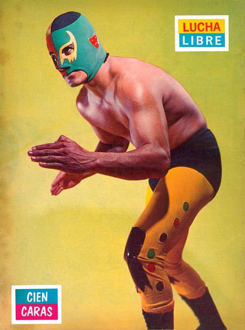
#38 Blood, Masks, and Glory: A Visual Tour Through Lucha Libre Magazine Covers of the 1970s #38 Cover Art
A masked luchador crouches in a ready stance against a bold yellow backdrop, his hands poised as if the next hold is only a heartbeat away. The green mask—trimmed with red accents—frames an intense gaze, while the streamlined black-and-gold tights keep the focus on athletic form and theatrical flair. In the corner, the “LUCHA LIBRE”…
-

#4 National Safety Council of Australia Posters from the 1970s: Visual Messages for Keeping People Safe and Well
A stark silhouette of a human head is drawn with a single black electrical cord, its plug hovering where the face might begin and the line looping into tight coils inside the skull. Frayed patches reveal flashes of red and blue wiring, a simple but unsettling detail that turns a clean graphic into a warning…