Category: Cover Art
Dive into a gallery of vintage cover art from books, magazines, and albums. Discover how graphic design and illustration reflected the moods of their times.
These covers capture the essence of cultural evolution — from bold propaganda to elegant minimalism.
-
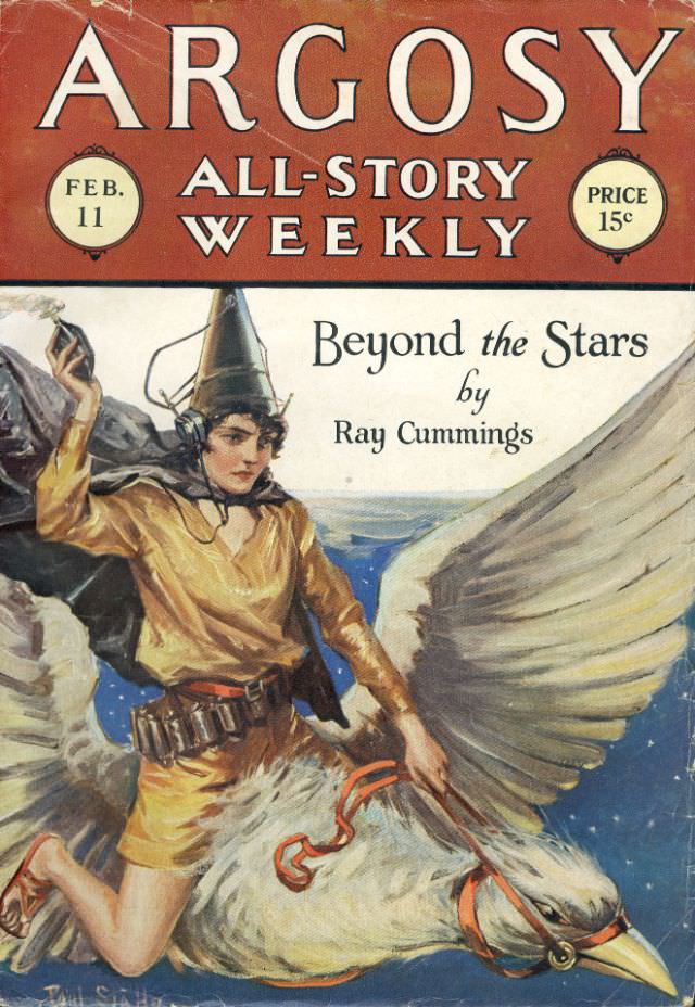
#27 Argosy cover, February 11, 1928
Bold lettering across the top announces **ARGOSY** and the promise of an “All-Story Weekly,” complete with the on-cover details **FEB. 11** and a **15¢** price—small design choices that instantly place the magazine in the bustling world of early 20th-century newsstands. The warm, reddish header frames a dramatic illustration below, a classic pulp-era layout meant to…
-
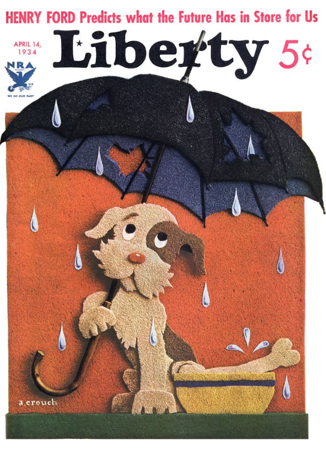
#8 Liberty cover, April 14, 1934
April 14, 1934 arrives in bright, playful color on the cover of *Liberty*, priced at 5¢, where a soaked little dog huddles beneath an oversized black umbrella as raindrops fall all around. The scene is instantly readable and warmly comic: the pup looks upward with wide, pleading eyes while water splashes into a yellow basin…
-
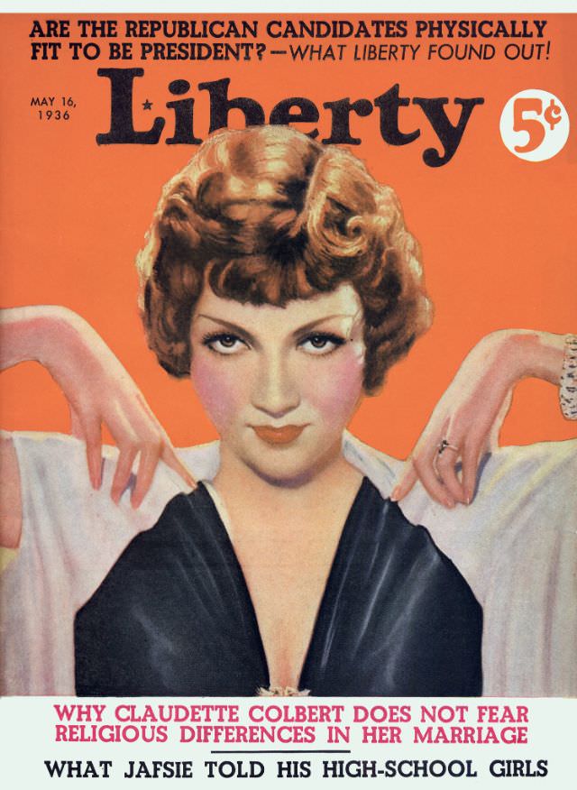
#24 Liberty cover, May 16, 1936
Bright orange fills the cover of *Liberty* dated May 16, 1936, with the magazine’s bold masthead stretched across the top and a 5¢ price mark tucked beside it. Above the title, a punchy teaser asks, “ARE THE REPUBLICAN CANDIDATES PHYSICALLY FIT TO BE PRESIDENT?—WHAT LIBERTY FOUND OUT!”—a reminder of how newsstand journalism blended politics, curiosity,…
-
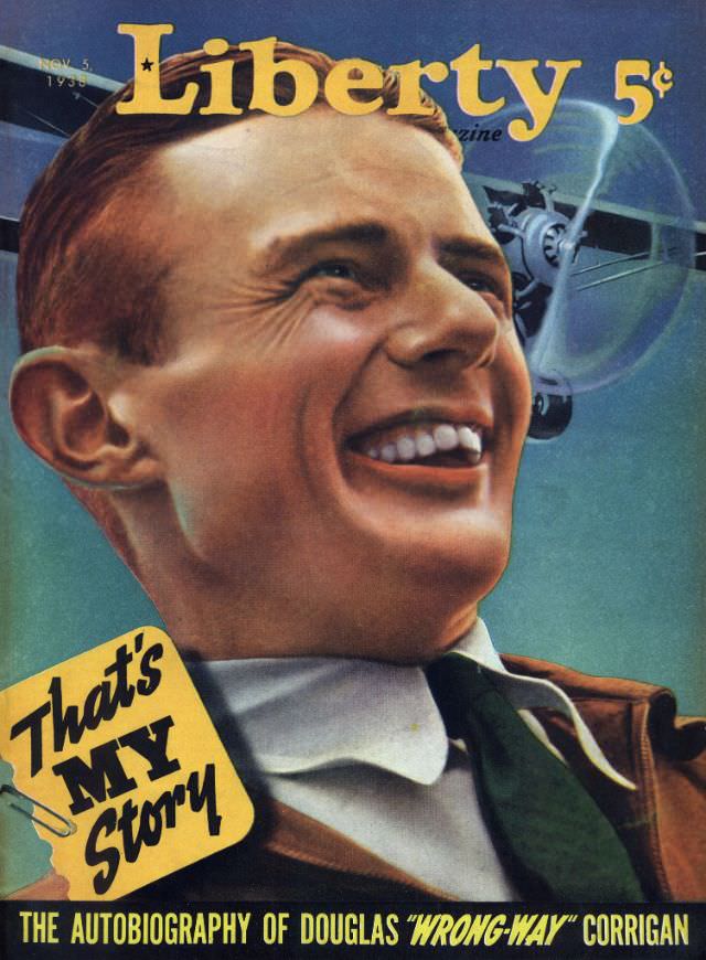
#40 Liberty cover, November 5, 1938
Bold lettering crowns the Liberty magazine cover dated November 5, 1938, priced at 5 cents, with a radiant, close-up portrait that practically spills past the frame. The illustration leans into warm skin tones and crisp highlights, the subject’s grin and laughing eyes selling confidence and momentum. Behind the head, the blurred suggestion of an airplane…
-

#9 The American Home cover, October 1931
October 1931 sits at the top of this **The American Home** cover, a moment when domestic ideals and practical budgeting shared the same page. The design is bold and readable, with the magazine’s title stretched across a dark header and a prominent **10¢** price seal that immediately places it in the everyday consumer world of…
-

#25 The American Home cover, October 1933
Bold crimson lettering announces *The American Home* for October 1933, framing a welcoming slice of domestic life in richly colored cover art. The design balances typography and illustration in a way that feels both promotional and intimate, inviting readers to imagine comfort, order, and taste at a moment when those ideals mattered deeply in everyday…
-

#1 Popular magazine cover, December 7, 1920
Bold red lettering crowns the December 7, 1920 cover of The Popular Magazine, a pulp-era promise of “Best Fiction Magazine in America,” priced at 25 cents and issued twice a month. The typography does more than announce a title—it sells urgency and escapism, the kind of eye-catching design meant to stop a newsstand browser in…
-

#17 Popular magazine cover, August 7, 1924
Bold lettering crowns the August 7, 1924 cover of *The Popular Magazine*, promising “Stories That Can’t Be Matched Elsewhere” and noting its twice-a-month schedule. Priced at 25 cents, the design leans into big, readable typography that would have leapt off a newsstand, with the date and cost neatly anchoring the era’s practical, mass-market appeal. Even…
-
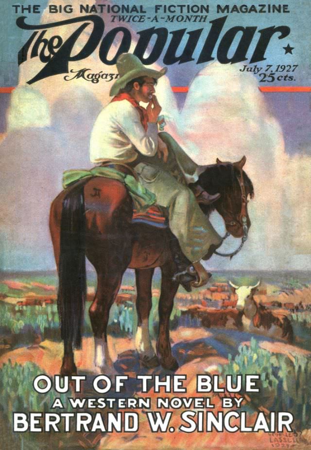
#33 Popular magazine cover, July 7, 1927
Bold lettering at the top announces *The Popular Magazine* as “The Big National Fiction Magazine,” and the cover date reads July 7, 1927, priced at 25 cents. The design immediately signals a mass-market publication aimed at readers hungry for adventure, with the word “Popular” sweeping across the sky in oversized script. Even before you reach…
-
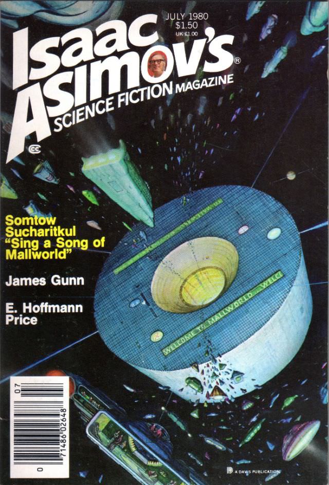
#4 Asimov’s Science Fiction cover, July 1980
July 1980 arrives in bold, slanted lettering across the top of Isaac Asimov’s Science Fiction Magazine, with the cover price tucked neatly beside it. Against a star-splashed black, a huge wheel-like space habitat dominates the scene, its surface patterned with tiny structural details that suggest both engineering precision and lived-in scale. The typography and layout…