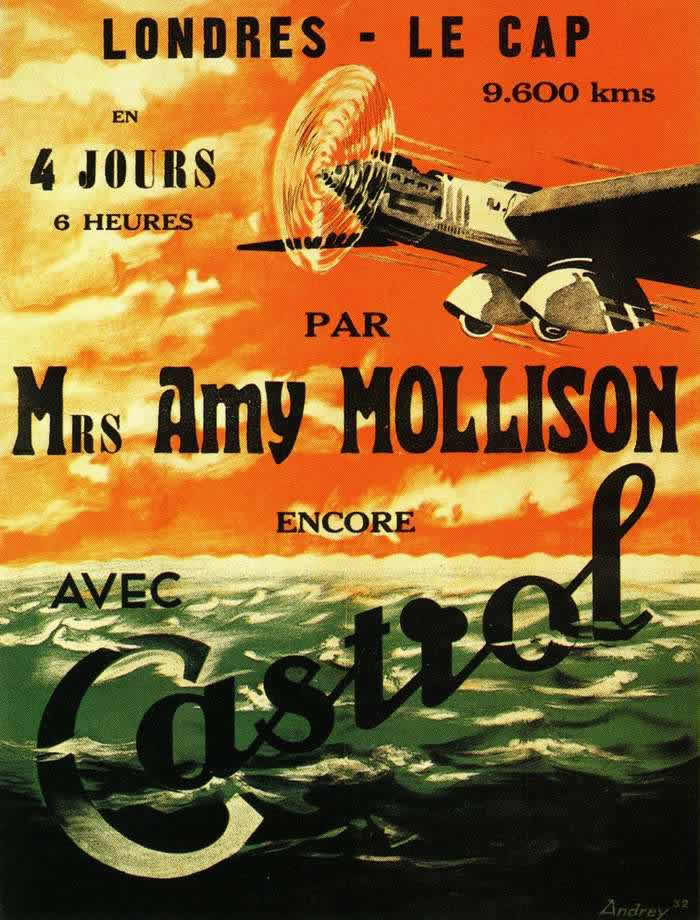
Bold French lettering shouts “Londres – Le Cap” across a blazing sky, turning distance and time into spectacle: 9,600 kilometres, “4 jours 6 heures.” A sleek aircraft slices through sunlit cloud, its propeller rendered as a spinning halo, while dark green ocean swells roll beneath—an irresistible mix of speed, modernity, and romance that poster artists used to make early air travel feel both heroic and attainable.
Imperial Airways advertising in the 1920s and 1930s leaned on exactly this kind of visual persuasion, where typography and color did as much work as the airplane itself. The design language is unapologetically optimistic—clean angles, simplified forms, and commanding type—selling not just a route but a new relationship with geography, in which continents shrink and schedules become part of the thrill.
Even without a full brochure’s worth of detail, the poster’s promise is clear: aviation can outrun the old limits of sea and rail, and it can do so in style. For readers interested in vintage travel posters, airline marketing history, and the golden age of flight, this cover art offers a vivid snapshot of how the skies were “advertised” to a public learning to imagine the world from above.