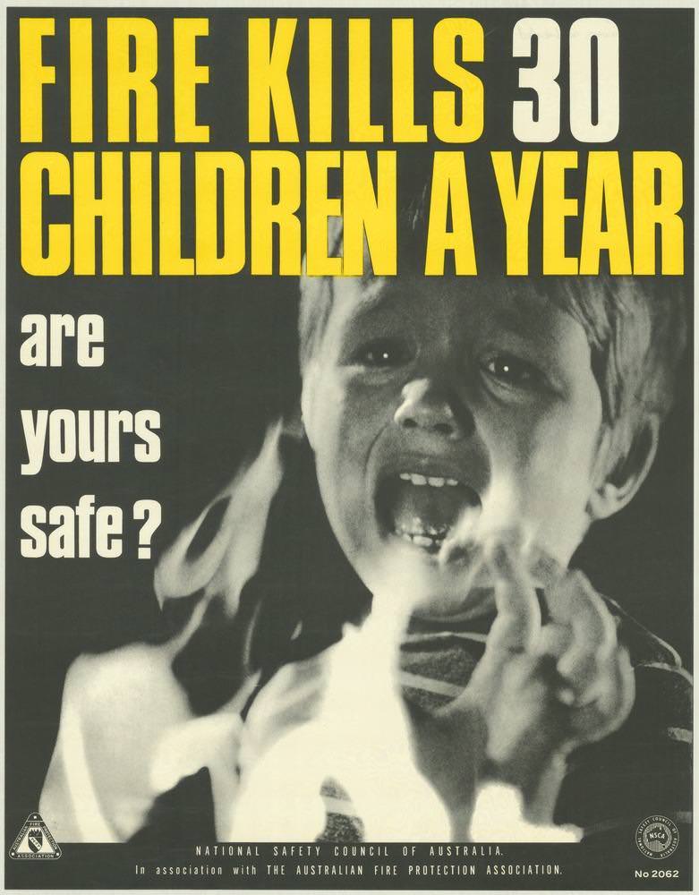
Bold typography dominates the cover art, shouting “FIRE KILLS 30 CHILDREN A YEAR” in yellow and white against a dark field, then turning the message personal with the stark question, “are yours safe?” A distressed child’s face and raised hands fill the lower half, the emotional impact heightened by the gritty monochrome treatment. It’s a classic example of 1970s public safety design: urgent, confrontational, and impossible to scroll past—decades before scrolling existed.
Created for the National Safety Council of Australia in association with the Australian Fire Protection Association, the poster leans on shock and empathy to push fire prevention into the family home. The oversized lettering works like a siren, while the photographic image does what statistics alone can’t—make risk feel immediate. As historical material, it reveals how safety campaigns of the era relied on simple, memorable visuals to translate public health data into a moral appeal directed at parents and carers.
Visitors exploring National Safety Council of Australia posters from the 1970s will find in this cover a powerful snapshot of the period’s visual messaging around keeping people safe and well. The design choices—high contrast, minimal copy, and a single unforgettable subject—show a deliberate strategy to cut through everyday noise and spark conversation. For readers interested in Australian social history, graphic communication, or fire safety education, this piece offers a compelling window into how prevention was marketed as both civic responsibility and personal duty.