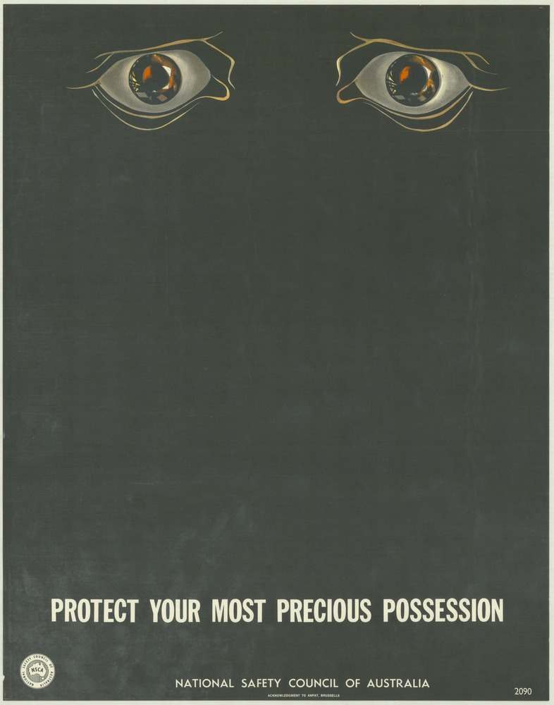
Two watchful eyes float near the top of a dark, minimalist field, their glossy highlights pulling you in before you even reach the message below. That stark emptiness is the point: it creates a pause, a moment of unease, and then delivers the blunt command in bold type—“PROTECT YOUR MOST PRECIOUS POSSESSION”—as if the poster itself were a warning sign you can’t ignore.
Printed under the banner of the National Safety Council of Australia, this 1970s safety poster cover art shows how public education campaigns used graphic design to change everyday behaviour. Rather than depicting a specific accident or workplace scene, the artist leans on symbolism and psychology: sight becomes the “possession” at stake, and the viewer is invited to imagine the consequences of neglect.
For readers exploring National Safety Council of Australia posters from the 1970s, this piece is a strong example of how visual messages were crafted to keep people safe and well through simplicity, contrast, and a memorable slogan. It’s also a reminder that safety history isn’t only found in regulations and reports—sometimes it’s preserved in a single arresting image designed to make you look twice, and then look after yourself.