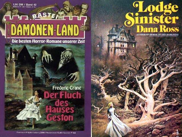
Lurid color and theatrical menace dominate these Gothic romance and horror paperback covers, where a lone woman in a flowing white dress bolts away from an imposing house that looms like a character of its own. The composition leans hard into the genre’s favorite emotional trigger: the tension between shelter and trap, between the promise of romance and the threat of ruin. Even at a glance, the oversized title lettering and stormy palettes do the work of a movie trailer, insisting on danger before a single page is turned.
On one cover, monstrous, shadowed figures press forward as if emerging from the air itself, while the fleeing figure below becomes a bright, human target set against murk and architecture. On the other, a stark, pale tree twists across the foreground like a set of grasping arms, guiding the eye toward a distant mansion perched above the landscape. These visual cues—deep blues and blacks, high-contrast whites, exaggerated perspective, and ominous silhouettes—create a readable shorthand for fear, secrecy, and pursuit that collectors and design historians instantly recognize.
For readers, the psychological appeal of “women running from houses” on Gothic romance covers lies in the promise of motion: escape, discovery, and the possibility that the heroine will outrun both social expectations and supernatural dread. The house functions as a symbol of inheritance, memory, and forbidden rooms, while the running woman embodies agency under pressure—terrified, yes, but also determined. As cover art, it’s a masterclass in pulp-era marketing, turning anxiety into allure and making the emotional stakes visible from across a bookstore spinner rack or a modern WordPress feed.