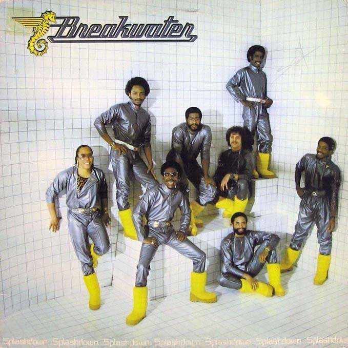
Chrome-like jumpsuits and canary-yellow boots turn a stark, tiled room into a stage set, where the band name “Breakwater” floats above the scene with a winged seahorse emblem. The grid walls suggest a laboratory, a showroom, or a futuristic bathroom—an intentionally odd backdrop that makes the figures look like they’ve stepped into a concept album rather than a conventional studio shoot. Even without a single instrument in view, the coordinated outfits and confident poses sell a clear message: this is music packaged as spectacle.
During the 1960s and 1970s, album cover art often became a playground for designers and musicians eager to look modern, strange, or slightly theatrical. This kind of stylized portrait leans into sci‑fi fashion and staged environments, echoing the era’s fascination with new materials, space-age imagery, and bold color contrasts. The clean geometry of the tiles amplifies the shine of the suits, while the bright boots act like exclamation points that pull your eye from one member to the next.
For collectors and curious listeners, unusual and unconventional album cover designs like this are more than nostalgia—they’re clues to how artists wanted to be seen in a crowded record store rack. The cover turns identity into branding: logo, uniform, and setting all working together to create instant recognition. If you’re exploring iconic 1960s and 1970s cover art, this one is a reminder that the packaging could be as experimental as the sound inside.