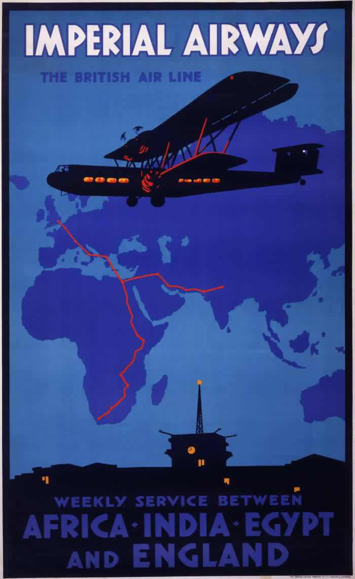
Bold lettering at the top—“IMPERIAL AIRWAYS, THE BRITISH AIR LINE”—announces the promise of modern flight with the confidence of interwar graphic design. A streamlined biplane silhouette glides across a deep blue sky, its cabin windows glowing in warm orange, while stylized radio waves suggest cutting-edge communication and dependable navigation. The poster’s limited palette and strong shapes do the selling: air travel is framed as sleek, safe, and unmistakably contemporary.
Beneath the aircraft, a simplified world map anchors the romance of the skies to the practical matter of routes, with red lines tracing long-distance connections across Africa and toward India. The design turns geography into a network, making vast distances feel manageable and almost routine—an early airline marketing strategy that traded on both novelty and reassurance. By pairing the aircraft with a cartographic backdrop, the artwork blends adventure with timetable certainty, inviting viewers to imagine the world as newly accessible.
At the bottom, the message becomes explicit: “WEEKLY SERVICE BETWEEN AFRICA · INDIA · EGYPT AND ENGLAND,” set above a darkened skyline punctuated by a tower and small lit windows. That single word—weekly—captures the shift from daring experiment to scheduled infrastructure, a key theme in 1920s and 1930s aviation history and advertising. As cover art for a post on Imperial Airways posters, this image offers a vivid entry point into how early airlines used visual storytelling, maps, and modernist aesthetics to sell the idea of flying far as an ordinary part of life.