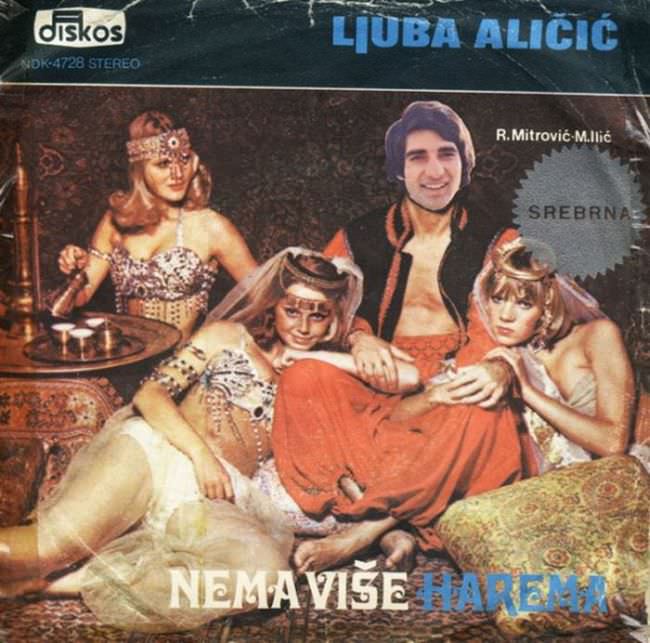
Glaring typography and a fantasy “harem” tableau collide on this Yugoslav record sleeve, where the name LJUBA ALIČIĆ dominates the top edge and the title NEMA VIŠE HAREMA sprawls along the bottom. The composition leans into soft-focus glamour: a lounging central figure framed by three stylized women, ornate textiles, and props that gesture toward an exoticized Orient rather than any lived reality. Even the label mark in the corner and the “SREBRNA” burst read like sales stickers in a crowded shop window, competing for attention instead of building a coherent visual story.
What makes cover art like this so infamous is the way it blends pop marketing with borrowed clichés—more spectacle than portrait, more costume than culture. The set dressing, heavy patterns, and stagey poses feel engineered for instant recognition on a rack, but they also reveal the era’s casual use of stereotypes as decoration. In the late 1970s and 1980s, many Yugoslav releases chased modernity while clinging to cheap visual shortcuts, creating sleeves that are memorable for their awkwardness as much as for their music.
Viewed today, the “ugly truth” is less about bad taste and more about what commercial design was willing to trade away: nuance, authenticity, and sometimes basic dignity, all for a punchy concept. Collectors and historians keep returning to these artifacts because they show how regional pop culture packaged desire, masculinity, and escapism in a single frame—bright names, crowded slogans, and a scene that plays like a postcard from nowhere. As album art from Yugoslavia continues to resurface online, covers like this one become a window into the period’s visual economy and the stories it chose to sell.