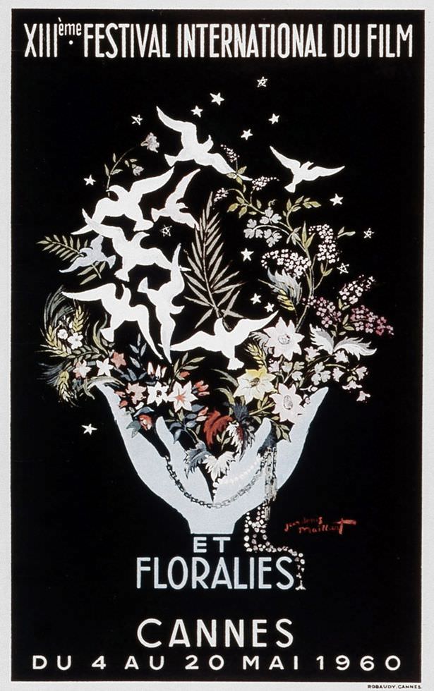
Midnight-black space sets the stage for a burst of white doves rising like sparks, their flight spilling out of an overflowing bouquet held in a pale, sculptural hand. Delicate flowers and leafy fronds crowd the composition, with tiny stars scattered above, giving the whole design a dreamy, supernatural glow that fits the “Twilight sequel” joke in the title surprisingly well. The contrast is crisp and theatrical, turning simple silhouettes into something romantic and slightly eerie.
French lettering across the top announces “XIIIe Festival International du Film,” while the lower text ties it to Cannes and the May 1960 dates printed along the bottom. The poster reads like classic cover art—part cinema announcement, part poetic emblem—where peace birds, night sky, and lush florals suggest glamour and aspiration without needing a single actor’s face. Even the limited palette feels intentional, letting the white birds and typography slice through the dark background like stage lights.
For anyone searching for Cannes Film Festival history, 1960 graphic design, or vintage film festival posters, this piece is a standout example of how mid-century promotional art leaned into symbolism over realism. It’s easy to imagine it as a book jacket: elegant, moody, and slightly fantastical, the kind of image that invites a story before you’ve read a word. As “Cover Art,” it reminds us how festivals sold not just screenings, but a whole atmosphere—stars overhead, flowers in hand, and the promise of flight.