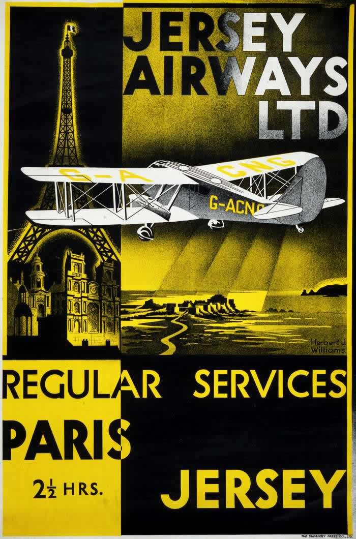
Bold typography and dramatic blocks of yellow and black pull the eye straight into the promise of modern movement, with “Jersey Airways Ltd” dominating the upper field. A stylized biplane cuts across the composition, its registration letters visible on the fuselage, while landmark imagery—an unmistakable Eiffel Tower and a cathedral-like façade—anchors the route in recognizable continental glamour. The overall design feels like a confident announcement that air travel had become not just possible, but desirable.
In the 1920s and 1930s, airlines and related carriers sold the idea of flight as an experience: fast, fashionable, and safely organized into “regular services.” Here, the poster does more than advertise transport; it markets time itself, boasting a “Paris 2½ hrs.” journey in a way that would have sounded astonishing to travelers accustomed to slower sea crossings and rail connections. The clean lines, simplified architecture, and heroic aircraft silhouette reflect the era’s love of streamlined progress and the romance of the skies.
Alongside the Imperial Airways story, this kind of aviation poster art reveals how early air travel was packaged for the public—through striking graphic design, recognizable destinations, and the language of reliability. It’s a window into an age when timetables, routes, and branding helped turn experimental flight into a commercial network linking cities and islands. For collectors, historians, and anyone interested in vintage travel advertising, the piece stands as a vivid example of how airlines persuaded people to look up and imagine going farther, faster.