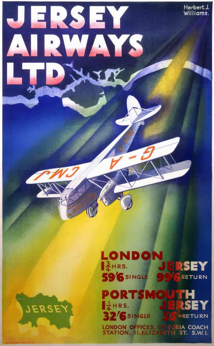
Bold lettering and saturated color announce “Jersey Airways Ltd,” turning the act of booking a flight into something modern, legible, and thrilling. A stylized map outline of Jersey hovers against deep blues and greens, while a small aircraft banks across the composition under a dramatic beam of light. The designer credit, “Herbert J. Williams,” tucked into the corner, reinforces how much early air travel relied on strong graphic identities as well as engineering.
Details like the route timings and fares—London to Jersey and Portsmouth to Jersey—place the poster squarely in the practical world of timetables and ticket counters, even as the artwork sells a dream. The plane’s angled wings and clean, simplified forms evoke speed and confidence, presenting flight as a dependable service rather than a daredevil stunt. In the interwar years, posters like this helped normalize aviation by promising that hours could replace days, and that an island destination was suddenly within easy reach.
For readers interested in Imperial Airways posters and the wider advertising culture of early aviation in the 1920s and 1930s, this piece offers a revealing companion: it shows how airlines packaged new technology as both glamorous and routine. Typography, color, and cartography work together to guide the eye from brand name to destination, from spectacle to purchase. As cover art for a WordPress post, it’s a vivid reminder that the story of early air travel was written not only in aircraft logs, but also in the persuasive language of commercial design.