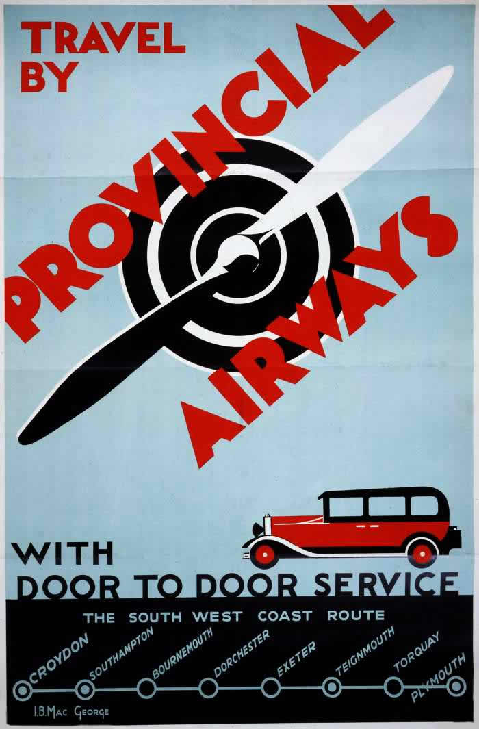
Bold red lettering shouts “Travel by Provincial Airways” across a cool sky-blue field, while a stylized propeller and target-like spiral pull the eye toward the promise of speed and modernity. The design is pure interwar poster art: simplified shapes, strong diagonals, and high contrast that turns aviation into a graphic symbol as much as a mode of transport. For readers interested in Imperial Airways posters and early airline advertising, this cover-style image evokes the same era’s confidence that flight could be marketed as clean, efficient progress.
Down at the bottom, a red motorcar signals another selling point: “door to door service,” a reminder that early air travel had to be stitched into the everyday realities of roads, terminals, and timetables. The route line lists a South West Coast itinerary with stops including Croydon, Southampton, Bournemouth, Dorchester, Exeter, Teignmouth, Torquay, and Plymouth, presented like a railway diagram to make the unfamiliar feel dependable. Even without a detailed narrative, the typography and map-like layout translate novelty into reassurance—air travel as organized, scheduled, and within reach.
Posters like this helped build the cultural logic of flying in the 1920s and 1930s, when airlines competed not only on routes but on imagination. The propeller motif doubles as a visual metaphor for precision and momentum, while the car suggests comfort and continuity from home to destination, smoothing over the perceived risk of taking to the skies. As a piece of historical graphic design, it’s also a time capsule of how early aviation brands—Imperial Airways among them—sold the future: not just faster travel, but a whole modern experience.