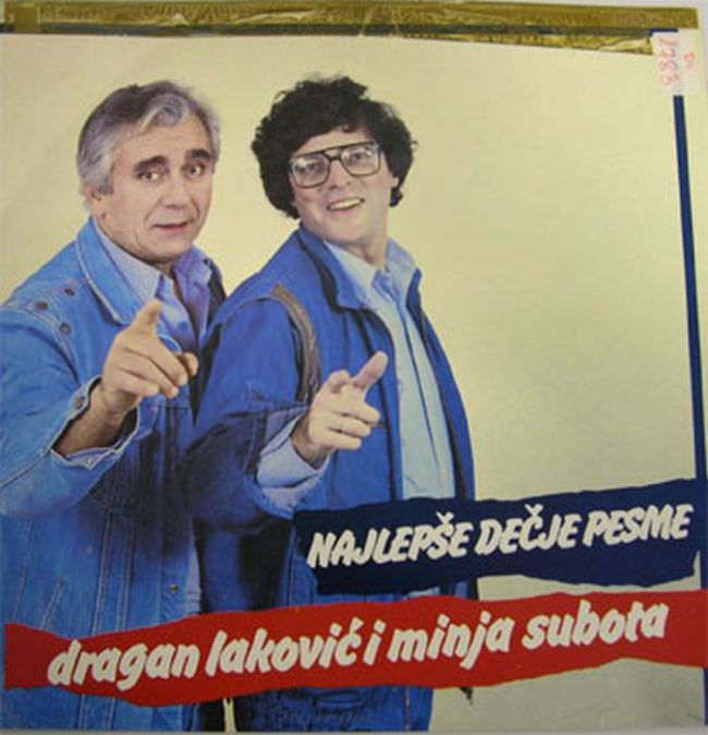
Two men in matching denim dominate the frame, both caught mid-gesture with outstretched fingers that feel half invitation, half sales pitch. Their confident poses and friendly grins play against a mostly blank background, a design choice that makes the figures—and their deliberately “everyman” styling—do all the work. The oversized glasses, the casual jackets, and the straightforward studio lighting evoke a particular late-20th-century pop sensibility where sincerity was often louder than sophistication.
Across the bottom, bold Serbian/Croatian text turns the cover into a poster-like announcement: “Najlepše dečje pesme” (the most beautiful children’s songs) and the artists’ names, “dragan laković i minja subota.” The color blocks and thick lettering prioritize legibility over elegance, suggesting a marketplace where album art had to compete from a distance in record-shop racks. Instead of metaphor or visual mystery, the design leans on directness—faces, names, and a promise of family-friendly content.
Nostalgia can make this era look charming, yet the title’s “ugly truth” fits the way many Yugoslav record covers from the 1970s and 1980s could appear blunt, improvised, or oddly staged. Limited budgets, fast turnaround, and a different set of aesthetic expectations produced graphics that now read as awkward—sometimes unintentionally funny—while still revealing what mattered: accessibility, recognizability, and mass appeal. For anyone digging into Yugoslavian album art and cover art history, this sleeve is a vivid reminder that design trends are as much about industry realities as they are about taste.