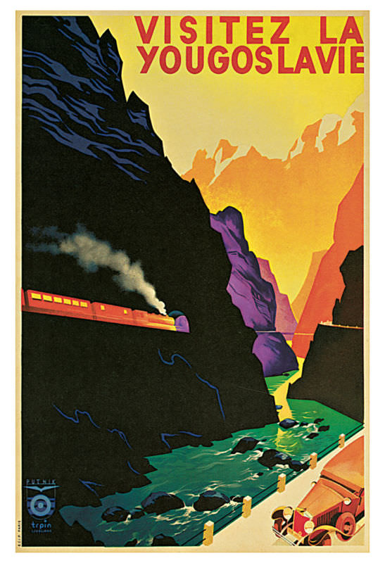
Bold, sunlit color blocks and dramatic silhouettes make this cover art impossible to ignore, with the French headline “Visitez la Yougoslavie” inviting viewers toward a grand, romanticized journey. A red train hugs a shadowy mountainside, its plume of steam cutting into the dark rock like a promise of speed and modern comfort. Below, turquoise water churns through a narrow gorge, turning the landscape into a staged spectacle meant to stir curiosity and wanderlust.
The composition is pure vintage travel advertising—part graphic design, part dreamscape—where nature appears monumental and travel feels effortless. Warm yellows and oranges glow in the distant peaks while cooler greens and blues ripple in the river, creating a striking contrast that guides the eye from the high ridge down to the rushing canyon. Even without naming a specific place, the poster sells an idea of the Balkans as scenic, adventurous, and newly accessible via rail.
At the bottom edge, a small automobile and roadside barrier hint at multiple ways to tour, underscoring how tourism marketing once celebrated mobility itself as a symbol of progress. For readers interested in vintage travel posters, cover art history, and classic tourism design, this piece offers a vivid snapshot of how destinations were branded through simplified shapes, saturated color, and carefully choreographed drama. It’s a reminder that before glossy photography dominated, illustrators and printers shaped the world’s imagination one poster at a time.