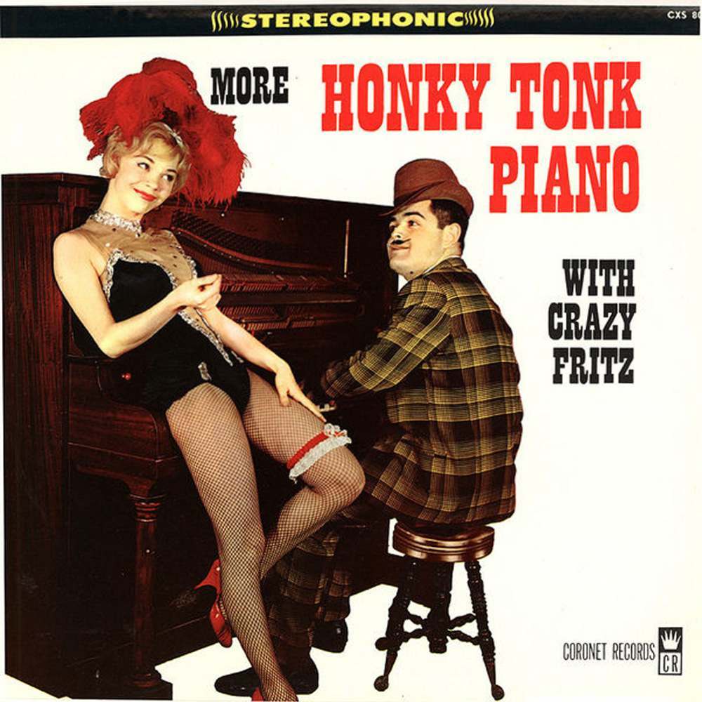
Loud lettering, cheeky staging, and a piano pushed right to the foreground—honky-tonk record cover art sold a whole night out before the needle ever touched the groove. Here, the promise is spelled in bold: “More Honky Tonk Piano,” with “Stereophonic” crowning the top like a marquee. The scene leans into cabaret swagger, pairing the upright piano’s wooden heft with a pin-up pose that turns music marketing into theater.
At the keys sits a grinning pianist in a patterned suit and hat, angled toward the viewer as if caught mid-riff, while a showgirl perches on the piano’s edge in fishnets, heels, and a dramatic feathered headpiece. The typography does the rest—blocky, high-contrast words that read instantly from across a record shop, with “with Crazy Fritz” positioned like a boast. Even the small “Coronet Records” mark at the bottom right anchors it as commercial ephemera from the era when labels competed as much with visuals as with sound.
Honky-tonk covers like this weren’t subtle; they were built for jukebox culture, bachelor-party jokes, and the fantasy of smoke, laughter, and relentless boogie-woogie. The photo’s playful glamour and staged flirtation reflect how “party tunes” were packaged—pianos, pin-ups, and a wink to the customer browsing for something rowdy. For collectors of vintage album covers and historians of mid-century pop design, it’s a sharp reminder that the wild world of honky-tonk wasn’t only heard—it was expertly advertised.