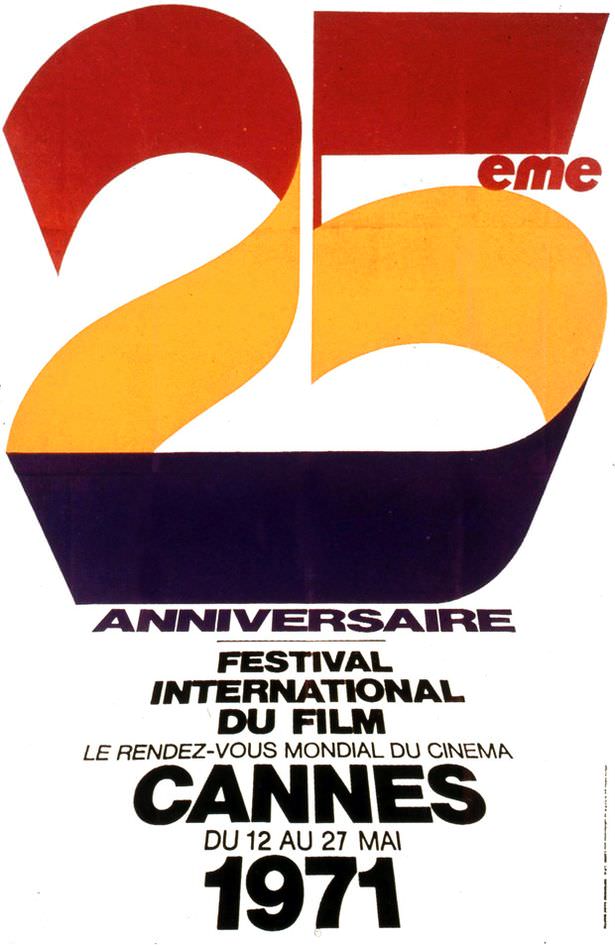
Bold, sweeping numerals dominate this cover art, turning “25” into a ribbon of color that feels both celebratory and distinctly early-1970s in its graphic confidence. The palette—warm reds and golds anchored by a deep, inky base—suggests a festival atmosphere while keeping the design clean and instantly legible. Even without depicting people or scenes, the composition communicates prestige, scale, and the pull of a major cultural event.
French typography anchors the poster to its purpose: “25e Anniversaire,” “Festival International du Film,” and the unmistakable “Cannes” set in heavy, assertive lettering. The text also preserves key historical details visible on the artwork, including the year 1971 and the dates “du 12 au 27 mai,” situating the celebration in a precise window on the calendar. As an artifact of film history, it offers a glimpse into how international cinema presented itself—modern, global, and designed for immediate impact on the street or in print.
Cover art like this does more than advertise; it becomes part of the festival’s memory, a visual shorthand for an anniversary year and the films, juries, and conversations that surrounded it. For readers exploring the 25th anniversary of the awards in 1971, the poster’s minimalist ambition underscores the era’s graphic design trends and Cannes’ role as a “rendez-vous mondial du cinéma.” The result is a compact historical document—half announcement, half icon—still readable decades later in both style and intent.