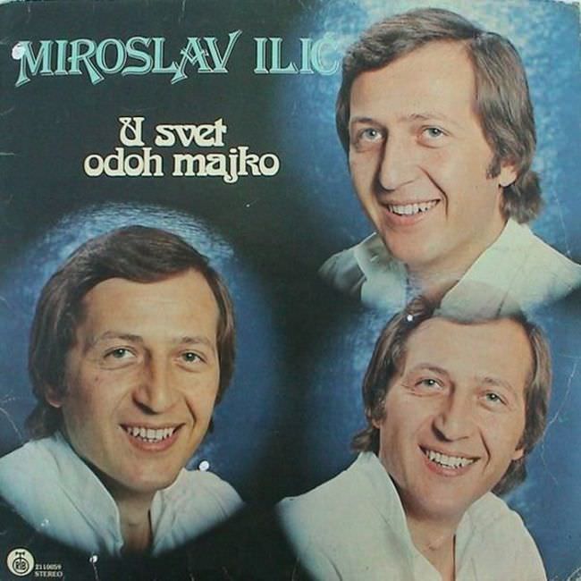
Miroslav Ilić’s name stretches across the top in ornate lettering, immediately setting a tone that feels half folk-pageantry, half record-shop glamour. Beneath it, the album title “U svet odoh majko” sits in bold, rounded type, floating over a smoky blue background that leans into mood rather than realism. The design tells you what many Yugoslav releases of the era promised at a glance: a recognizable singer, an emotional title, and a cover engineered to sell familiarity.
Three near-identical portraits of the performer are arranged like a soft-focus triptych, each with the same bright smile and tidy collared shirt. The repeated headshots create an odd, almost uncanny effect—more like a promotional poster collage than a single considered piece of cover art—while the airbrushed glow and vignette edges try to elevate the image into something dreamy. It’s a revealing look at how 1970s and 1980s Yugoslavian album cover art often relied on studio photography and simple visual tricks when budgets, printing limitations, or label habits kept design experimentation in check.
What makes the “ugly truth” interesting isn’t just kitsch; it’s the cultural work these sleeves were doing on crowded racks, signaling genre, respectability, and star power within seconds. This post digs into the aesthetics behind Yugoslav record covers like this one—fonts that shout tradition, colors that mimic nightclub haze, and portrait-heavy layouts that prioritize the singer over concept. For collectors and design historians alike, it’s a reminder that even awkward cover art can be a sharp document of taste, technology, and marketing in the late socialist music economy.