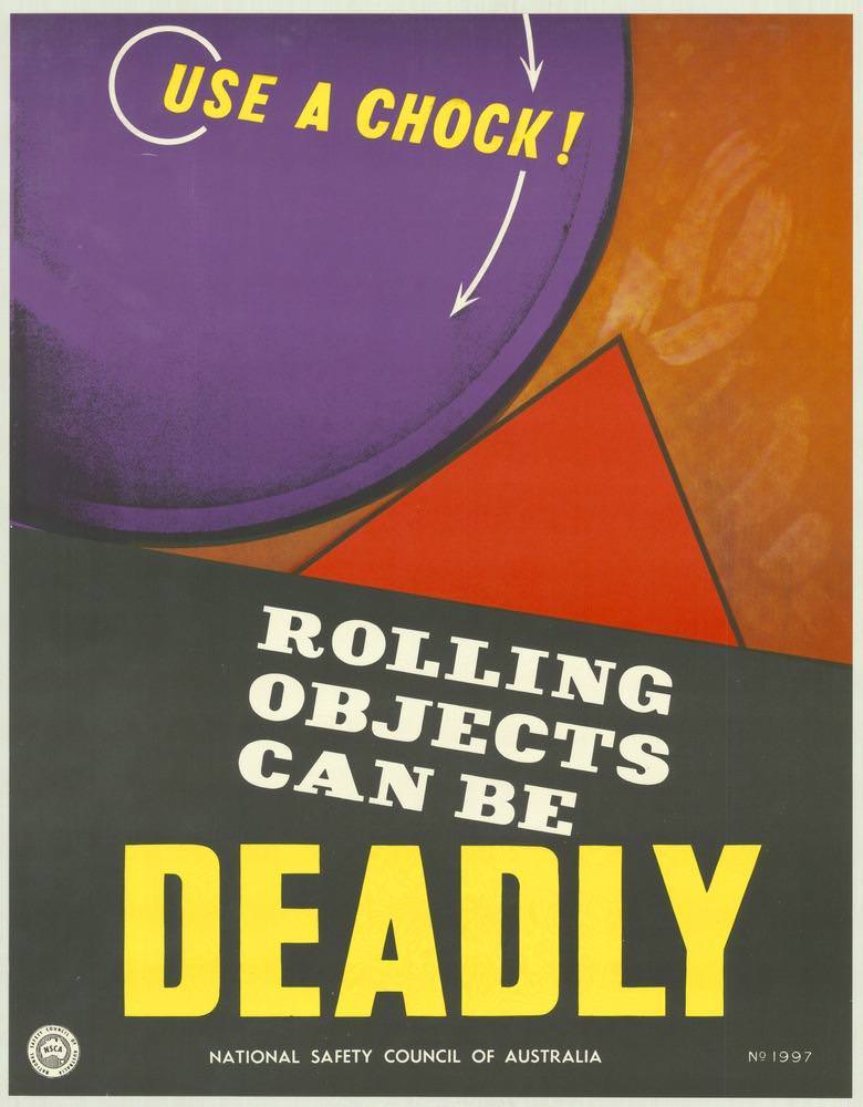
Bold colour and blunt typography do the heavy lifting on this National Safety Council of Australia poster, where the command “USE A CHOCK!” sits above the stark warning “ROLLING OBJECTS CAN BE DEADLY.” A purple wheel-like circle, a red wedge, and directional arrows turn a simple safety instruction into a graphic lesson about motion, weight, and what happens when equipment isn’t secured. Even without showing people, the design makes the hazard feel immediate—an everyday workplace risk distilled into a few unforgettable words.
Design cues associated with the 1970s—high-contrast blocks, simplified shapes, and oversized lettering—help explain why these Australian safety posters worked so well on factory walls, depots, and worksites. The message is practical and specific: chock wheels, stop uncontrolled rolling, prevent crush injuries. It’s also a reminder of how public-facing industrial safety campaigns relied on clarity over subtlety, ensuring the warning could be read at a glance from across a busy floor.
Viewed today, the poster doubles as cover art and as a piece of social history, reflecting an era when occupational health and safety education was increasingly visual, standardized, and widely circulated. Collectors, designers, and researchers interested in Australian ephemera will appreciate the way the National Safety Council of Australia paired strong graphic communication with a life-and-death theme. As part of a broader look at 1970s safety messaging, this image highlights how posters translated policy and procedure into something workers could remember—and act on immediately.