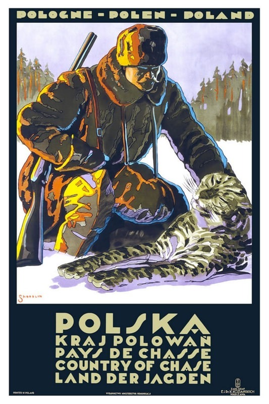
Bold lettering across the top reads “POLOGNE – POLEN – POLAND,” setting the tone for a striking piece of vintage travel advertising cover art. In the foreground, an outfitted hunter kneels in winter gear, rendered in sharp, graphic shapes and saturated browns, while a big cat lies at his side—an image designed to sell not just a destination, but a sense of drama and frontier adventure. Behind them, a band of dark forest rises against a pale sky, giving the scene an unmistakable outdoorsman’s atmosphere.
“POLSKA” anchors the bottom in blocky type, followed by multilingual lines that promote the country as a “land of chasse,” a reminder of how posters once spoke to international audiences at a glance. The palette and stylization feel rooted in early poster design traditions—high contrast, simplified forms, and confident outlines that read from a distance in a station hall or travel office. Even without a specific date, the composition signals an era when tourism marketing leaned heavily on spectacle and romance.
As part of “Around the World in Posters,” this piece highlights how cover art and travel posters shaped perceptions of places long before glossy brochures and social media feeds. It’s a provocative artifact: equal parts design history and cultural messaging, inviting modern viewers to consider what was emphasized, what was omitted, and why. For collectors, designers, and historians alike, it’s a memorable example of vintage Poland travel poster art—where typography, illustration, and aspiration meet on a single sheet.