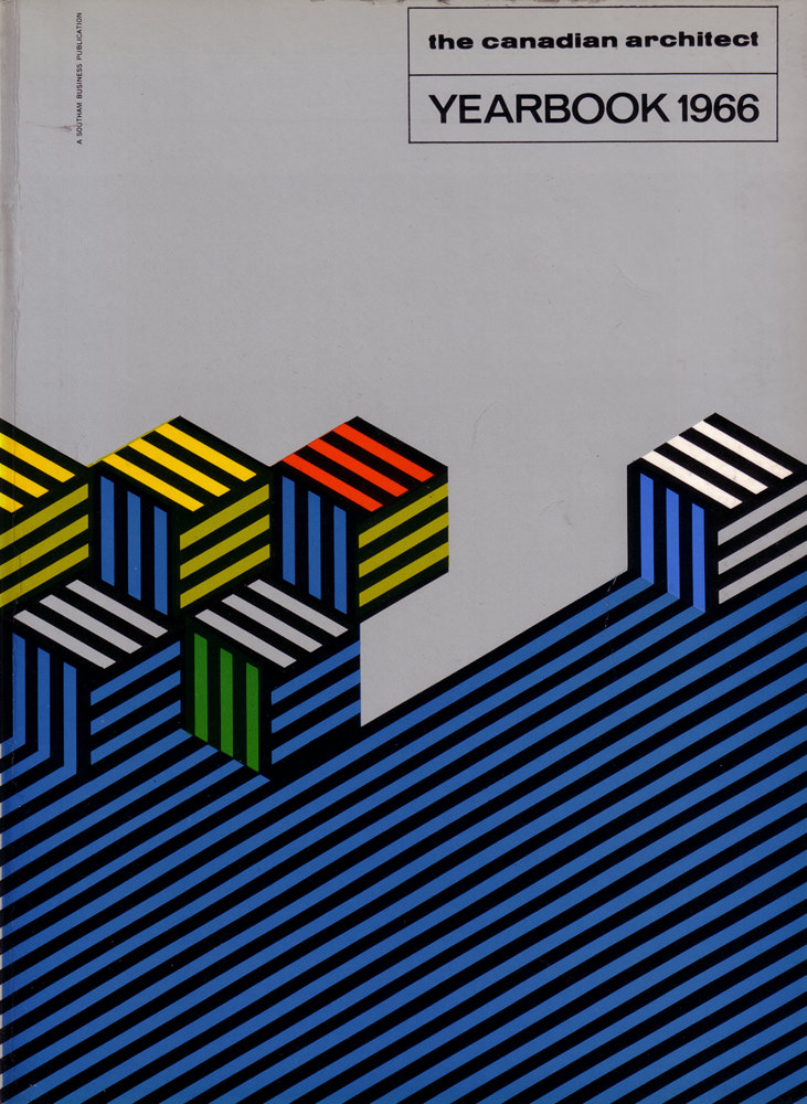
Bold geometry and restrained typography define the cover of *The Canadian Architect – Yearbook 1966*, a piece of graphic design that feels as modern as the era it represents. Set against a cool grey field, the title block sits crisply in the upper corner, letting the artwork do the talking. Along the margin, the small imprint “A Southam Business Publication” quietly anchors the object in its publishing context.
Across the lower half, diagonal blue bands rise like a stylized landscape or drafted contour lines, interrupted by a cluster of cube forms built from alternating stripes. Yellow, red, green, black, and white accents snap into place with an almost optical rhythm, suggesting modular construction, repetition, and the logic of the grid. The overall effect echoes mid-century modern and op-art sensibilities, translating architectural thinking into pure cover art.
For collectors and researchers of Canadian architecture, this 1966 yearbook cover is more than packaging—it’s a visual snapshot of confidence in design, systems, and the future. The clean layout and hard-edged color palette speak to the professional culture surrounding architecture and planning in the 1960s, when print yearbooks served as curated records of ideas and practice. As a WordPress post image, it offers strong SEO appeal for searches related to The Canadian Architect magazine, yearbook covers, and vintage architectural graphic design.