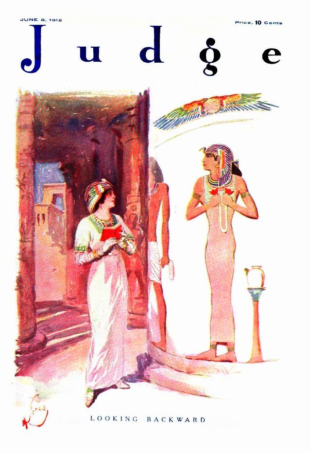
June 8, 1912 appears at the top of this Judge magazine cover, where tall lettering and clean white space frame a richly colored scene titled “Looking Backward.” The artwork leans into an ancient Egyptian revival mood, with stylized figures in long robes posed among monumental columns and stepped architecture. A winged sun disc hovers overhead, a familiar motif that signals antiquity and ceremony in early 20th-century illustration.
Warm reds, sandy browns, and pale stone tones create a theatrical sense of depth, as though the viewer has stepped into a painted temple corridor. One figure turns toward another near the threshold, their gestures suggesting hesitation or reflection, while crisp decorative details—headpieces, jewelry, and patterned trim—anchor the composition in period imagination rather than strict archaeology. The price marker (“10 cents”) and the magazine’s bold masthead remind us this was mass-market visual culture, meant to catch the eye on a crowded newsstand.
As cover art, it’s a compact window into how American humor and commentary magazines used historical and exotic themes to signal satire, nostalgia, or cultural critique without needing a single paragraph of text. For readers interested in Judge magazine history, vintage magazine covers, and the era’s fascination with Egypt-inspired design, this issue offers a vivid example of early 1900s print illustration at its most decorative. The phrase “Looking Backward” invites interpretation—part joke, part warning, part daydream—making the cover as evocative now as it was in 1912.