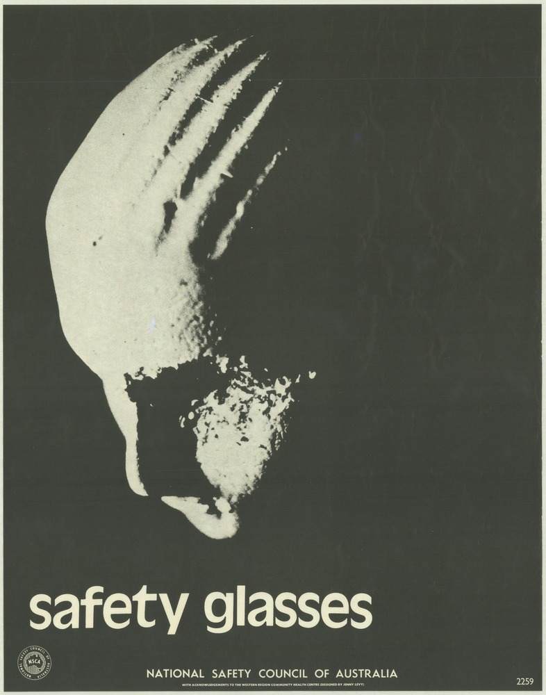
A stark profile floats out of a near-solid black field, its pale surface marked by deep scratches that read like an injury as much as a design choice. Beneath it, the blunt lowercase message—“safety glasses”—lands with the force of a warning label, leaving no room for doubt about the poster’s purpose. The National Safety Council of Australia imprint anchors the piece as public-facing safety communication rather than gallery art, even as the visual language borrows confidently from modern graphic design.
Seen in the context of 1970s workplace and community health campaigns, the poster’s power comes from what it refuses to show: no busy workshop scene, no explanatory diagram, just a single, unsettling suggestion of what can happen to an unprotected eye. High contrast, minimal text, and a tight composition make it readable at a distance—ideal for factory walls, training rooms, and corridors where a message had to compete with noise and routine. The effect is both educational and emotional, turning personal vulnerability into a shared responsibility.
As cover art for a broader look at National Safety Council of Australia posters from the 1970s, this piece sets the tone for an era when visual messaging was a key tool in injury prevention. It’s a reminder that occupational safety posters were engineered for attention: quick to grasp, hard to forget, and aimed at changing habits before accidents happened. For readers interested in Australian safety history, graphic design, or public health communication, this image offers a clear entry point into how “keeping people safe and well” was translated into ink, contrast, and urgency.