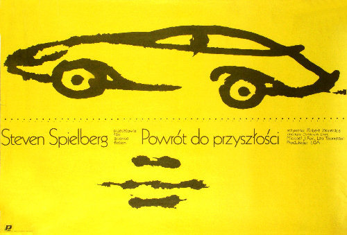
Bold yellow floods the page, turning the poster into a warning sign and a promise at the same time. A few swift black strokes outline a low, futuristic car, rendered more like a memory or a sketch than a machine—an economical mark that instantly reads as speed, invention, and motion. The sparse composition pulls the eye to the silhouette and invites you to fill in the details, a perfect visual echo of a story that’s always racing ahead.
Along the lower half, Polish text anchors the design in its cultural context, with “Powrót do przyszłości” standing out as the local title for “Back to the Future.” The lettering sits casually against the open field of color, while scattered ink-like smudges add texture and a slightly handmade feel, as if the artwork was built from gesture rather than polish. Even without elaborate imagery, the layout communicates blockbuster energy through contrast, negative space, and an immediately recognizable icon.
Created by Mieczyslaw Wasilewski in 1986, this piece of cover art reflects a period when film promotion often leaned on graphic shorthand instead of photo realism. The result is both minimalist and memorable: a time-travel movie poster distilled to its essence, where design does the storytelling. For collectors of vintage movie posters, Polish poster art, and 1980s graphic design, it’s a striking example of how a few lines and a single color can carry an entire cinematic world.