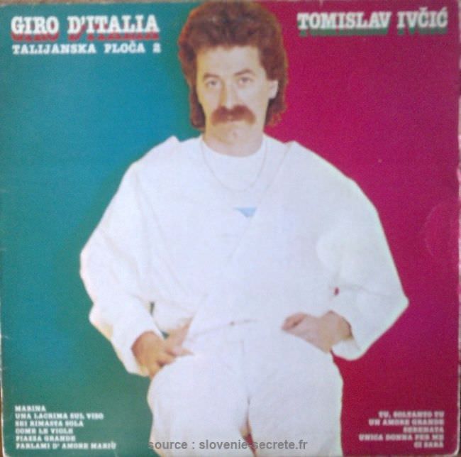
Neon blocks of teal and magenta clash behind a casually posed man in an all-white outfit, complete with a chain necklace and a neatly groomed moustache, creating the kind of blunt, studio-cutout aesthetic that defined plenty of Yugoslavian record sleeves in the late 20th century. The typography is loud and declarative—“Giro d’Italia” on one side and “Tomislav Ivčić” on the other—while the figure sits almost weightlessly, as if pasted onto a poster rather than photographed for a musical release. It’s exactly the sort of cover art that stops modern viewers mid-scroll: bold, awkward, and strangely confident.
Printed on the sleeve is a jumble of signals—Italian wording, a Balkan performer’s name, and a track list set in small type—hinting at a music market where cross-border appeal mattered and design budgets often didn’t stretch to subtlety. The harsh cutout edges, simplified lighting, and high-contrast color fields suggest quick production and a focus on recognizability over refinement. Instead of telling a story, the cover sells a persona: clean, approachable, and unmistakably “pop,” even when the visual choices veer into kitsch.
Seen through the lens of 1970s and 1980s Yugoslavian album art, the “ugly truth” isn’t simply bad taste—it’s a snapshot of commercial realities, printing limitations, and a regional graphic style that favored impact over elegance. For collectors and design historians, pieces like this become artifacts of how music circulated, how artists were packaged, and how Western visual trends were reinterpreted on local terms. If you’re exploring Yugoslav record covers, retro cover art, or Balkan pop ephemera, this sleeve offers a vivid example of the era’s unpolished charm.