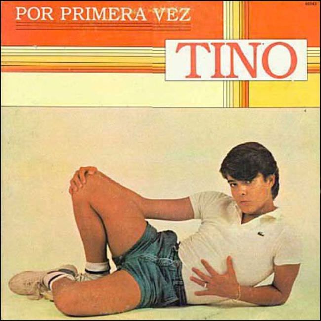
Loud typography and a grid of stripes set the stage for an album sleeve that seems determined to shout before a single note is heard. The words “POR PRIMERA VEZ” and the oversized “TINO” dominate the upper half, leaving little room for subtlety and leaning into that unmistakable late-70s/early-80s bargain-bin bravado. It’s the kind of design that tells you exactly why collectors remember Yugoslav-era cover art with a mix of affection, disbelief, and secondhand embarrassment.
Below the text, a studio pose does the heavy lifting: a young man reclines against a blank backdrop in athletic shorts, white shirt, and sneakers, framed like a pin-up but lit like a catalog model. The composition feels simultaneously confident and awkward, with the body language selling charisma while the minimal set offers no narrative beyond “look at the star.” That tension—between aspirational pop imagery and limited, sometimes clumsy art direction—sits at the heart of the era’s most notorious record covers.
What makes this sleeve worth revisiting isn’t just its “ugly truth,” but how clearly it reflects the visual economy of Yugoslavian album art in the 1970s and 1980s: bold type, simple color blocks, and a performer-centered photograph meant to move units fast. The result can feel kitschy today, yet it’s also a fascinating artifact of regional pop marketing, printing constraints, and international style trends filtered through local tastes. For anyone exploring vintage Yugoslav record sleeves, retro album cover design, or the stranger corners of Balkan pop aesthetics, this image is a perfect entry point.