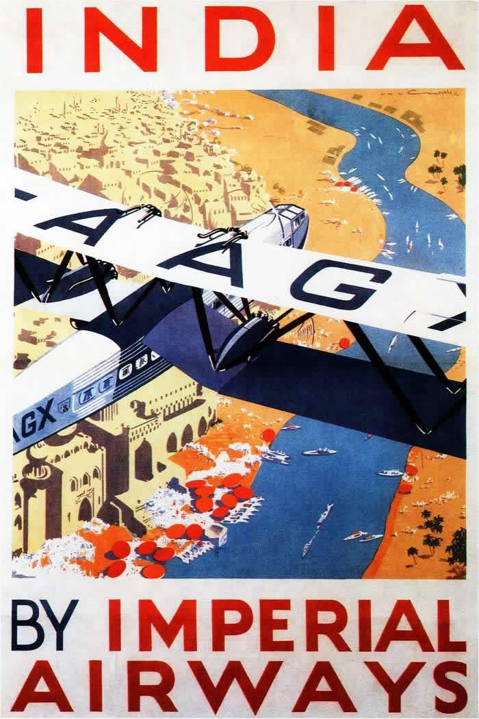
Bold letters shout “INDIA” across the top while a sleek aircraft cuts diagonally through the frame, its wing dominating the viewer’s perspective. Below, a stylized river winds past clustered buildings and sun-warmed shoreline, rendered in simplified shapes and confident color blocks that feel unmistakably interwar. The composition sells altitude and speed—an invitation to look down on a vast landscape from the privileged seat of early air travel.
Imperial Airways is positioned not just as a carrier, but as a promise of modern connection, with the plane’s crisp geometry contrasting the intricate world beneath it. Details like tiny boats on the water and scattered structures on land act as visual proof of distance conquered, turning geography into a scenic spectacle. The limited palette—sand, blue, and striking reds—pushes the poster’s message with the clarity of good advertising: travel is streamlined, legible, and thrilling.
Early airline posters like this helped normalize flying for audiences who still associated aircraft with novelty and risk, framing long journeys as comfortable and aspirational. For readers exploring Imperial Airways posters from the 1920s and 1930s, the piece offers a vivid example of how design, typography, and romance of the aerial view worked together to market routes and destinations. It’s cover art with a purpose—selling the skies as the next frontier of everyday travel.