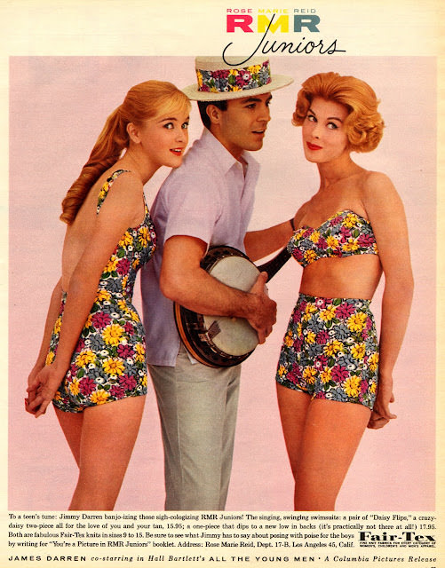
Sunlit color and a wink of playfulness set the tone on this Seventeen-style cover art, where bright floral swimwear and a smooth, studio-pink backdrop sell an easy, youthful summer fantasy. Two-piece bathing suits with high-waisted bottoms and a structured bandeau top read as unmistakably mid-century, while the polished hair and lipstick keep the look tidy, curated, and magazine-ready. Even at a glance, the design balances flirtation with wholesomeness—exactly the kind of visual tightrope teen fashion media loved in the 1960s.
At center, a casually posed young man in a crisp short-sleeve shirt and patterned hat holds a banjo, turning the scene into a lighthearted tableau rather than a straightforward fashion spread. The prop nods to the era’s pop-folk moment and the broader culture of “clean-cut” entertainment that advertisers leaned on to make style feel safe for parents and exciting for teens. That mix—music, romance, and coordinated outfits—helps explain why cover illustrations and promotional art became such powerful engines for trend-making.
Along the bottom, dense ad copy and branding details do more than fill space; they reveal how 1960s fashion imagery doubled as an advertisement, guiding readers toward mail-order purchases and reinforcing what “junior” style was supposed to look like. The saturated florals and confident silhouettes spotlight the decade’s love of bold prints, while the careful composition keeps every detail legible for browsing eyes. For anyone exploring Seventeen magazine cover art and 1960s teen fashion, this piece offers a vivid snapshot of how groovy threads and bold ads worked together to sell a lifestyle.