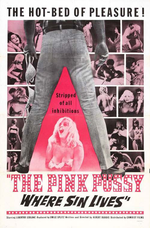
Bold typography shouts from the top while a collage of intimate, tabloid-like vignettes frames the center, selling sensation through graphic design as much as through subject matter. The composition hinges on a single, unmistakable stance: legs planted wide to create a literal “A” window, turning the human body into architecture for the poster’s message. That triangular cutout—hot pink against grayscale imagery—makes the pose feel both confrontational and carefully staged, the kind of visual hook that still reads instantly in a scrolling feed.
At the heart of the layout, the A-frame silhouette functions like a spotlight and a border at once, directing attention inward while keeping the surrounding scenes in constant peripheral motion. The poster relies on contrast—pink versus monochrome, big block letters versus smaller snapshots—to suggest a whole world of drama in a single glance. Even without knowing the film’s specifics, the design communicates how marketing often fused fashion, sexuality, and spectacle into one punchy, street-facing advertisement.
Long after its original era, the A-frame pose keeps resurfacing because it’s simple, legible, and loaded with attitude: it projects power, frames the subject, and creates instant symmetry. Modern fashion editorials, album covers, and movie posters still borrow this visual grammar to telegraph confidence or provocation, sometimes quoting it directly and sometimes softening it into a runway stance. Seen as cover art today, the piece doubles as a lesson in how an iconic pose can outlive its context and continue shaping poster design, styling, and visual storytelling.