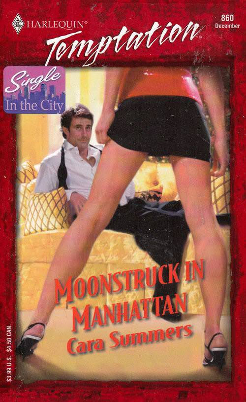
Bold typography and a saturated red frame announce this as romance cover art, but it’s the staging that does the real selling. A standing figure in high heels and short black shorts dominates the foreground with legs set wide, while a seated man in an open-collared white shirt looks on from the bed. That triangular stance—feet planted, hips squared, body becoming a graphic “A”—turns a simple room into a charged scene built on power, anticipation, and gaze.
Design choices reinforce why the A-frame pose became a visual shorthand across fashion photography, movie posters, and advertising. The low viewpoint forces the eye upward, the split composition creates instant depth, and the strong diagonal lines guide attention straight to the center of the frame. Even the surrounding elements—the warm bedding, the casual loosened tie, and the oversized title lettering—work like stage props, amplifying a story without needing a single line of dialogue.
Across decades of pop culture imagery, this pose keeps returning because it communicates confidence and confrontation in one clean silhouette. It can suggest seduction, authority, or challenge depending on wardrobe and context, which is why contemporary editorial shoots and poster designers still borrow the same geometry. In this post, the cover’s dramatic perspective serves as a vivid example of how the A-frame continues to shape modern visual language—one stance, endlessly remixed.