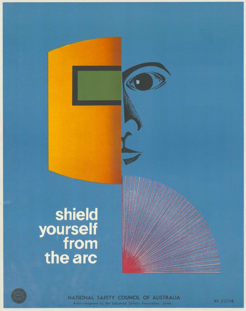
Bold colour blocks and razor-clean geometry give this 1970s National Safety Council of Australia poster an immediate, modern punch. A stylised face peers from the right edge while a protective visor or mask—rendered in warm orange with a green window—cuts across the composition, turning personal protective equipment into a graphic symbol. The short directive, “shield yourself from the arc,” anchors the message with the plainspoken urgency typical of workplace safety campaigns.
Design does most of the talking here: the cool blue field suggests a controlled, industrial setting, while the fan of red lines evokes the spray and flare of an electrical arc. By pairing minimal text with an abstracted hazard, the cover art distils a complex risk into something instantly legible, even at a glance on a noticeboard or workshop wall. It’s a reminder of how occupational health and safety communication in the 1970s leaned on strong visuals to cut through noise and routine.
Within the wider set of National Safety Council of Australia posters from the 1970s, this piece highlights a shift toward graphic design as a public health tool—clean typography, simplified figures, and high-contrast palettes engineered for quick comprehension. Readers interested in Australian safety history, industrial design, or vintage poster art will find plenty to study in the way warning, instruction, and reassurance are balanced on a single page. As cover art, it sets the tone for a collection devoted to keeping people safe and well through memorable visual messages.