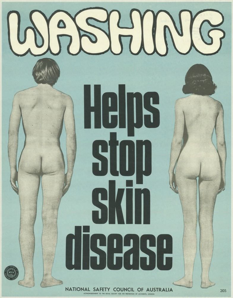
Bold, bubble-like lettering spelling “WASHING” crowns a stark public health message: “Helps stop skin disease.” Set against a flat, pale blue field, two unclothed figures are shown from behind at either side, turning the human body into a straightforward reminder of hygiene and prevention rather than a scene with narrative distraction.
The design speaks in the plain, attention-grabbing language common to 1970s safety and health campaigns, where typography did as much work as imagery. Heavy black text stacked down the center reads like a command on a factory noticeboard, while the uncluttered layout makes the message instantly legible from a distance—ideal for community spaces, workplaces, and institutional walls.
As part of the National Safety Council of Australia poster tradition, the cover art reflects an era when visual communication aimed to be direct, memorable, and widely understood. For readers interested in Australian safety posters, health education history, and 1970s graphic design, this piece offers a striking example of how prevention messaging relied on simplicity, contrast, and a touch of shock to promote everyday habits that keep people safe and well.