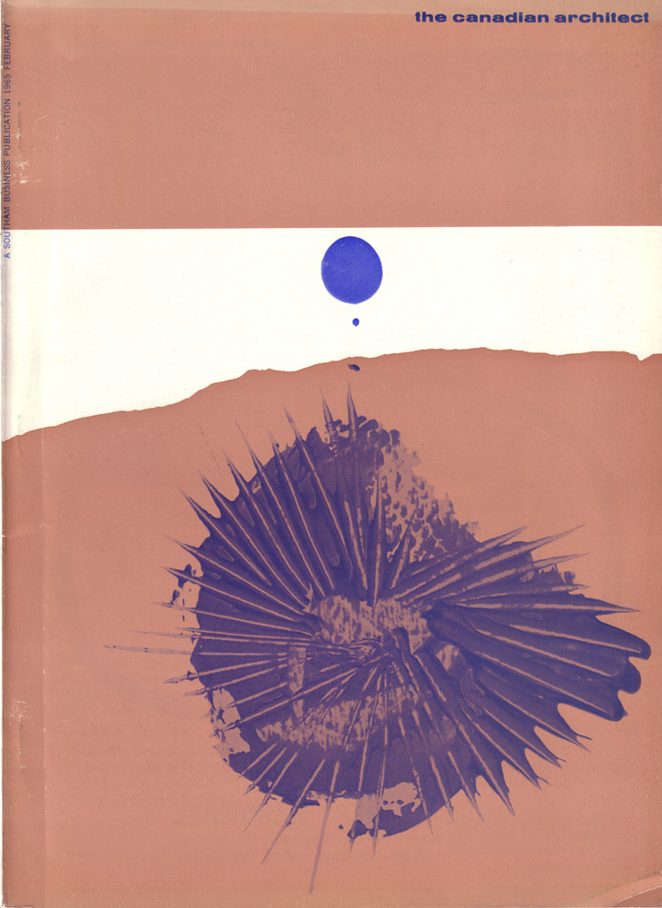
A bold field of warm colour dominates the February 1965 cover of *The Canadian Architect*, interrupted by a crisp white band and a single, suspended blue dot that feels almost planetary. Below it, an explosive blue form—part ink bloom, part sea urchin, part engineered burst—spreads outward in sharp rays, suggesting both organic growth and the precision of drafted lines. The design’s restraint and drama speak to mid-century modern graphic sensibilities, where a few shapes could carry the weight of an era’s ambitions.
Along the left margin, the small vertical text identifies it as “A Southam Business Publication,” anchoring the artwork in the world of professional journals and Canadian design culture. Rather than relying on literal buildings or familiar skylines, this cover art leans into abstraction, hinting at architecture as an idea: structure, tension, rhythm, and the meeting of clean geometry with unpredictable material energy. The slightly worn edges and softened surface add a tactile reminder that this is an artifact handled, shelved, and saved.
For collectors of architectural magazines, historians of Canadian modernism, or anyone drawn to vintage print design, this issue offers a striking example of how the profession presented itself in the 1960s. The pared-back palette and graphic punch make it instantly recognizable on a bookshelf, while the composition invites close looking—what reads as a simple dot and burst becomes a conversation about scale, balance, and invention. As cover art, it’s less a snapshot of a single project than a visual manifesto for the period’s forward-looking spirit.