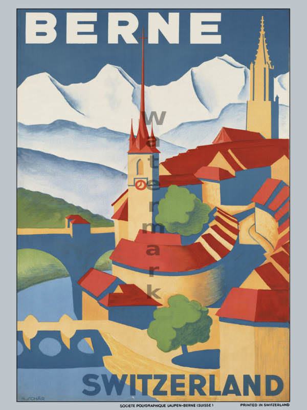
Bold lettering announces “BERNE” above a stylized sweep of rooftops and church spires, set against crisp, snow-bright mountains that promise alpine air and postcard views. The design leans into clean shapes and saturated color blocks—deep blues, warm reds, and creamy yellows—turning the city into an inviting pattern of towers, bridges, and river curves. Even at a glance, it reads like classic travel cover art: confident, modern, and instantly legible from a distance.
Vintage travel advertising loved this kind of simplification, where geography becomes mood and architecture becomes icon. Here, the old town’s silhouettes and the surrounding peaks work together as a single brand: Switzerland as both cultured city break and gateway to mountain scenery. The poster’s crisp typography and graphic perspective reflect an era when rail journeys and tourism campaigns sold destinations with elegance rather than photographic realism.
For collectors, designers, and history lovers, this piece fits neatly into any exploration of classic European travel posters and Swiss tourism ephemera. It’s a reminder of how printed advertising shaped expectations—what to notice, where to wander, and how to imagine arrival—long before social media feeds and digital booking. If you’re browsing “Around the World in Posters,” let Berne’s cover art-style charm stand in for a whole age of wanderlust rendered in ink and color.