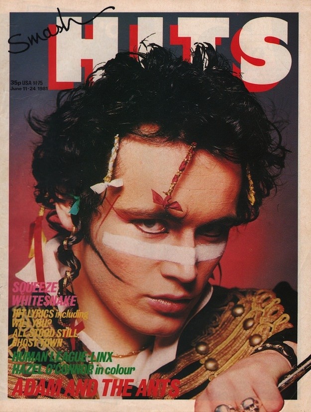
Bold type and louder color blocks announce the unmistakable world of *Smash Hits*, where pop wasn’t just heard—it was packaged as attitude. The cover art leans into immediacy: a close, confrontational portrait framed by oversized lettering, with the magazine’s masthead towering behind the subject like a stage backdrop. Even the price and issue details tucked near the top edge become part of the design rhythm, reminding you this was meant to be grabbed quickly and read obsessively.
Across the face, theatrical styling and graphic makeup signal the era’s taste for new romantic drama, punk hangovers, and pop-star reinvention. Ribbons, braids, and ornate costume details push the look toward performance, while the tight crop keeps the focus on expression—equal parts cool, defiant, and carefully constructed for the newsstand. Cover lines stack along the left in bright, high-contrast colors, selling the promise of interviews, lyrics, and the next big thing in 1980s music culture.
Collectors and music fans return to these iconic magazine covers because they function as miniature time capsules of design, fandom, and celebrity. *Smash Hits* cover art balanced accessibility with edge, turning weekly pop journalism into something closer to poster-worthy ephemera. If you’re exploring 1980s print aesthetics, British pop magazines, or the visual language of the decade’s youth culture, this cover is exactly the kind of bold, era-defining artifact that still reads loud today.