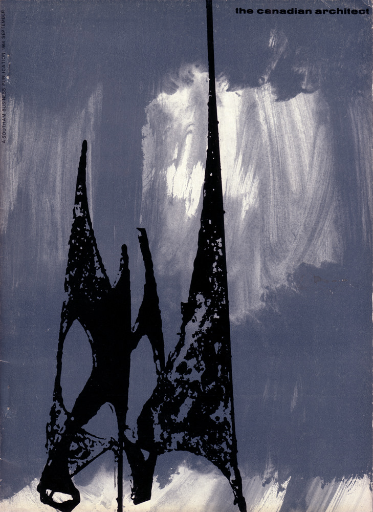
A stark, modernist cover dominates the September 1964 issue of *The Canadian Architect*, using bold silhouette and texture rather than literal depiction. Two sharp, spire-like forms rise from the lower edge, their black shapes pitted and irregular as if cut from weathered metal or inked with a rough brush. Behind them, a smoky wash of blue-grey and white suggests sky, glare, or light breaking through cloud—an atmospheric backdrop that turns the composition into a study of contrast.
The design feels in conversation with mid-century architectural culture, when magazines often used abstract cover art to signal experimentation and new materials. Those tapering points could be read as towers, scaffolds, or simply graphic marks—ambiguous on purpose, inviting the viewer to project structure and meaning onto form. Even without a named building, the image evokes the era’s fascination with verticality, engineering bravado, and the drama of construction.
For collectors and researchers, this cover is a compelling artifact of Canadian architectural publishing in the 1960s, marrying editorial identity with striking visual language. It works well as a reference point for anyone exploring graphic design in architecture magazines, modernist aesthetics, or the visual rhetoric of professional journals. Filed under “Cover Art,” it offers a memorable portal into the period’s mood—serious, forward-looking, and unafraid of abstraction.