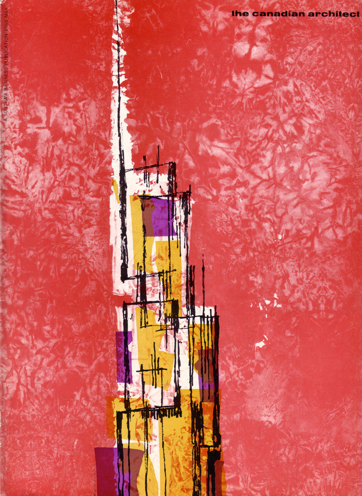
A bold field of mottled red sets the stage for the May 1965 cover of *The Canadian Architect*, where graphic design and architectural thinking meet on equal terms. The title sits quietly at the top right, letting the composition do the talking: a tall, narrow figure rises from the bottom edge like a city in shorthand, spare and confident.
At the center, layered blocks of ochre, gold, and violet are pinned together by brisk, black linear marks that read like a structural sketch—part elevation, part diagram, part improvisation. The pale vertical band running upward suggests a spine or core, while the surrounding textures feel tactile, like printed ink pressed hard into paper, capturing the era’s appetite for abstraction.
More than “cover art,” this magazine front becomes a small time capsule of mid-century modernism in Canada, reflecting how architects and editors used visual language to signal new ideas. For readers browsing a collection of vintage architecture magazines, Canadian design history, or 1960s graphic design, this issue offers an instantly recognizable blend of editorial sophistication and avant-garde energy.