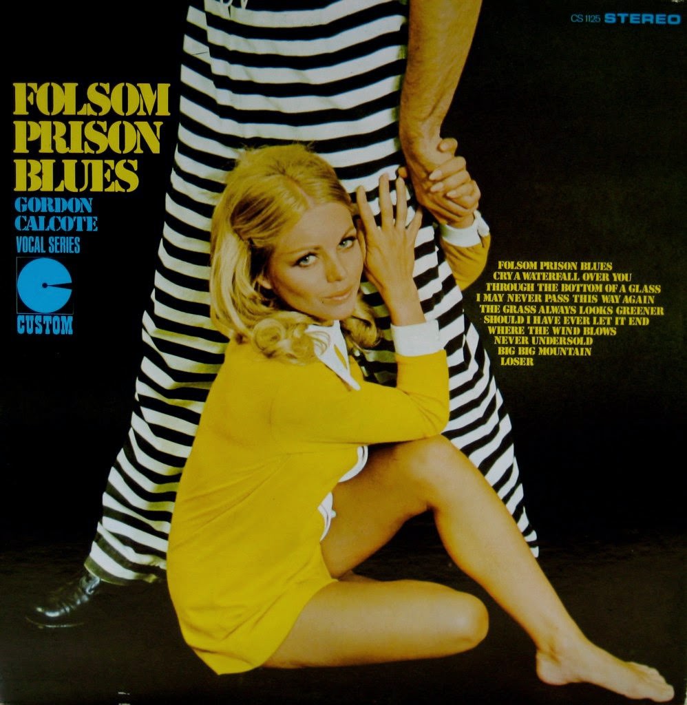
Front and center is a perfect slice of “so bad it’s good” album-cover theater: bold lettering, a deep black backdrop, and a model in a bright yellow outfit clinging dramatically to a pair of black-and-white prison stripes. The contrast is intentionally loud, pushing the eye from the oversized title to the staged pose, as if the designer wanted melodrama to do the selling before the first note even plays. Even the small “stereo” branding and track list crowd the frame like a badge of modernity, reminding us how much record sleeves once tried to be mini movie posters.
The comedic spark comes from the mismatch between the tough-sounding “Folsom Prison Blues” theme and the glossy, fashion-advertisement styling. Those iconic stripes read instantly as “jail,” yet the overall mood feels more like a studio glamour shoot than a hard-edged blues record, creating the kind of unintentional humor collectors love. It’s campy, catchy, and slightly confusing—in other words, exactly the kind of vintage cover art that makes you laugh and keep looking for more.
Posts like this celebrate the weird little decisions that shaped retro graphic design, from aggressive typography to eyebrow-raising concepts that probably sounded better in a brainstorm than on a store shelf. For fans of vintage album covers, kitsch nostalgia, and oddball music memorabilia, this image is a reminder that the past didn’t always aim for “cool”—sometimes it landed on unforgettable. Scroll on for more hilariously misguided cover art that’s become a time capsule of style, marketing, and accidental comedy.