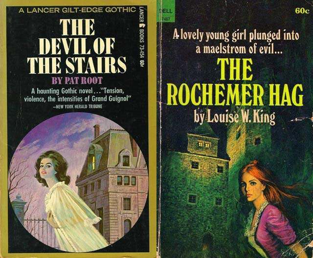
Lurid color, looming architecture, and a solitary heroine in motion—these classic gothic romance covers lean hard into the moment just before the story turns dangerous. On one jacket, a woman in a pale, flowing dress flees past an iron gate as a severe mansion rises behind her; on the other, a red‑haired figure in a vivid jacket bolts away from a dark, fortress-like house. The typography shouts in heavy capitals, while taglines promise “tension” and a “maelstrom of evil,” making the covers themselves feel like a whispered warning.
Running from the house is more than a convenient plot cue; it’s a psychological hook that compresses fear, desire, and agency into a single image. The house functions as a character—an imposing symbol of secrets and confinement—while the woman’s movement suggests urgency and self-preservation, inviting the viewer to imagine what she has discovered inside. That push-pull between attraction to the mystery and dread of what it contains is the engine of gothic romance cover art, and it primes readers to step into a world where love, menace, and the uncanny intertwine.
For collectors and design lovers, these mid-century style paperback covers also showcase how marketing and mood work together: saturated hues, dramatic lighting, and stark contrasts make the scene readable at a glance. The repeated visual trope of the fleeing heroine becomes a recognizable promise—danger near the threshold, revelation behind the door, and a heroine caught between surrender and escape. In exploring the psychological appeal of women running from houses on gothic romance covers, we’re really tracing how a genre learned to sell suspense through a single, unforgettable silhouette in flight.